Navigating the UI UX 차이 (difference between UI and UX) has become crucial for anyone building a career in digital design, particularly within South Korea’s rapidly advancing tech ecosystem. As Korea’s design industry continues to shape global trends, understanding these fundamental concepts isn’t just helpful—it’s essential.
This comprehensive guide offers UX design aspirants in Korea a clear, practical perspective on UI and UX distinctions, complete with insights into how these principles apply within our local context and what to expect as we move into 2025 and beyond.
Growing up in Seoul’s Cheongdam-dong district has given me a unique lens through which to view design—one that bridges traditional Korean aesthetics with modern digital innovation. This perspective shapes how I approach the UI UX 차이 discussion.
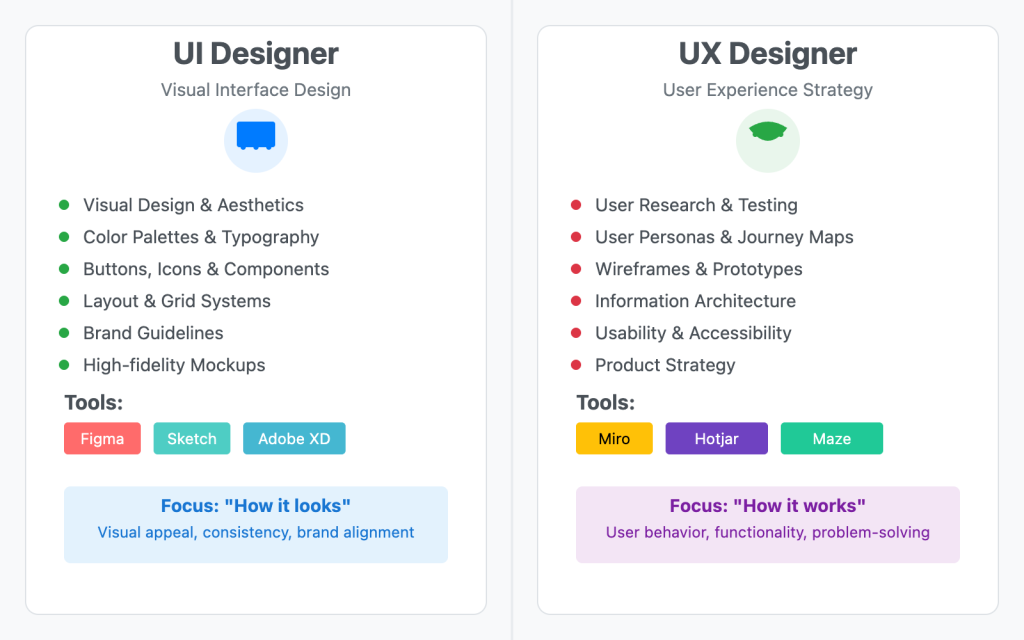
At its core, UI (User Interface) encompasses the visual and interactive elements users directly engage with—think buttons, color schemes, typography, and layout structures. UX (User Experience), meanwhile, focuses on the holistic journey users take when interacting with a product or service, emphasizing usability, accessibility, and emotional connection.
Korea’s rich heritage of user-centered innovation provides fascinating context for understanding these concepts. From King Sejong’s revolutionary creation of Hangul—designed specifically for ease of learning and use—to today’s digital powerhouses like Naver and Kakao, Korean design has consistently prioritized user needs. This tradition influences how UI and UX manifest locally: Korean UI design often embraces vibrant, energetic aesthetics that reflect our cultural preferences, while UX considerations include unique elements like vertical text layouts and culturally-specific user behaviors.
- Korean UX Design History and Cultural Roots
- UI UX 차이 – What is UI? What is UX?
- Key Differences: UI vs UX (UI UX 차이)
- Why UI UX 차이 Matters for Korean UX Design Aspirants
- Practical Applications of UI UX 차이 for Professionals
- Roles and Career Paths Based on UI UX 차이
- Frequently Asked Questions (FAQ)
- How do UI and UX design influence user satisfaction differently in digital products?
- Can improving UX design without changing UI still enhance a product’s success?
- What are the key challenges when integrating UI and UX strategies during product development?
- How do UI and UX roles differ in the design process, and what collaboration is essential?
- In what ways will UI and UX design trends evolve in 2025 to better meet user expectations?
- Conclusion
Korean UX Design History and Cultural Roots
The origins of Korean UX design trace back to the 15th century with King Sejong’s creation of Hangul, a writing system crafted for user convenience and efficiency. Hangul’s scientific structure and ease of learning embody early user-centered design principles, emphasizing clarity and usability. This cultural foundation has deeply influenced modern Korean UX approaches, fostering designs that prioritize straightforward user experiences.
With South Korea’s rapid growth in information and communication technology, UX design evolved in tandem with technological advances, especially as mobile-first environments became dominant. Leading Korean digital companies like Naver and Kakao pioneered innovations tailored to these trends, focusing on seamless and intuitive user flows.

Traditional Korean values such as harmony and community also shaped UX design, encouraging smooth interactions that respect user context. The strong emphasis on education and swift technology adoption accelerated the maturity of UX in Korea’s digital services.
Visually, Korean UX integrates cultural aesthetics including bright colors and clean layouts to resonate with local users. Historically, the focus shifted from physical product usability to digital interface design, resulting in a unique blend of linguistic, cultural, and technological factors that define Korean UX development today.
UI UX 차이 – What is UI? What is UX?
UI (User Interface) refers to the visual and interactive elements users engage with directly—buttons, icons, color schemes, typography, and layout. UI design determines how a product looks and how users interact with each screen or element. The unique characteristics of Hangul, Korea’s alphabet, also influence UI design, requiring special attention to typography and layout to accommodate its distinct character shapes and reading patterns.
UX (User Experience) encompasses the entire journey users go through when interacting with a product or service. It’s about how intuitive, efficient, and satisfying the experience is, from first impression to task completion and beyond. Korean UX design prioritizes convenience, efficiency, and minimizing user effort, reflecting strong consumer expectations for seamless service. Trust-building through consistent quality and responsiveness is a core part of UX in Korea, given the market’s emphasis on reliability.
Think of UI as the paint, furniture, and decor of a house, while UX is the architecture, layout, and flow that make the house functional and comfortable to live in.
Here I would like to make one thing quite clear. It’s essential to recognize that the terms UI (User Interface) and UX (User Experience) are primarily used within the realm of digital technology, referring to how users interact with and experience digital products like websites, mobile apps, and software platforms.
While the foundational principles of user-centered design can be applied more broadly, nearly all UI/UX roles, skills, and industry standards are focused on creating and refining digital experiences, making a strong understanding of this context crucial for anyone aiming to build a career in the field.
Korean digital platforms typically focus on quick access and intuitive navigation, tailored for the fast-paced mobile usage common in the country. While UI concerns the look and feel, the visible part of the interaction, UX includes the entire experience, including backend processes that support smooth functionality.
The distinction between UI and UX is especially clear in Korea, where cultural preferences demand detailed service personalization and continuous adaptation. Local UX strategies often involve frequent updates and feedback loops to meet evolving user needs, ensuring that both UI and UX work together to create engaging, efficient, and culturally aligned digital experiences.
Key Differences: UI vs UX (UI UX 차이)
| Aspect | UI (User Interface) | UX (User Experience) |
|---|---|---|
| Focus | Visual design, interactivity | Overall user journey and satisfaction |
| Main Tasks | Designing screens, buttons, colors | Research, user flows, wireframes, testing |
| Output | Mockups, style guides, prototypes | Personas, journey maps, wireframes |
| Goal | Attractive, clear, and usable interface | Seamless, intuitive, and meaningful experience |
| Timing in Process | Usually after UX planning | Starts with user research and strategy |
UI and UX differ from each other in scope and context. The table above specifies key differences across various aspects
To make this discussion more relatable and meaningful for Korean readers, let me explain the concepts of UI and UX from a uniquely Korean perspective, highlighting how local culture, language, and user expectations shape digital design in South Korea.
Korean UI design typically prioritizes bright, eye-catching colors and bold typography to quickly grab users’ attention. This visual boldness is often shaped by the characteristics of Hangul, where designers carefully consider the shape and spacing of characters to ensure both legibility and aesthetic balance. Unlike Western design norms that may opt for minimalism, Korean UI frequently incorporates multiple interactive elements on a single screen, catering to users who are accustomed to dense information layouts and fast-paced interactions. Standardized iconography familiar to local users also plays a key role in improving quick recognition and reducing cognitive load.
UX in Korea, on the other hand, focuses deeply on seamless service flow and minimizing the steps required to complete tasks. Reducing cognitive load is a core principle, achieved through streamlined processes and intuitive navigation. Korean UX strategies emphasize localization and cultural relevance, tailoring content and services to meet local expectations and preferences. This includes integrating customer service touchpoints directly into the user journey, reflecting Korean consumers’ strong preference for responsive support. Furthermore, personalization is a hallmark of Korean UX, with platforms like Naver and Kakao leveraging user data to deliver customized experiences that feel both efficient and relevant.
Another important difference lies in the implementation: UI changes tend to be more immediate and visual, involving front-end adjustments such as color schemes, typography, and icon placement. UX improvements, however, often require backend modifications and a holistic view of the user journey to optimize overall satisfaction and usability.
Why UI UX 차이 Matters for Korean UX Design Aspirants
For those starting out in UX design in Korea, understanding UI UX 차이 is more than a theoretical exercise—it’s key to building products that resonate with local users and meet global standards. Korean digital platforms like Kakao and Naver showcase how UI and UX work together:
Korean Example of Kakao
Kakao uses bold, familiar UI elements for easy navigation and a seamless, mobile-first UX that reduces friction in tasks like banking or ride-hailing.
Kakao has emerged as a frontrunner in user-centric design philosophy, prioritizing frictionless and intuitive interactions throughout its service portfolio. The company’s banking platform demonstrates this commitment through a simplified onboarding experience that drastically reduces form complexity, minimizing user burden and eliminating unnecessary obstacles. By maintaining visual and functional consistency with the widely-adopted KakaoTalk interface, the platform creates an instantly recognizable environment that leverages users’ existing familiarity with the Kakao ecosystem.
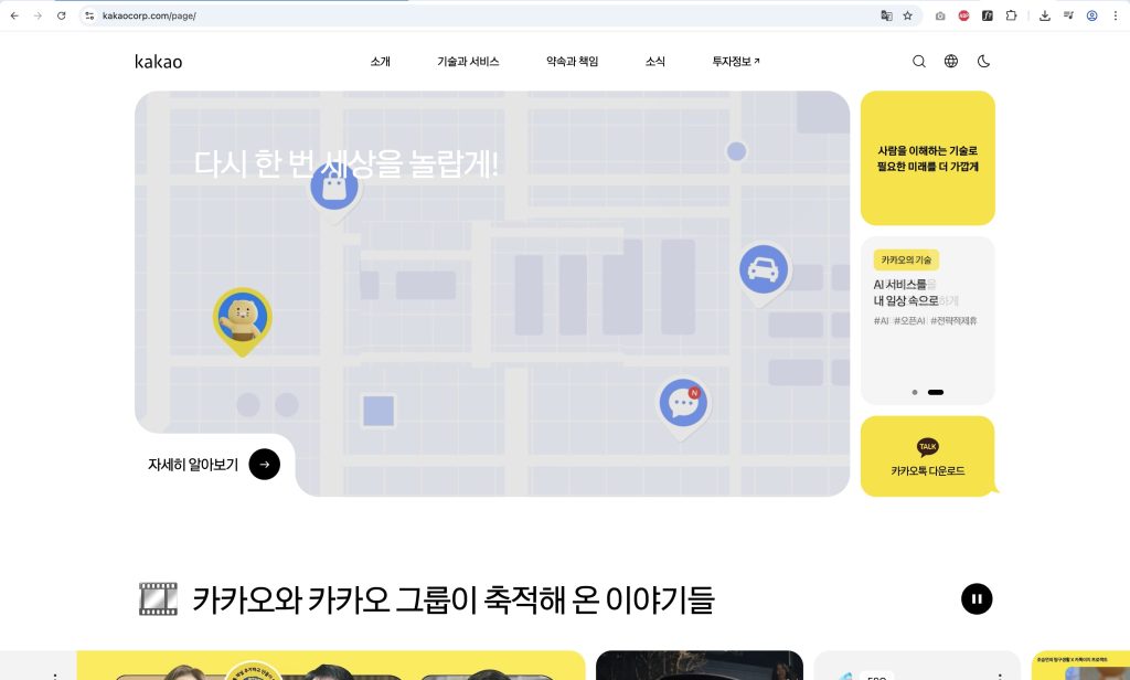
Strategic placement of floating action buttons ensures that essential functions like fund transfers remain easily accessible, allowing users to accomplish primary objectives with minimal effort. The platform’s attention to user experience nuances is particularly evident in thoughtful features such as automatic savings goal tracking and secure partial identity verification during transactions—elements that simultaneously reduce user error and enhance security confidence.
Recognizing South Korea’s mobile-centric digital landscape, Kakao has implemented a comprehensive mobile-first design strategy that guarantees optimal performance across diverse device configurations. This approach extends beyond banking to encompass services like KakaoTaxi and KakaoMap, where simplified interfaces and real-time information delivery eliminate procedural complexity while optimizing task completion workflows.
Central to Kakao’s success is its commitment to iterative design improvement driven by continuous user feedback collection. This data-informed approach enables regular refinement of service architectures and interface elements, ensuring alignment with shifting user expectations and behaviors. The consistent visual language and established brand recognition across all Kakao touchpoints cultivate user trust and operational familiarity, resulting in accelerated adoption rates and sustained engagement levels within intensely competitive market segments.
These strategic design initiatives illustrate how user-focused experience design, emphasizing convenience and clarity, can simultaneously drive customer satisfaction and achieve substantial business objectives.
Korean Example of Naver
Naver’s 2023 search interface transformation represents a pivotal shift toward intent-driven digital experiences that dynamically respond to user needs. The platform’s adaptive framework intelligently reorganizes content presentation based on search objectives, seamlessly accommodating users seeking immediate answers, comprehensive research, or exploratory discovery.
At the core of this evolution lies the AI-enhanced ‘Cue:’ functionality, which synthesizes algorithmically generated insights with expertly curated content to deliver highly personalized search outcomes. This intelligent personalization extends strategically across Naver’s ecosystem, enhancing platforms like Naver Shopping and Webtoon through sophisticated recommendation engines that analyze user patterns to surface relevant products and content.
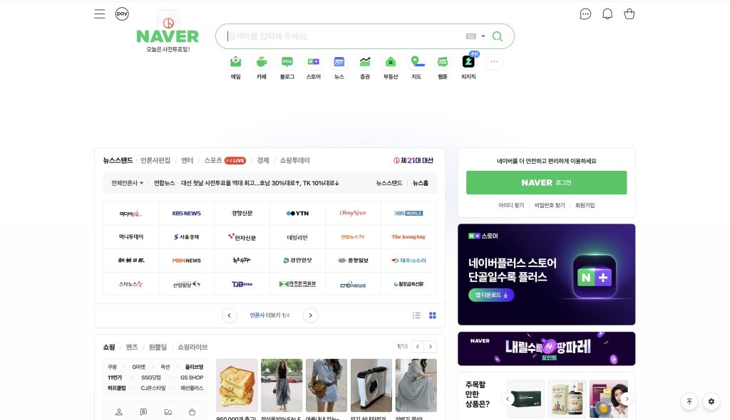
The interface redesign prioritizes accessibility and visual hierarchy through a refined design framework that carefully calibrates typography scales and color relationships, ensuring optimal readability across diverse viewing contexts. Strategic image optimization maintains the delicate balance between information density and visual comprehension, creating an engaging yet digestible content experience.
Naver’s responsive design architecture accommodates multiple screen configurations and device types, delivering consistent interaction quality regardless of user context or hardware limitations. Comprehensive design standards ensure visual and functional consistency throughout the service ecosystem, strengthening brand identity while enabling flexible content adaptation driven by continuous machine learning optimization.
This AI-integrated methodology not only enhances search accuracy and system responsiveness but also enriches the discovery process, transforming routine searches into more engaging and intuitive user journeys that anticipate and fulfill user expectations.
UI UX 차이 for Korean Platforms
Korean platforms uniquely integrate cultural considerations into their design philosophy, incorporating respectful language patterns and social etiquette into UX messaging while maintaining culturally appropriate visual hierarchies. Interface elements dynamically adapt to seasonal celebrations and promotional campaigns without compromising core usability principles, while UX frameworks consistently maintain service quality through accessibility features including color-blind friendly design systems.
Social connectivity remains central to Korean digital culture, with sharing functionalities prominently featured in interface design, supported by UX strategies that encourage community participation through feedback mechanisms and engagement optimization.
These implementations clearly delineate that UI represents the tangible, interactive elements users directly manipulate, while UX encompasses the comprehensive user journey—addressing emotional responses, satisfaction metrics, and seamless service delivery that extends far beyond visual interaction.
Practical Applications of UI UX 차이 for Professionals
For UI and UX design professionals, mastering the distinct differences between these disciplines is essential for creating visually compelling yet highly functional interfaces. When designing for Korean users, incorporating cultural and linguistic considerations—such as Hangul readability and flexible text orientation—becomes critical for user acceptance.
Effective collaboration between UI designers and UX strategists ensures visual elements enhance rather than hinder user journeys. Regular user testing reveals interface challenges while refining experience flows to match user expectations. Data-driven design decisions enable personalized experiences and rapid usability improvements, particularly vital in Korea’s dynamic digital environment.
Understanding Korean market trends helps designers implement relevant AI integrations and mobile-first approaches that address evolving user demands. Balancing aesthetics with functionality prevents visual complexity from compromising user experience clarity. Integrated feedback systems enable continuous UX refinement, ensuring products adapt to changing user needs.
Finally, proficiency in emerging technologies like artificial intelligence positions professionals to future-proof their practices and remain competitive in Korea’s innovative digital landscape.
Roles and Career Paths Based on UI UX 차이
A UI Designer focuses on how a product looks and feels. They handle visual elements such as typography, spacing, iconography, and color palettes. If you enjoy working with aesthetics, design systems, and pixel-perfect layouts, a career in UI design might suit you. Common roles include UI Designer, Visual Designer, and Interface Specialist.
A UX Designer is concerned with the user’s journey, emotions, and satisfaction. They perform research, create wireframes, test usability, and map user flows. If you’re curious about user behavior and love solving problems, UX design roles such as UX Researcher, UX Strategist, or Product Designer may align well with your interests.
Many companies, especially startups, look for designers who understand both UI and UX. These hybrid roles demand strong collaboration skills and a working knowledge of both user research and visual design. Titles like UX/UI Designer or Product Designer are common in such settings.
As you grow, you can specialize further — moving into roles like UX Lead, UI Art Director, or even Head of Design. Alternatively, you could explore related fields like UX writing, service design, or design ops. Understanding the core UI UX 차이 helps you decide where your passion lies and how to tailor your learning path accordingly.
Frequently Asked Questions (FAQ)
How do UI and UX design influence user satisfaction differently in digital products?
UI (User Interface) design focuses on the visual elements users interact with, such as buttons and menus, while UX (User Experience) design addresses the overall feel and usability of the product. Together, UI affects how users perceive the product’s aesthetics, and UX ensures the product meets user needs effectively, leading to higher satisfaction.
Can improving UX design without changing UI still enhance a product’s success?
Yes, improving UX by streamlining workflows, enhancing navigation, or optimizing functionality can significantly boost a product’s success, even if the UI remains the same. This is because UX directly impacts how easily and effectively users achieve their goals.
What are the key challenges when integrating UI and UX strategies during product development?
A key challenge is maintaining balance between visual appeal (UI) and usability (UX). Designers must ensure the interface looks attractive while also being intuitive and accessible. Misalignment between UI and UX teams can result in a product that is either visually confusing or functionally frustrating.
How do UI and UX roles differ in the design process, and what collaboration is essential?
UI designers focus on crafting the look and interactive elements, whereas UX designers concentrate on research, user behavior, and usability testing. Collaboration is essential to align design goals, translate user insights into visual elements, and ensure a cohesive experience.
In what ways will UI and UX design trends evolve in 2025 to better meet user expectations?
In 2025, UI and UX design trends are expected to emphasize personalized experiences, accessibility, and seamless integration of AI-driven features. Designers will focus more on adaptive interfaces that respond to user preferences and contexts, creating more intuitive and inclusive digital interactions.
Conclusion
This complete guide explores the distinctions between UI and UX within the Korean market in 2025, tracing their cultural roots from the creation of Hangul to modern digital innovations. It explains basic UI and UX concepts emphasizing Korea’s unique cultural and linguistic influences, and highlights key differences seen in major platforms like Kakao and Naver. Kakao focuses on user-centered, intuitive UX with familiar UI elements, while Naver advances AI-driven, flexible UI/UX designs. The post also outlines emerging trends such as AI integration, mobile-first design, and culturally tailored experiences, offering practical insights for professionals aiming to apply these UI UX 차이 effectively in Korea’s evolving digital landscape.
