Google’s design philosophy has come a long way since the early days of Android’s inconsistent visual identity. The roots of Material 3 Expressive lie in a scattered approach to mobile interface design that has evolved into one of the most sophisticated design systems in the tech world. The journey began in 2014 with the introduction of Material Design, Google’s ambitious attempt to create a unified visual language across all its products and platforms.
Material Design was revolutionary for its time, introducing the concept of “material” as a metaphor for digital interfaces. The system emphasized clean lines, bold colors, and subtle shadows that mimicked real-world physics. This marked a significant departure from the skeuomorphic designs popular in the early 2010s, offering instead a fresh, flat aesthetic with depth and meaning.
The design system continued to mature with Material Design 2, which refined the original concepts and introduced more flexibility for developers and designers. The real shift came in 2021 with Material You (Material Design 3), which introduced wallpaper-based personalization and dynamic color palettes.
Now, Google has announced Material 3 Expressive, revealed at The Android Show in May 2025. While Google positions this as the next evolution in interface design, the update raises questions about whether constant visual overhauls truly serve users’ needs or simply provide marketing momentum for new Android releases.
What Is Material 3 Expressive?
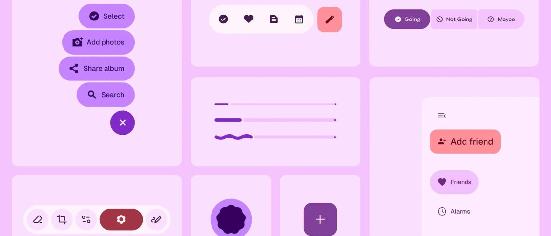
Material 3 Expressive builds upon Material You while introducing what Google calls “enhanced expressiveness.” Rather than addressing fundamental usability issues, the update focuses primarily on visual flourishes and animations that may prioritize aesthetics over function.
Google claims this design approach responds to user research showing preference for more expressive interfaces. However, the emphasis on “making interfaces feel more alive” raises questions about whether users actually requested more animated, attention-grabbing elements or if Google is solving problems that didn’t exist.
The system introduces new interaction patterns and animations, though critics argue these changes may create inconsistency as the rollout spans months across different apps and devices.
Key Features and Improvements
Typography Changes and Visual Emphasis
Material 3 Expressive introduces new typography styles that Google claims improve information hierarchy. The system uses variable fonts and emphasizes important actions through bold visual treatments.
While these typography improvements may help readability in some contexts, they also consume more screen real estate. The emphasis on “bold editorial layouts” prioritizes visual impact over information density, which may frustrate users who prefer efficiency over expressiveness.
Animation-Heavy Interactions
The most noticeable change in Material 3 Expressive is its emphasis on animations. Google introduces what it calls “springy” animations and interactions like notifications that “stick together” when dismissed.
These animations undoubtedly make interfaces feel more playful, but they also consume processing power and may slow down interactions for users who prioritize speed over visual flair. The focus on “moments of delight” in everyday routines assumes all users want their phone interactions to be entertaining rather than efficient.
Device-Specific Adaptations
Material 3 Expressive adapts differently across form factors. On smartwatches, animations follow the curvature of round displays, while larger screens get more prominent interactive elements.
This specialization addresses real usability concerns, though the implementation creates fragmentation. Users switching between devices may encounter inconsistent behaviors as the rollout progresses at different paces across the ecosystem.
Enlarged Interactive Elements
The system introduces notably larger buttons and interactive elements, with Google citing research showing users can spot key actions “up to 4x faster.” However, this approach treats smartphones like kiosks, prioritizing new user onboarding over the daily experience of familiar users.
Experienced users may find the enlarged elements wasteful of screen space, and the emphasis on making every action obvious may actually create visual noise that makes interfaces less scannable for power users.
Rollout Strategy and Timeline
Material 3 Expressive will debut with Android 16, though the implementation reveals Google’s ongoing challenge with design consistency. The gradual rollout means users will experience months of mixed interfaces as some apps update while others remain unchanged.
The staggered approach affects Pixel devices first, followed by other Android manufacturers who may implement their own interpretations of the design language. This fragmentation undermines one of Material Design’s original goals: creating a unified experience across the Android ecosystem.
Google is already pushing Material 3 Expressive to its major apps through server-side updates, but early reports suggest extremely slow rollout speeds that may frustrate users eager to experience the new design.
The design language is also coming to Wear OS 6, though the practical impact on smartwatch usability remains to be seen given the platform’s existing limitations.
The Broader Design Context
Material 3 Expressive represents Google’s continued pattern of regular visual overhauls that prioritize freshness over stability. While the company frames these changes as user-driven improvements, the constant evolution may serve Google’s marketing needs more than genuine user requirements.
The emphasis on expressiveness and playfulness assumes all users want their devices to be sources of entertainment rather than efficient tools. This philosophy may alienate users who prefer subtle, functional interfaces that don’t compete for attention with their actual tasks.
For developers, Material 3 Expressive offers updated tools and guidelines, though the frequent changes create ongoing maintenance burdens. Apps must constantly adapt to new design standards, potentially diverting resources from functional improvements users might actually prefer.
Alternative Perspectives
Critics argue that Google’s resources might be better spent addressing Android’s persistent issues rather than repeatedly redesigning interfaces that already work adequately. Some users wish “Google used its resources to add some crucial features to Android and its own apps instead of a prettier design.”
The Hacker News community has expressed skepticism about the design justifications, with some comparing the explanations to “Pepsi Logo” marketing speak and questioning whether bigger buttons truly improve long-term usability for experienced users.
The focus on visual research metrics like “playfulness” and “creativity” may not align with what users actually need from their daily computing tools, particularly in professional or productivity contexts where efficiency matters more than emotional engagement.
Looking Forward
Material 3 Expressive represents Google’s continued commitment to pushing the boundaries of digital interface design. By focusing on expressiveness and improved usability, the system addresses real user needs while preparing for the future of human-computer interaction.
The gradual rollout strategy suggests Google is taking a measured approach to this transition, learning from previous updates and ensuring that the new design language truly improves the user experience rather than simply changing it for change’s sake.
As Material 3 Expressive continues to roll out across Google’s ecosystem, it will likely influence broader design trends in the tech industry. The emphasis on fluid interactions, expressive typography, and device-specific optimizations sets a new standard for what users can expect from modern digital interfaces.
The evolution from Material Design to Material 3 Expressive shows how design systems can mature while staying true to their core principles. As we move forward, Material 3 Expressive will undoubtedly continue to evolve, responding to user feedback and emerging technological capabilities to create even more engaging and intuitive digital experiences.


