


A design system succeeds only when it becomes easier to use than to ignore. That sounds obvious, but it is where many ambitious system projects go wrong. Teams spend months perfecting colour scales, component anatomy and documentation, then discover that product designers still detach components, engineers still rebuild controls locally, and the system team has become a service desk for exceptions.
So the useful question is not simply how to create a design system. It is how to build one that survives contact with real product work. That means starting with the product you already have, deciding which decisions genuinely deserve to become shared infrastructure, connecting design and code closely enough that they do not drift apart, and creating a contribution model that can evolve without turning the library into a museum. For the broader architecture around those layers, start with the DesignWhine Guide to Design Systems.
This guide focuses on that build process. If you are still estimating the size of the investment, our separate guide on estimating a design system in hours is the better starting point. If the system already exists but people route around it, our analysis of why design systems fail deals with the adoption problem directly.
A design system is not finished when the library is complete. It is finished only when teams trust it enough to stop rebuilding the same decisions.
Start With the Product You Have
The fastest way to build the wrong design system is to begin with a blank Figma file. A system should emerge from repeated product decisions, not from an abstract catalogue of everything a team might someday need.
Begin with a representative audit of the live product. Pick important journeys, high-traffic screens and the interfaces where inconsistency already creates friction. Inventory repeated buttons, inputs, cards, navigation patterns, typography, spacing, colours, icons, form behaviour and interaction states. At the same time, inspect the corresponding code. A Figma library and a production component library can look aligned from a distance while hiding completely different naming, properties and behaviours underneath.
- Repeated patterns: Which interface decisions appear often enough to deserve system ownership?
- Inconsistencies: Where do products solve the same problem in several ways?
- High-cost areas: Which patterns repeatedly consume design, engineering or QA time?
- Risk: Which interactions have accessibility, regulatory or brand implications?
- Code reality: Which components already exist in production and which are merely represented in design?
The result should not be a giant spreadsheet of UI fragments. It should be a prioritised map of the decisions worth standardising first.
Define the System Boundary
Not every repeated interface belongs in the design system. A mature system has a boundary: a clear idea of what the central team owns, what product teams own, and what should remain intentionally local. This is also the distinction behind Your UI Kit Is Not a Design System: reusable assets are useful, but infrastructure begins when ownership and implementation become explicit.
Start with foundations and high-reuse primitives: colour roles, typography, spacing, elevation, iconography, buttons, inputs, selection controls, feedback patterns and common layout structures. Add complex components only when repeated use proves that centralising them will reduce work or risk. Prematurely standardising a highly specialised workflow can make the system more complicated without making the product more coherent.
This is also the moment to decide whether your organisation needs one system or several layers. A multi-brand company may have shared foundations with brand-specific themes. A web and native-mobile organisation may share semantic tokens while maintaining platform-specific components. The goal is not maximum uniformity. It is deliberate consistency.
Build Foundations Before Components
Components become brittle when the values beneath them are arbitrary. Before building a component library, establish the foundations that allow those components to change coherently: colour roles, type styles, spacing, radii, elevation, motion and responsive rules.
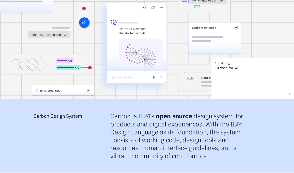
Modern systems increasingly express those decisions as design tokens. The Design Tokens Community Group’s stable 2025.10 format exists specifically to improve interoperability between tools by giving tokens a common exchange format. Figma variables can represent many of the same reusable decisions inside the design environment, including modes for themes and contexts. (Sources: Design Tokens Community Group; Figma Variables.)
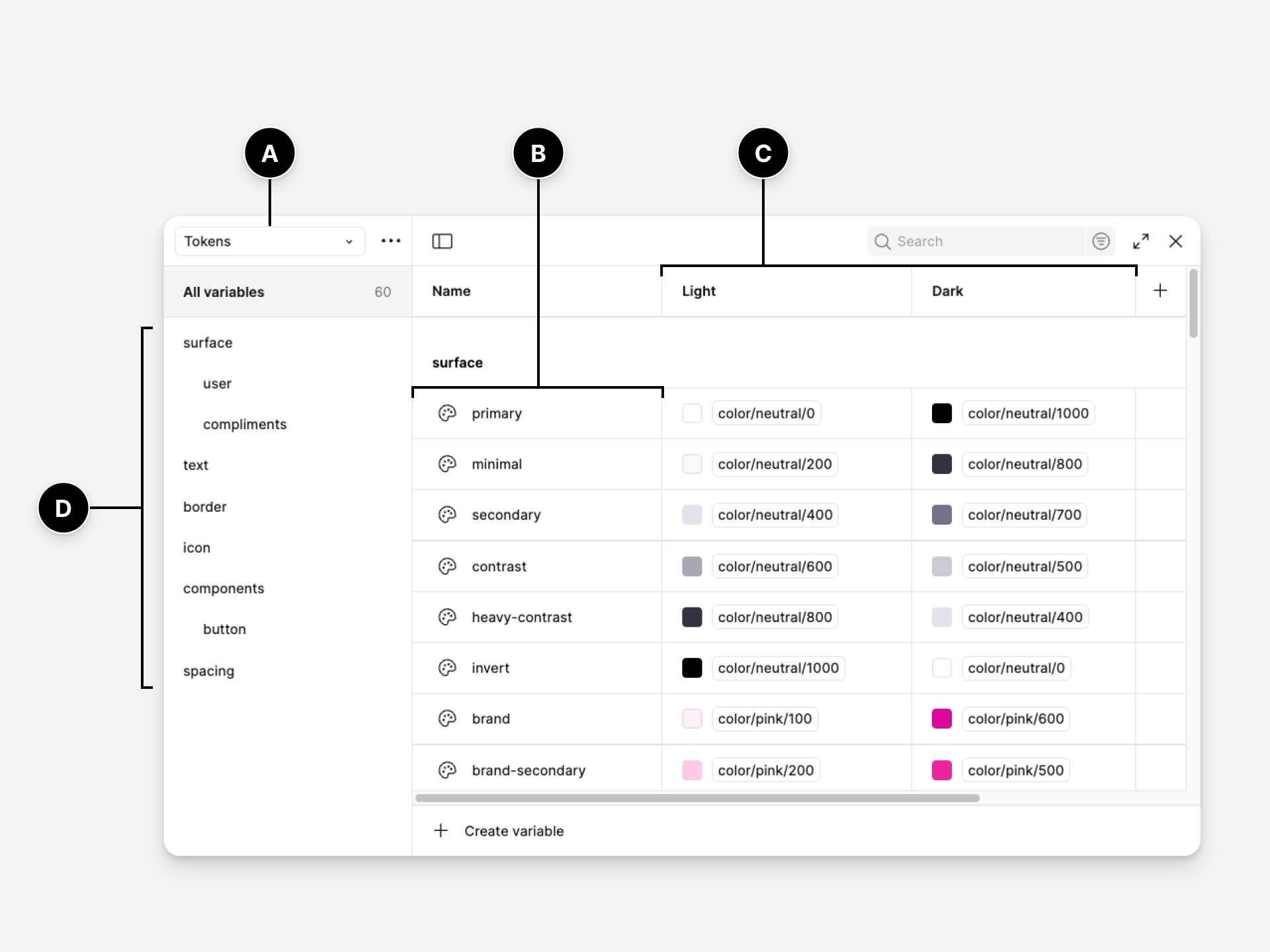
The important distinction is between a raw value and a semantic decision. #0057ff is a colour. color/action/primary explains why the colour exists. Semantic naming makes the system easier to theme, easier to migrate and increasingly easier for AI tools to interpret.
Design Components With Code in Mind
A component is useful only if its design representation and production implementation describe substantially the same thing. This is where many systems split into two realities: designers maintain a beautifully structured library while engineers maintain another set of components shaped by technical constraints and historical decisions.
For every high-use component, agree on purpose, states, properties, content rules, accessibility behaviour and responsive behaviour before obsessing over visual polish. A button, for example, is not simply a rectangle with text. The system needs to answer what happens when it is loading, disabled, focused, icon-only, destructive, too narrow for its label or used inside a form.
- Use names that describe purpose rather than appearance.
- Keep component properties and code props conceptually aligned where possible.
- Model real states instead of maintaining disconnected visual duplicates.
- Define accessibility behaviour as part of the component contract.
- Make exceptions explicit rather than silently forking the component.
Our interview with Indeed design-system practitioner Diana Wolosin is useful here because it shows what this work looks like inside a mature organisation: components are not isolated design assets, but shared infrastructure involving design, development, accessibility, localisation and content.
Make Documentation Executable
A design system with invisible rules depends on tribal knowledge. That works until teams scale, people leave or a product group encounters an edge case the original system team never anticipated.
Document why a component exists, when to use it, when not to use it, its important states, content guidance, accessibility expectations and implementation details. For coded components, documentation is stronger when teams can inspect live states rather than rely only on screenshots. Storybook, for example, treats stories as rendered component states and can generate documentation alongside them, allowing design-system teams to keep usage guidance close to executable UI. (Source: Storybook documentation.)
The most valuable documentation explains the decision the component is protecting, not merely the pixels it contains.
Documentation should also have an owner. If nobody is responsible for updating guidance when the component changes, the system eventually trains teams not to trust the documentation.
Design Governance Before Launch
Governance is often treated as something to solve after the library is released. By then, the system may already have created an unhealthy relationship with product teams: the central team behaves like a gatekeeper, while product teams learn to bypass it whenever a deadline is tight.
Before launch, establish how people request changes, propose components, report problems and deprecate old patterns. Decide what evidence justifies adding something to the shared system. Define who can approve breaking changes and how consuming teams will be warned. Most importantly, give contributors a realistic path to improve the system instead of forcing every need through one central team. Our deeper guide to design-system governance covers the operating model behind those decisions.
This is the organisational side of the problem explored in Why Design Systems Fail. Design-system entropy usually begins with perfectly rational local decisions made because the shared system could not respond quickly enough.
Launch Through Real Product Work
Do not launch a design system as a finished artefact and ask teams to migrate. Pilot it through real product work. Choose one or two representative product areas and build with the system alongside the teams who will eventually consume it.
This exposes problems a library review cannot. A component that looks elegant in isolation may be awkward inside an actual workflow. A token structure may be theoretically clean but difficult to use across platforms. Documentation may answer questions no one is asking while missing the questions engineers encounter every day.
- Track how often teams use system components instead of local alternatives.
- Record where components are detached, overridden or forked.
- Measure time lost to missing guidance and ambiguous patterns.
- Collect contribution requests and repeated exceptions.
- Ask consuming teams what they still rebuild most often.
Adoption is not a vanity metric. It is evidence that the system is solving enough real problems to justify its maintenance cost.
Prepare the System for AI
AI has made the quality of design-system structure more consequential, not less. An AI agent can generate an interface quickly, but without explicit components, tokens, naming and code mappings it can also reproduce inconsistency at machine speed.
That does not mean every design system needs an AI programme today. It does mean the practices that make a system healthier for humans increasingly make it more useful to machines as well: semantic names, explicit component properties, structured tokens, trustworthy documentation and parity between design and production code.
For teams already experimenting with Figma MCP, Code Connect or coding agents, our practical guide to making a design system AI-ready covers that layer in detail. The central lesson is simple: connecting AI is the last step. Cleaning the system is the first.
The Build Is the Beginning
A design system is not a project with a neat completion date. The build phase creates the first shared language. The harder work is keeping that language useful as products, teams, platforms and technology change.
If there is one principle worth carrying through the entire process, it is this: standardise only what the organisation is prepared to maintain. A smaller system that teams trust will outperform a comprehensive system they routinely bypass.







[…] of design systems over the years, you’ll know we’ve already explored why design systems fail, how to create one, and how to estimate the effort involved. Those fundamentals remain unchanged because AI has not […]
[…] more than the library itself. If you are building that operating model from scratch, our guide to building a design system teams actually use turns those principles into a practical […]