

Design systems used to be discussed as a way to stop designers from drawing the same button twice. That description was never entirely wrong, but it has become hopelessly incomplete.
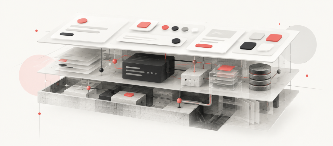
A mature design system now sits somewhere between product infrastructure, organizational memory and an operating agreement between design and engineering. It carries visual decisions, interaction patterns, accessibility rules, reusable code, naming conventions, contribution processes and the logic that keeps hundreds of product choices from drifting apart. In 2026, it may also need to explain those decisions to AI agents.
That is why the most useful definition of a design system is not “a library of reusable components.” A component library can be part of one. So can a UI kit, a set of tokens or a documentation site. None of those things, by themselves, create a system. Our deeper comparison, Your UI Kit Is Not a Design System, examines where that boundary becomes visible in real product work.
A design system is the shared product language that tells a team what to reuse, what to change, what not to invent and how those decisions survive from design into code.
Figma describes a design system as a set of building blocks and standards that creates a unified language for digital products. Its own design-systems course expands that idea into principles, foundations, documentation and processes, not merely components. IBM’s Carbon goes further still: its public system combines working code, design tools, human-interface guidance and a contributor community. The GOV.UK Design System includes styles, coded components, user-centred patterns, research and an open contribution model. These systems look different because the organizations behind them need different things. That is precisely the point. (Sources: Figma; IBM Carbon.)
What a Design System Actually Is
The quickest way to understand a design system is to stop thinking about the artefacts and start thinking about the decisions behind them.
A colour token is useful because a team has agreed what that colour means. A button component is useful because its states, behaviour and implementation have been settled once and can be reused. Documentation is useful because it preserves the reasoning that would otherwise live in somebody’s memory. Governance is useful because products continue changing long after the first component library is published.
This makes a design system less like a style guide and more like an internal product. It has users, a roadmap, maintenance costs, adoption problems and technical debt. It can be coherent or fragmented. It can be widely trusted or quietly ignored.
| Layer | What It Contains | What It Prevents |
|---|---|---|
| Principles | Product and design values, decision rules | Teams solving the same problem with conflicting philosophies |
| Foundations | Colour, type, spacing, grid, motion, iconography | Visual drift |
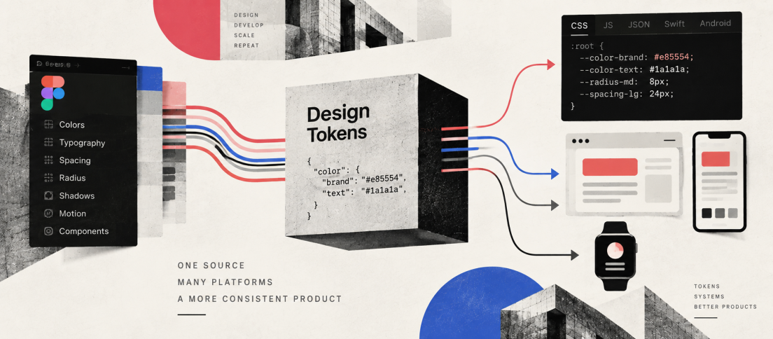
| Tokens | Named design decisions expressed in reusable values | Raw values diverging across tools and platforms |
| Components | Reusable UI with states, variants and code | Duplicate implementation |
| Patterns | Solutions for recurring user tasks and flows | Consistency at component level but chaos at experience level |
| Documentation | Usage, constraints, accessibility, examples | Tribal knowledge |
| Governance | Ownership, contribution, release and deprecation processes | The system becoming an abandoned library |
Atlassian’s public foundations show the breadth clearly. Its system includes design tokens alongside accessibility, content, spacing, grids, colour, typography, iconography, elevation and other shared conventions. The system is valuable because those pieces operate together rather than as isolated files. (Source: Atlassian Design System.)
The UI Kit Problem
Many teams say they have a design system when what they really have is a Figma library. That distinction becomes obvious the moment a component leaves the canvas.
If the designer’s button has no reliable relationship to the button engineers import in production, the organization has two sources of truth. If the component has five variants but nobody knows when to use each one, the library has inventory without guidance. If teams routinely detach components because the approved version cannot support real product work, the system is producing consistency in screenshots rather than in the product.
This is one reason our guide on how to build a design system that teams actually use begins with an interface audit rather than with components. The system should emerge from recurring product decisions, not from a desire to catalogue every possible UI element.
The easiest design system to build is a library. The difficult part is creating a system people trust enough not to work around.
Why Teams Build Them
The obvious benefit is consistency, but consistency is usually the outcome rather than the business case.
Design systems become useful when a company is repeatedly paying for the same decisions. Designers recreate familiar patterns. Engineers rebuild components already implemented elsewhere. Accessibility problems are fixed in one product and reintroduced in another. Brand updates require manual changes across dozens of surfaces. New team members need months to learn conventions that were never written down.
A good system turns those recurring costs into shared infrastructure. It gives teams a default path so that product work can focus on what is genuinely new. The GOV.UK Design System makes this especially visible because its components and patterns incorporate reusable code, guidance and accumulated user research. Government service teams can start from work that has already been tested rather than solving common tasks independently. (Source: GOV.UK Design System.)
That does not mean every organization needs a comprehensive system. A two-person team with one small product can easily spend more time maintaining system infrastructure than it saves. The useful question is not “Are design systems best practice?” It is “How much repeated product decision-making are we currently paying for?”
Components Are Not Enough
Components are the most visible layer because they produce immediate efficiency. But the systems that remain valuable over time usually become stronger above and below the component layer.
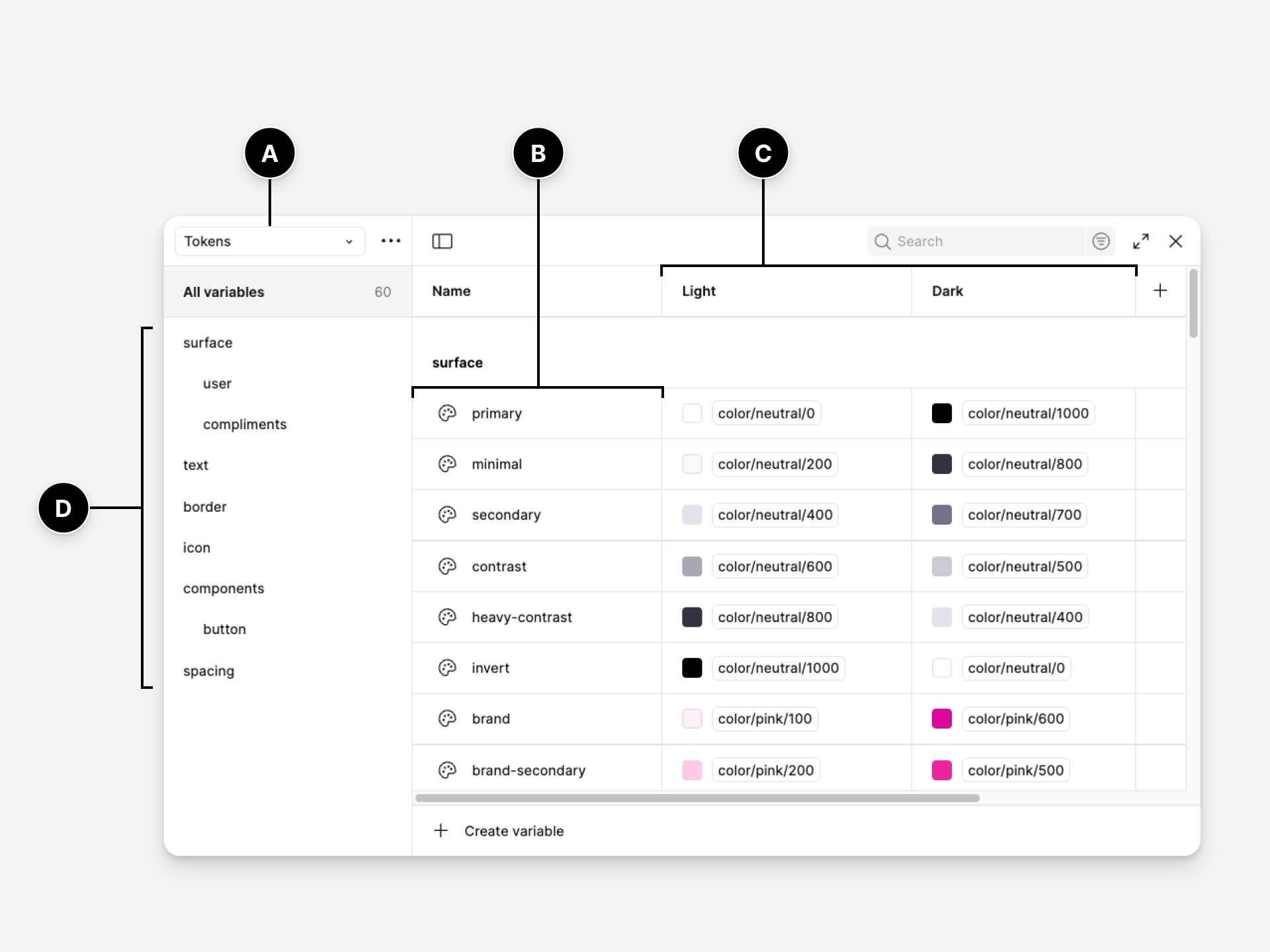
Below components sit foundations and design tokens. Tokens turn decisions such as colour, typography, spacing and radius into named values that can move between design tools and code. That layer is becoming materially more important. In October 2025, the Design Tokens Community Group published the first stable version of its vendor-neutral token format, an attempt to make design decisions portable across tools and platforms rather than trapped inside proprietary representations. (Source: Design Tokens Community Group.)
Above components sit patterns and product conventions. A button component can tell a team how buttons look and behave. It cannot decide how password recovery should work, how a destructive action should be confirmed, or when a table is preferable to a card layout. Patterns encode those larger experience decisions.
This is why a mature system often looks less like a component catalogue and more like a map of how the organization builds products.
The System Is Also Code
A design system that exists only in Figma is useful to designers. A design system represented in production code can change how an organization ships software.
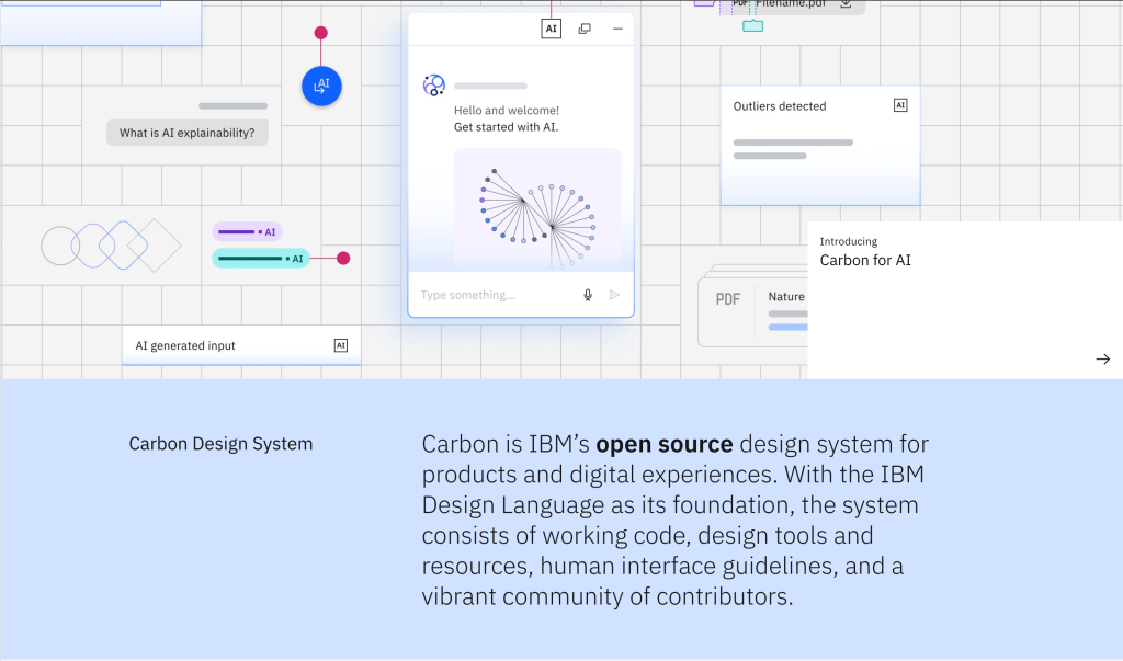
IBM Carbon is a useful example because its public ecosystem combines Figma resources with React, Angular, Vue, Svelte and Web Components libraries. The system is not asking every product team to interpret a visual reference and reconstruct it. It provides working implementation. The same principle appears in GOV.UK, where components include coded examples and production packages.
That parity between design and code is where many internal systems become fragile. A designer updates a component, but engineering continues using an older implementation. Engineering adds a state that never returns to the Figma library. Over time both sides remain internally tidy while describing different products.
The result is exactly the kind of decay explored in Why Design Systems Fail. Systems rarely collapse dramatically. They lose authority one workaround at a time.
Governance Decides Whether It Lives
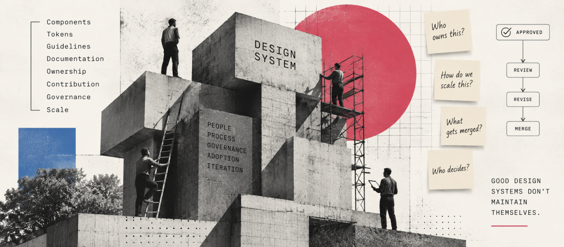
A component library can be launched. A design system has to be governed. Our deeper guide to design-system governance covers the ownership, contribution, release and deprecation mechanisms in detail.
Someone needs to decide when a new component deserves to exist, how breaking changes are released, who can contribute, how teams request additions, what happens to deprecated patterns and how the system balances local product needs against cross-product consistency. Without those decisions, the system either becomes restrictive or permissive. Teams stop trusting it in both cases.
The governance model does not need to be bureaucratic. Small organizations may have one owner and a lightweight contribution process. Large systems may use working groups, maintainers and formal release cycles. What matters is that the system has a way to change without becoming arbitrary.
Diana Wolosin, who has worked on design systems at Indeed, described this tension in our conversation about mature design systems: innovation continuously introduces new capabilities, but every change has to be weighed against migration cost, technical debt and the stability people already rely on.
The Economics of a Design System
Design systems are often justified with vague claims about speed. The more useful conversation is about where the organization expects to recover the investment.
A system costs time to audit, design, code, document, govern and maintain. The return arrives through reuse, fewer duplicated decisions, faster onboarding, lower implementation drift and improvements that can propagate across many products at once.
That makes scope extremely important. Our design-system estimation model deliberately separates foundations, tokens, components, documentation, code alignment and governance because “build a design system” is not one unit of work. A system intended for one web application is a different investment from one serving multiple brands, platforms and engineering frameworks.
The mistake is treating a design system as a project that becomes free once version 1 ships. Systems create ongoing operating costs. They need to earn their place continuously.
AI Changes the Definition Again
For years, design systems had two primary audiences: designers and developers. AI introduces a third.
An agent generating interface code needs to understand which components are canonical, which tokens carry semantic meaning, which states are valid and which patterns must not be invented. A system that humans can navigate through experience and tribal knowledge may still be opaque to software.
This is the argument behind our piece Why AI Needs a Design System Before It Can Design Anything. AI does not reduce the value of a system. It increases the cost of ambiguity, because an agent can reproduce inconsistency much faster than a human team ever could.
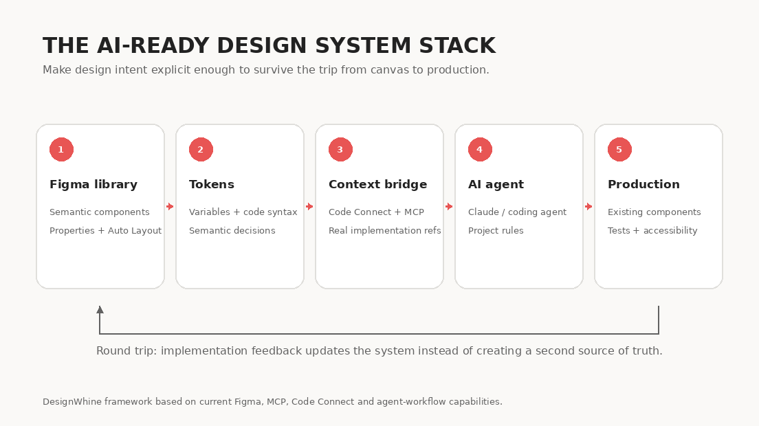
The practical response is already visible. Figma is exposing structured design context to coding agents through MCP and Code Connect. Google Stitch’s DESIGN.md explores another route: representing product design rules in a text format that software can consume. And the stable DTCG token specification gives teams a vendor-neutral way to represent a growing part of their design language.
The next design-system maturity test is not whether a designer can find the right component. It is whether a machine can understand why that component is the right one.
That is why our guide to making a design system AI-ready focuses on semantic naming, explicit properties, token architecture, code mappings, agent rules and validation. Connecting an AI tool to a poorly structured library does not make the library intelligent. It gives the agent faster access to the mess.
What Good Systems Have in Common
Carbon does not look like GOV.UK. Atlassian does not need the same patterns as a government service. A startup should not copy IBM’s governance model simply because IBM’s system is mature. Our analysis of the design systems worth studying in 2026 looks at six mature systems specifically for the operating lessons beneath their visual language.
The strongest systems tend to share something more fundamental: they reduce uncertainty. Teams know what is canonical. The design and code representations are related. Important decisions are documented. Accessibility is treated as part of the system rather than a final audit. Contributions have a path. Changes have owners. Exceptions are possible, but they are visible.
That is a much more useful standard than the size of the component library. A system with 25 trusted components can be healthier than one with 250 components nobody quite understands.
Where to Start
If your organization does not yet have a design system, do not start by making a giant inventory of buttons. Start by finding repetition and friction.
- Audit real product interfaces and code to find recurring patterns and inconsistencies.
- Agree on a small set of foundations and naming conventions.
- Build the highest-value shared components in design and code together.
- Document when those components should and should not be used.
- Establish a lightweight contribution and release process before the library begins to fragment.
- Measure adoption and fix the reasons teams work around the system.
For the implementation detail, use our step-by-step build guide. The purpose of this page is broader. A design system is not valuable because every organization is supposed to have one. It is valuable when it becomes the clearest expression of how an organization intends to build product repeatedly.
The DesignWhine View
The industry spent years reducing design systems to efficiency tools. That framing helped secure budgets, but it also encouraged teams to measure success by component count, library coverage and perceived speed.
The more durable value is institutional memory.
Products accumulate decisions faster than organizations can remember why they made them. People leave. Frameworks change. Brands evolve. AI generates new interfaces. A good design system is the mechanism that allows useful decisions to survive those transitions without freezing the product in place.
That is why the future of design systems is simultaneously less glamorous and more important than another component-library feature. The system increasingly sits underneath the visible work, carrying the constraints, language and history that make a product recognizably itself.
Explore DesignWhine’s Design Systems Coverage
This guide is the starting point. DesignWhine’s deeper coverage examines the parts of design-system work that deserve their own treatment:
- Your UI Kit Is Not a Design System for the difference between reusable UI assets and real product infrastructure.
- How to Build a Design System That Teams Actually Use for implementation from audit through adoption.
- How Long Does It Take to Build a Design System? for effort, scope and estimation.
- Design Tokens Are Becoming the API of Design for token architecture, portability and semantic contracts.
- Design System Governance Is the Part Nobody Wants to Own for ownership, contribution, releases and deprecation.
- Why Design Systems Fail for adoption, ownership, drift and recovery.
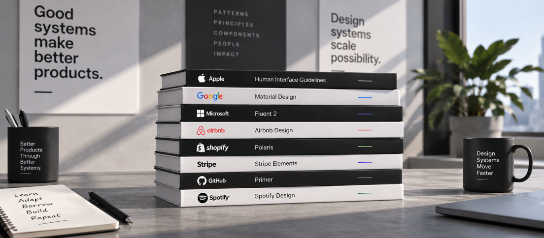
- The Design Systems Worth Studying in 2026 for lessons from Material, Carbon, Polaris, Atlassian, GOV.UK and Primer.
- Diana Wolosin on Building Design Systems for the realities of maintaining a mature system at scale.
- Why AI Needs a Design System Before It Can Design Anything for the shift from prompts to structured product context.
- How to Make Your Design System AI-Ready for Figma, MCP, Claude and design-to-code implementation.
- What the Hell Is Google Stitch’s DESIGN.md? for machine-readable design systems and portable context.
- How AI Is Changing the Journey from PRD to UI for the wider design-to-code workflow around the system.
We will keep expanding this guide as the discipline changes. That is appropriate for design systems themselves: a system that stops evolving eventually becomes documentation for a product that no longer exists.



What is the hardest part of a design system in practice for your team: building components, getting adoption, keeping design and code aligned, governance, or making the system usable by AI?
[…] DesignWhine Guide to Design Systems argues that a design system is product infrastructure and institutional memory, not merely a […]