

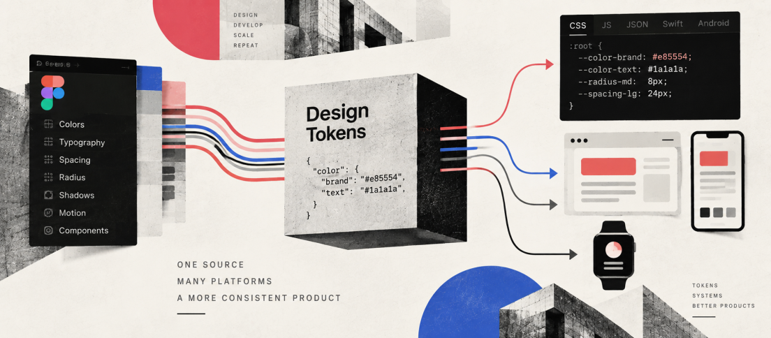
For years, design tokens were easy to dismiss as the plumbing of a design system. Designers saw colour variables. Developers saw CSS custom properties. System teams saw a cleaner way to stop the same blue from appearing as six slightly different hex values.
That framing is becoming too small.
A modern design token does more than store a value. It gives a design decision a stable name, a meaning and a route through the product stack. color.action.primary can survive a brand refresh, a light-to-dark theme switch, a move from web to iOS and a redesign of the component that consumes it. The literal value may change. The intent does not have to.
The most important thing about a design token is no longer the value it stores. It is the contract its name creates.
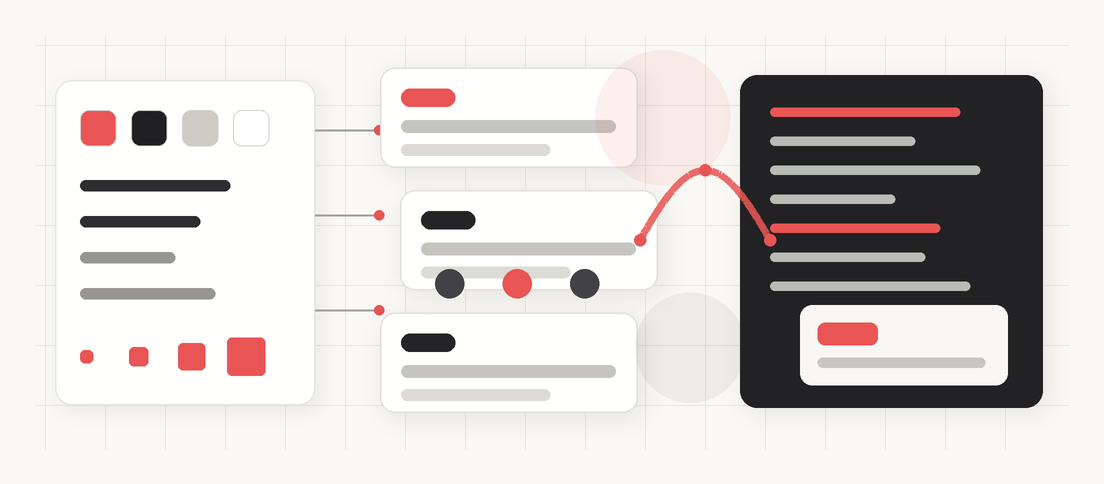
That is why design tokens are beginning to resemble an API for design. Not an API in the narrow sense of a REST endpoint, but in the more useful sense of a stable interface between systems. Design can change behind that interface. Code can consume it. Tools can translate it. Themes can override it. AI agents can reference it. Teams can build on it without needing to know every implementation detail underneath.
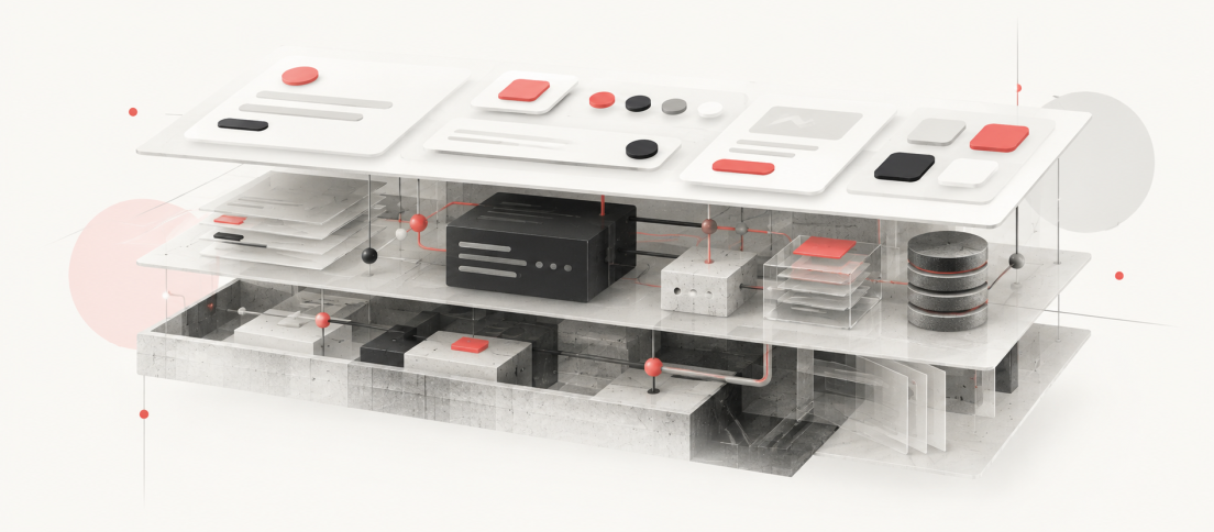
In the broader architecture, tokens are only one layer. Our DesignWhine Guide to Design Systems places them alongside foundations, components, patterns, documentation, production code and governance. Their special value is portability: they can carry meaning between those layers.
The timing is not accidental. The Design Tokens Community Group published the first stable version of its vendor-neutral specification in October 2025. Figma can now import DTCG-formatted token files directly into Variables. Style Dictionary can transform tokens into platform-specific outputs. Adobe Spectrum has long treated tokens as design decisions expressed as data rather than decorative constants. The industry is slowly moving from “we use variables” toward something much more consequential: design intent that can travel. (Sources: Design Tokens Community Group; Figma; Adobe Spectrum.)
Tokens Are Design Decisions
The simplest definition is still useful: a design token is a named piece of design information. Colour, spacing, typography, radius, duration and other reusable decisions can all become tokens.
But the phrase “named value” hides the most interesting part. A raw value tells you what something is. A well-designed token tells you why it exists.
#1769e0 is a colour. blue.600 is a reusable primitive. color.action.primary expresses intent. button.primary.background.default narrows that intent to a component and state. Each layer adds meaning while allowing the underlying value to remain replaceable.
| Token Layer | Example | What It Communicates |
|---|---|---|
| Primitive | blue.600 | The raw design value available to the system |
| Semantic | color.action.primary | The role or intent the value serves |
| Component | button.primary.background.default | Where that decision applies in a specific component or state |
Figma teaches a similar primitive, semantic and component-specific model. Adobe Spectrum recommends using aliases wherever possible because an alias carries meaning while allowing the global value underneath it to change. This is the architectural leap that turns tokens from a tidy palette into a system of relationships. (Sources: Figma; Adobe Spectrum.)
Why the API Metaphor Fits
Good software APIs let consumers depend on a stable interface while the implementation behind it evolves. Tokens increasingly do the same thing for design.
A product team should not need to know which exact shade of blue currently represents an interactive action. It should be able to ask the system for the primary action colour. A component should not care whether a compact mode uses 8 pixels of spacing today and 6 tomorrow. It should consume the spacing decision the system exposes for that context.
This also explains why token naming is not housekeeping. Once dozens of components, applications and platforms consume a token, its name becomes part of the system’s public interface. Renaming or deleting it can create migration work in much the same way that changing a software API can break consumers.
A mature token name is not a label attached to a colour. It is an interface that other parts of the product have learned to trust.
This is one reason design-system governance becomes inseparable from token architecture. Adding a token is easy. Supporting its meaning across themes, platforms and releases is the commitment.
The Standard Finally Matters
Design tokens have existed for years, but their portability was constrained by fragmentation. One tool stored tokens one way, another used its own JSON shape, and an engineering pipeline expected something else. Teams could still build sophisticated systems, but much of the interoperability was custom work.
The DTCG specification changes the direction of travel. Its 2025.10 release is the first stable version of a common format for expressing and exchanging design tokens. The group describes the goal explicitly: a vendor-neutral foundation so design decisions can move reliably across tools and technologies. It is a Community Group specification, not a W3C Standard, but the core format is considered stable for production use. (Source: Design Tokens Community Group.)
The practical consequence is already visible. Figma accepts DTCG JSON when importing design tokens into Variables. It maps supported token types into native variables, can create modes from imported files and can resolve cross-collection references with Figma-specific extension data. This is not perfect interoperability yet, but it is meaningfully different from copying values by hand between a token repository and a design file. (Source: Figma.)
On the engineering side, Style Dictionary can take platform-agnostic tokens and transform them into formats appropriate for CSS, iOS, Android and other targets. Version 4 also understands the DTCG $type model. A single design decision can therefore become a CSS custom property on the web, a different representation on Android and another on iOS without forcing the design team to maintain three independent decisions. (Sources: Style Dictionary; Style Dictionary transforms.)
Figma Variables Are Not the System
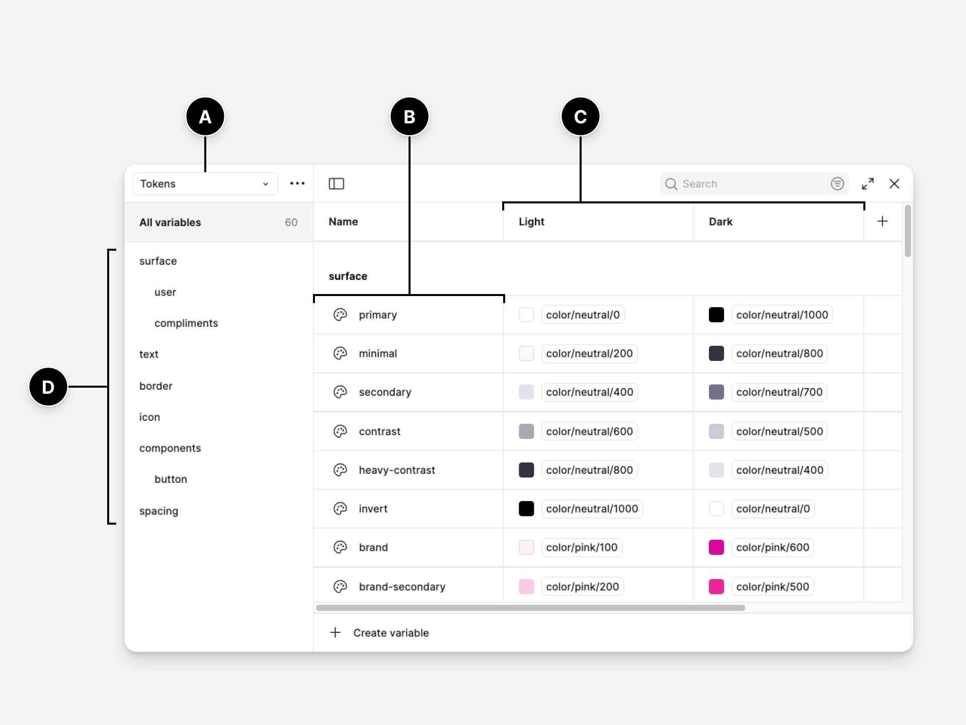
Figma Variables have made tokens much more tangible for designers. Variables can store reusable values, alias other variables, switch through modes and expose code syntax for web, Android and iOS. Figma also supports Variables through its REST and Plugin APIs, which makes synchronization with external systems possible. (Source: Figma.)
But “we use Figma Variables” and “we have a token architecture” are not the same claim. The same distinction sits behind Your UI Kit Is Not a Design System: sophisticated assets inside a design file do not, by themselves, create the code relationships, guidance, ownership and change model that make a system dependable.
Variables are an implementation surface. Token architecture is the set of decisions about naming, hierarchy, aliasing, ownership, modes, platforms and change. A team can create hundreds of variables and still have no coherent contract between design and code. Conversely, a strong token model can survive a change in design tooling because its meaning is not owned by the interface where somebody happened to edit it.
This is why the “single source of truth” debate can become a distraction. The important question is not whether Figma or GitHub wins. It is whether there is one canonical decision model and a reliable synchronization path around it.
Modes Turn Values Into Context
The API analogy becomes even clearer once modes enter the picture.
A semantic token such as color.surface.default can resolve to one value in light mode and another in dark mode. A spacing decision can change between compact and comfortable density. The same token language can support different brands, platforms or device contexts without requiring every consuming component to know how those contexts are implemented.
Figma’s modes are designed around exactly this idea: one variable can hold different values for different contexts, from themes to device sizes. That allows the component to ask for the decision rather than the literal value. (Source: Figma.)
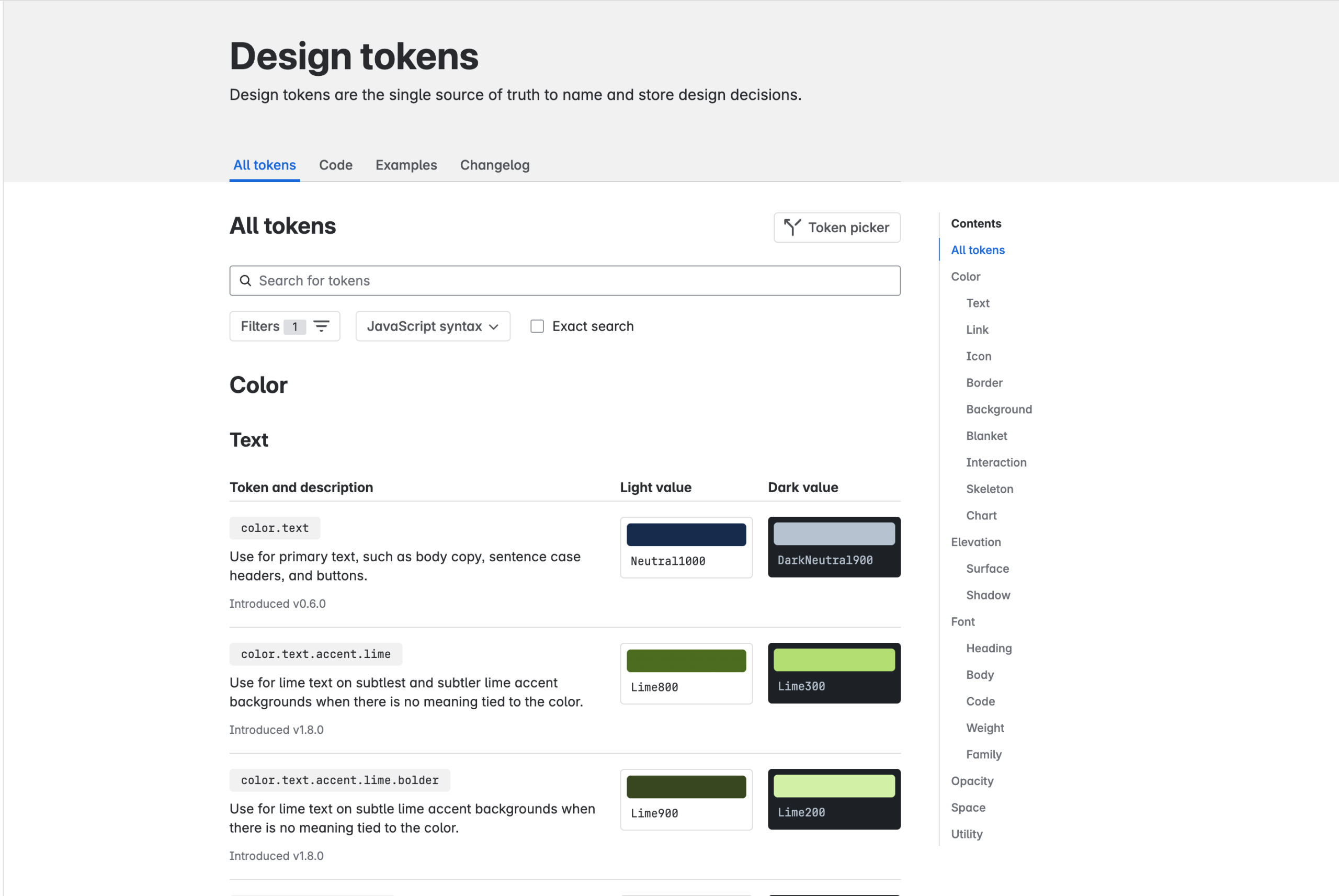
The payoff is not just easier dark mode. It is separation of intent from implementation. That separation is what lets a design language scale without every component becoming aware of every brand, platform and theme. For a broader view of how mature systems use those foundations differently, see The Design Systems Worth Studying in 2026.
Token Sprawl Is Real
Once teams understand the power of tokens, the next mistake is predictable: they tokenize everything. It is one of the quieter ways a system can become harder to use, and it appears again in our analysis of why design systems fail.
Every one-off spacing value gets a name. Every component gets a private colour alias. Names become longer to distinguish decisions that should probably never have become global. The system gains theoretical precision while becoming harder for humans to understand.
Adobe Spectrum offers a useful counterpoint. Its methodology explicitly favours a focused set of tokens rather than attempting to represent every possible value. Tokens are one resource inside the system, not the entire knowledge model. Components still need behaviour, accessibility, usage guidance and implementation detail. (Source: Adobe Spectrum.)
A useful rule is to create a token when a decision needs to remain consistent, change coherently or travel across multiple consumers. A value that is truly local and unlikely to be reused may be clearer as a local implementation detail.
This matters because every published token increases the surface area of the design API. More surface area means more names to teach, document, migrate and govern.
AI Makes Tokens More Valuable
AI adds another consumer to the system.
A coding agent can reproduce a hex value from a screenshot. What it cannot infer reliably is whether that value represents a brand primitive, a destructive action, a disabled state or a local exception that should never be reused.
Tokens expose that meaning in a form software can read. This is part of the reason our AI-ready design-system guide treats semantic variables and code mappings as core infrastructure. An agent that sees color.text.danger has more useful context than one that sees #c9372c.
Humans can infer meaning from a screen. Machines work better when the meaning has already been named.
Figma’s own AI guidance reflects the same shift. Variables, semantic component structure and code mappings give agents structured signals instead of forcing them to reconstruct a product language from pixels. The token layer therefore becomes useful not only for consistency between designers and developers, but as context for automated production.
Build the Contract, Not the Catalogue
If you are introducing tokens into an existing system, resist the urge to begin by converting every style and value into a variable. Start with the decisions that need to travel.
- Audit recurring decisions. Find colours, spacing, typography and other values repeated across real product surfaces and code.
- Separate primitives from intent. Keep raw scales available, but make semantic tokens the language most product work consumes.
- Name for meaning. Prefer names that survive visual redesigns over names tied to current appearance.
- Use component tokens selectively. Introduce them when a component genuinely needs an independent contract, not simply because another alias layer is possible.
- Define modes deliberately. Themes, brands and densities should reflect real contexts rather than become storage columns for unrelated values.
- Decide where canonical changes originate. Figma, a repository or another token platform can work, but synchronization and ownership must be explicit.
- Treat changes like API changes. Renames, removals and semantic shifts need migration thinking, not silent edits.
This fits the broader approach in our guide to building a design system teams actually use. The goal is not maximal systemization. It is to make repeated product decisions easier to understand, reuse and evolve.
The DesignWhine View
Design tokens began as a practical answer to inconsistency. Their next phase is more ambitious.
Once a design decision has a stable semantic name, it becomes addressable. Once it is addressable, tools can exchange it, code can consume it, themes can override it and agents can reason about it. The token stops being a colour chip with a clever label and starts behaving like infrastructure.
That does not make tokens the whole design system. Our DesignWhine Guide to Design Systems deliberately places them alongside components, patterns, documentation, code and governance. A token cannot tell you whether a destructive action needs confirmation or how a checkout flow should recover from failure.
But tokens may become the most portable layer of the system. Components remain framework-dependent. Documentation remains partly human. Product patterns remain contextual. A well-defined token can move from design tool to repository to web to native app to AI agent while carrying the same intent.
That is what makes the API metaphor useful. The future of design systems may depend less on where the visual source of truth lives and more on whether the decisions underneath it expose a language every consumer can understand.




Where does your team treat the source of truth for design tokens today: Figma, a code repository, a token platform, or somewhere in between?
[…] systems increasingly express those decisions as design tokens. The Design Tokens Community Group’s stable 2025.10 format exists specifically to improve […]
[…] the visible design work is complete. The missing parts are mostly invisible. Our deeper guide to design tokens makes the same distinction from the architecture side: variables become truly valuable when their […]