

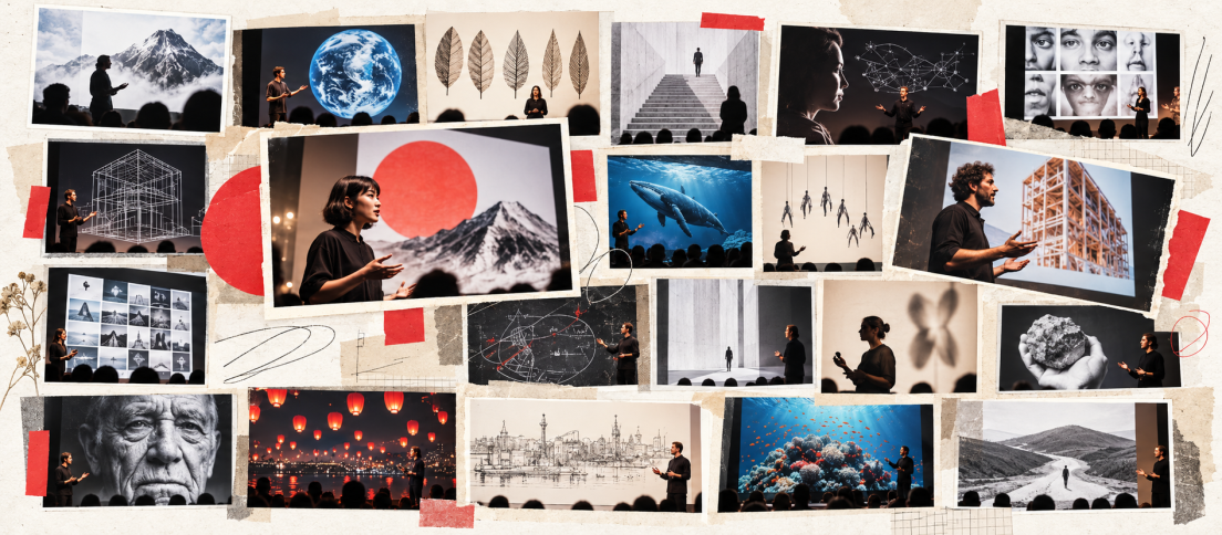
PechaKucha is simple enough to explain in one sentence and difficult enough to expose every weakness in a presentation. You get 20 slides, each stays on screen for 20 seconds, and the deck advances automatically. That gives you 6 minutes and 40 seconds to make a complete argument without hiding behind dense slides or flexible timing.
If you are new to the format, start with our complete guide to PechaKucha. This piece is different. Instead of explaining the rules, it looks at the kinds of PechaKucha presentations that work especially well and the design choices worth borrowing from them.
What Makes a Great PechaKucha Example?
The official PechaKucha format is a 20-image slideshow with each image auto-advancing after 20 seconds. The constraint is the point. According to PechaKucha, the format was created in Japan in 2003 by architects Astrid Klein and Mark Dytham as a more concise, visual way to share ideas.
Good examples therefore do not resemble ordinary PowerPoint decks played faster. They use the timing as part of the storytelling. Each slide performs one job, visuals carry real narrative weight, and the speaker knows where the story is going before the first slide appears.
1. The Personal Transformation Story
Personal stories are unusually well suited to PechaKucha because the timeline gives the presentation a built-in spine. Childhood, turning point, setback, discovery and outcome can each occupy a short run of slides without requiring complicated exposition.
The strongest versions do not narrate every event. They select a few vivid scenes and let the audience infer the rest. That is useful far beyond autobiographical talks. Product case studies and design retrospectives can use the same structure: before, tension, intervention, consequence.

2. The Visual Journey
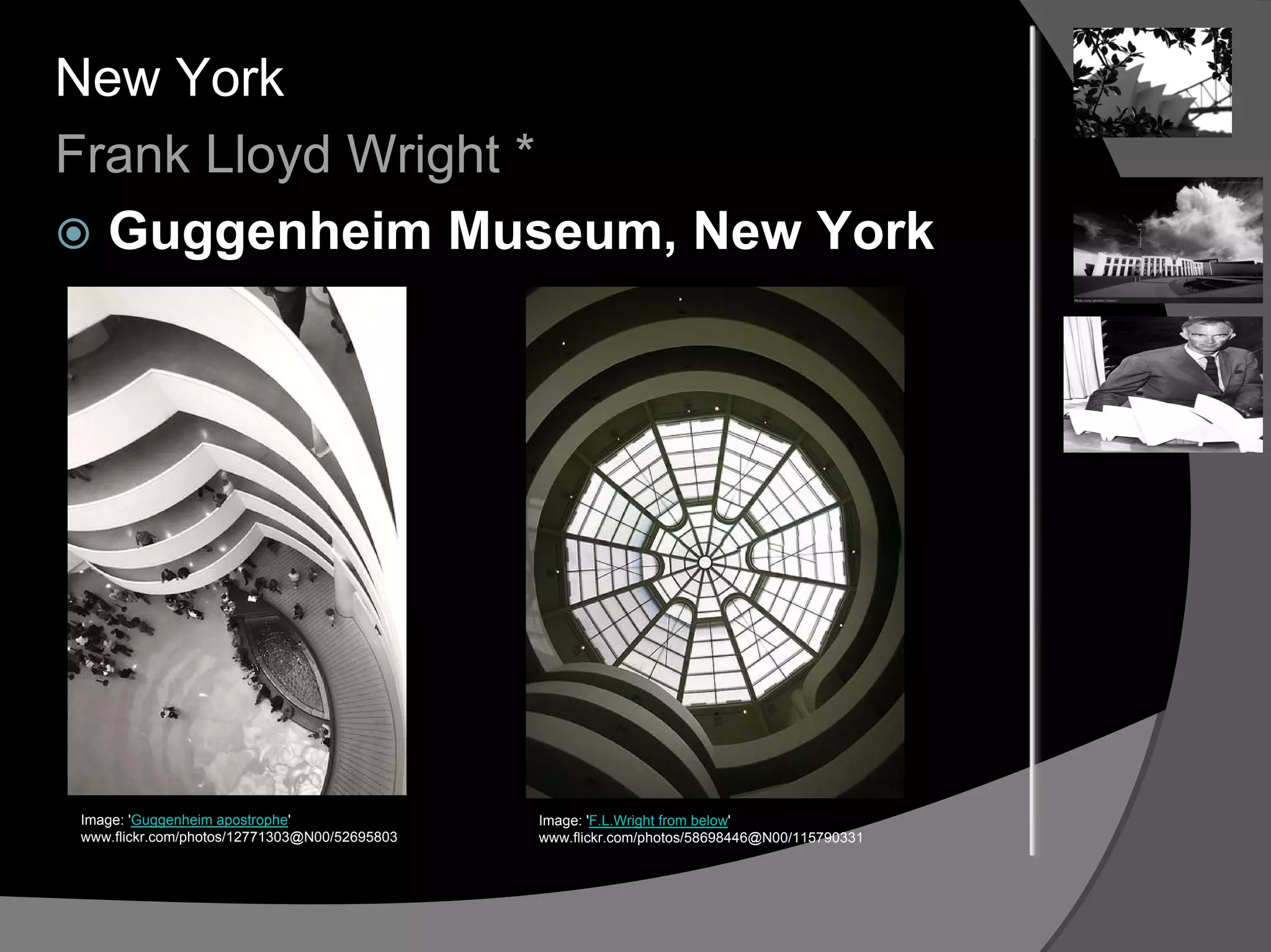
Architecture, travel and place-based stories often produce excellent PechaKucha presentations because the images already contain progression. A street, room, landscape or building can change from slide to slide while the speaker explains why those changes matter.
The lesson is not “use beautiful photographs.” It is to make the sequence do work. Slide 8 should feel like it could not have arrived before slide 7. A good visual journey has direction.

3. The One-Idea Argument
Some of the best short presentations do not attempt to cover a subject. They defend one claim. That approach fits PechaKucha perfectly because 400 seconds is long enough to establish a proposition, show evidence, address an objection and land a conclusion.
PechaKucha is not really about speed. It is about editorial judgment.
If you are building one yourself, our slide-by-slide PechaKucha template uses this same principle: every slide should advance one argument rather than introduce another topic.
4. The Unexpected Object Story
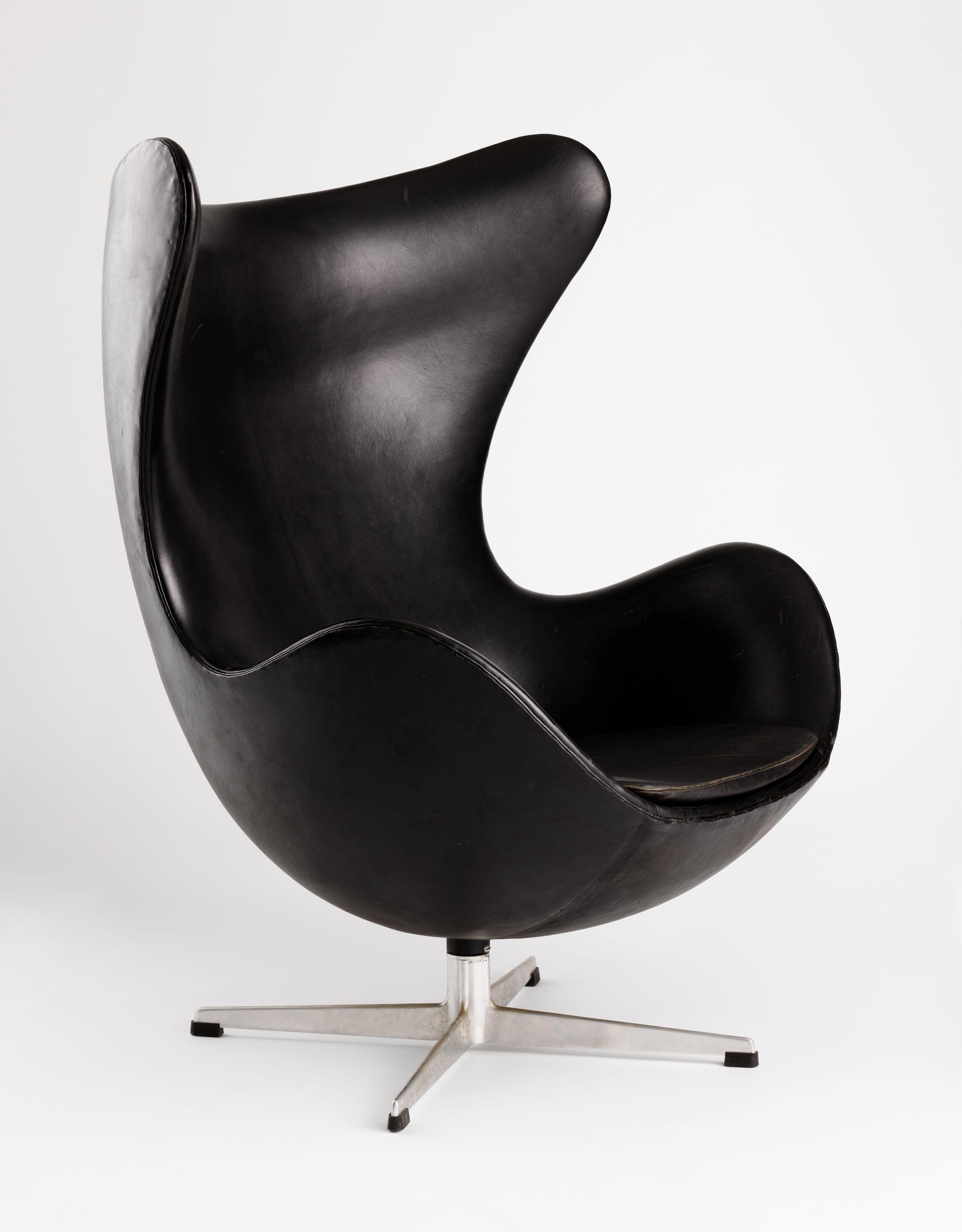
A mundane object can become a surprisingly strong narrative device. A chair, notebook, receipt, ticket or old interface can serve as the thread connecting 20 visual moments. The object gives the audience something concrete to hold onto while the speaker moves into broader ideas.
This works because PechaKucha rewards specificity. “What design means to me” is abstract. “What I learned from the 12 chairs I have owned” already contains images, chronology and personality.
5. The Before-and-After Case Study
Designers can use the format to show transformation without turning the talk into a portfolio walkthrough. Start with the problem, establish the constraint, show a few decisive iterations and spend the final slides on what changed as a result.
The important discipline is omission. A traditional case study might explain every research phase. A PechaKucha version should preserve only the moments that changed the direction of the work.
6. The Myth-Busting Presentation
This format begins with a belief the audience probably holds, then spends the next 15 or 16 slides dismantling it. The final slides rebuild a more useful model. It works especially well for talks about design, technology, work and culture because the structure creates natural tension.
A strong version does not simply list misconceptions. It uses each misconception to deepen one argument. The deck should feel cumulative, not like a countdown article converted into slides.

7. The Data Story Without the Dashboard
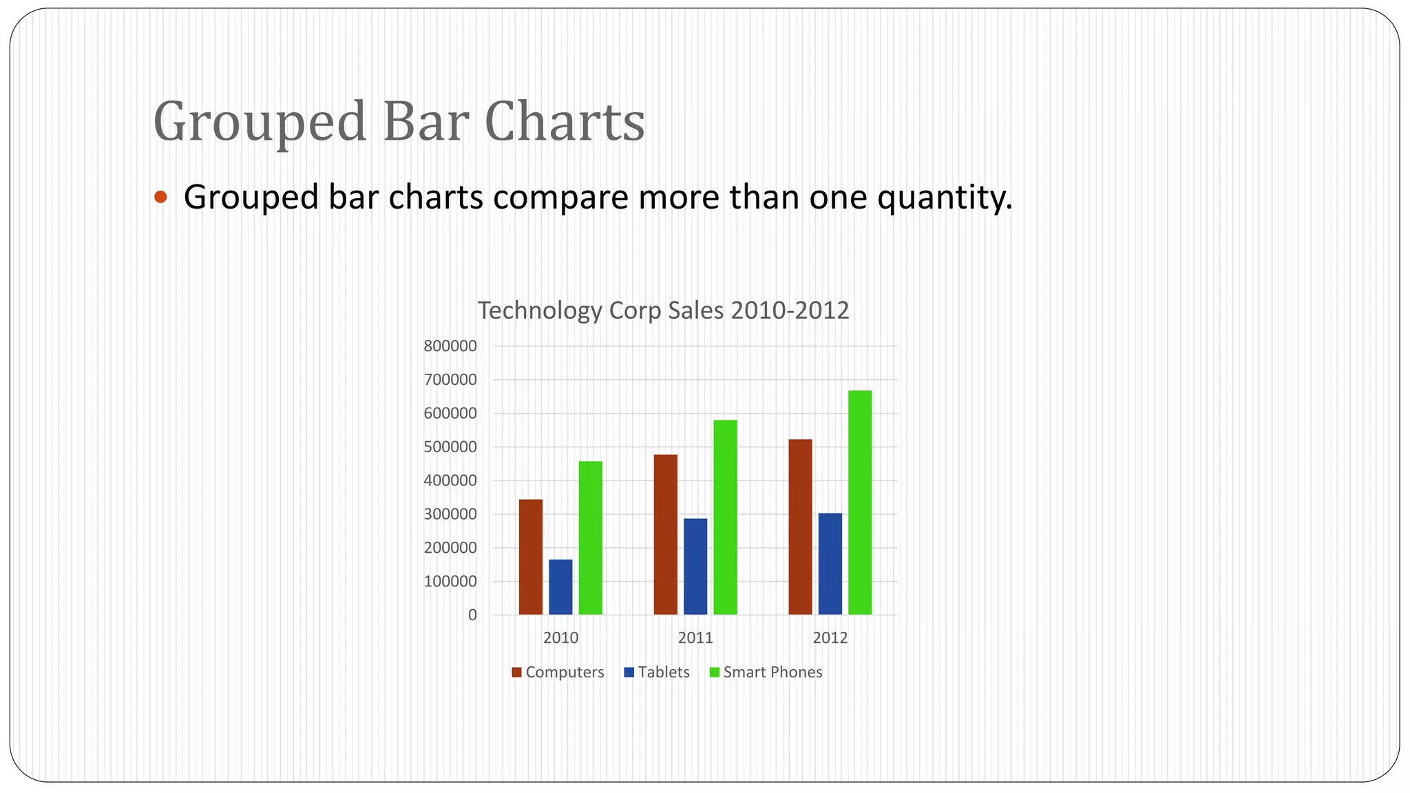
PechaKucha can handle data, but only when the presenter resists the urge to show dashboards. One number, one visual comparison or one relationship per slide is usually enough. The spoken layer provides meaning while the visual layer provides orientation.
This is a useful constraint for product teams. If a chart needs 40 seconds of explanation before the audience knows where to look, it probably does not belong in a 20-second slide.
The best 20×20 decks make the timing constraint disappear because the sequence feels inevitable.
8. The Process Story
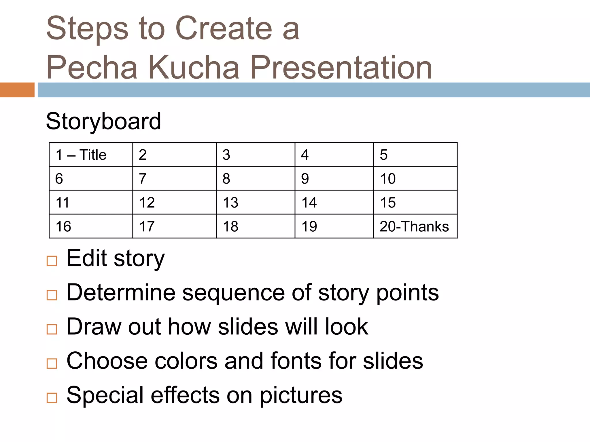
Processes make natural 20-slide narratives because each step can become a visual beat. The mistake is treating every step as equally important. Better presentations compress routine stages and slow the narrative around decisions, surprises and reversals.
That distinction matters because PechaKucha is not really about speed. It is about editorial judgment. The presenter is continuously deciding what deserves 20 seconds and what deserves nothing.
9. The “Twenty Views of One Thing” Presentation
Another effective pattern is to keep the subject constant while changing the perspective. Twenty views of the same city, interface, ritual, object or problem can create coherence without repetition.
This structure is particularly good for design education because it forces the presenter to notice differences instead of adding more material. It also leads naturally into the PechaKucha topic ideas that work best when the premise itself can generate 20 distinct visual moments.
10. The Strongly Designed Minimal Deck
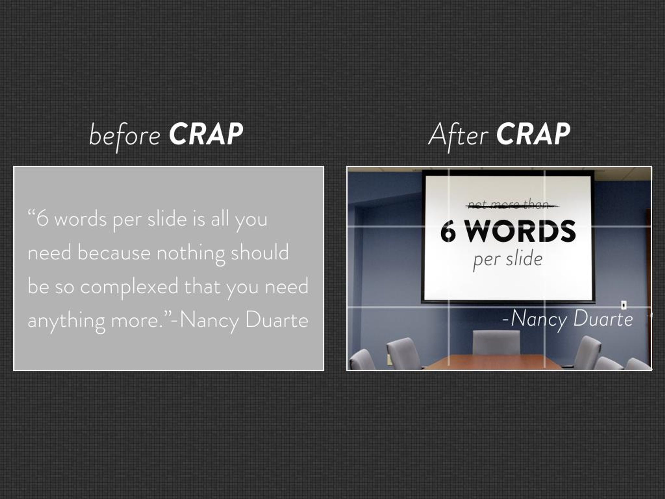
The most memorable PechaKucha decks often feel almost under-designed. One image. One crop. One short line. Maybe no text at all. The speaker and visual are allowed to coexist rather than compete.
Research on PechaKucha in higher education has found benefits including stronger audience understanding and higher ratings for appearance and creativity compared with traditional presentations in some settings. The results are not a universal guarantee, but they support the basic idea that the constraint can improve how presenters structure and show information. See the studies indexed by ERIC and ERIC.
What These Examples Have in Common
The best PechaKucha examples are not the ones that manage to squeeze the most information into 400 seconds. They are the ones that make the limitation disappear. You stop thinking about the timer because the sequence feels inevitable.
That usually comes down to four things: one clear story, a deliberate visual sequence, very little on-screen text and ruthless editing. If you are designing your own deck, the next useful step is not finding a fancier template. It is learning how to design a slide that can actually survive 20 seconds.
How to Study an Example Without Copying It
When you watch a PechaKucha presentation for inspiration, ignore its surface style first. Instead, map what each slide is doing. Which slide establishes the problem? Where does the speaker introduce surprise? When does the story turn? How many slides are spent on setup versus consequence? That structural reading is more transferable than borrowing somebody else’s visual language.
Then watch again with the sound off. A strong deck should still reveal a sequence rather than a random collection of attractive images. Finally, listen without looking at the slides. If the narration becomes difficult to follow without the visuals, that can be a strength: it means the image layer is carrying genuine information instead of merely decorating the speech.
The goal is not to make your PechaKucha look like a famous example. It is to understand how constraint, sequence and omission make an idea easier to remember.




What is the best PechaKucha presentation you have seen, and what made it memorable?