


A PechaKucha presentation looks simple until the timer starts. You get 20 slides, each stays on screen for exactly 20 seconds, and the deck keeps moving whether you are ready or not. That gives you 6 minutes and 40 seconds to make one idea feel inevitable.
The obvious mistake is to design 20 slides and then squeeze a talk into them. The better approach is the reverse: build the story first, decide what each 20-second beat needs to accomplish, and only then design the visuals. If you need the format itself explained first, start with our complete PechaKucha guide. If you already know the rules, this is the practical 20-slide template.
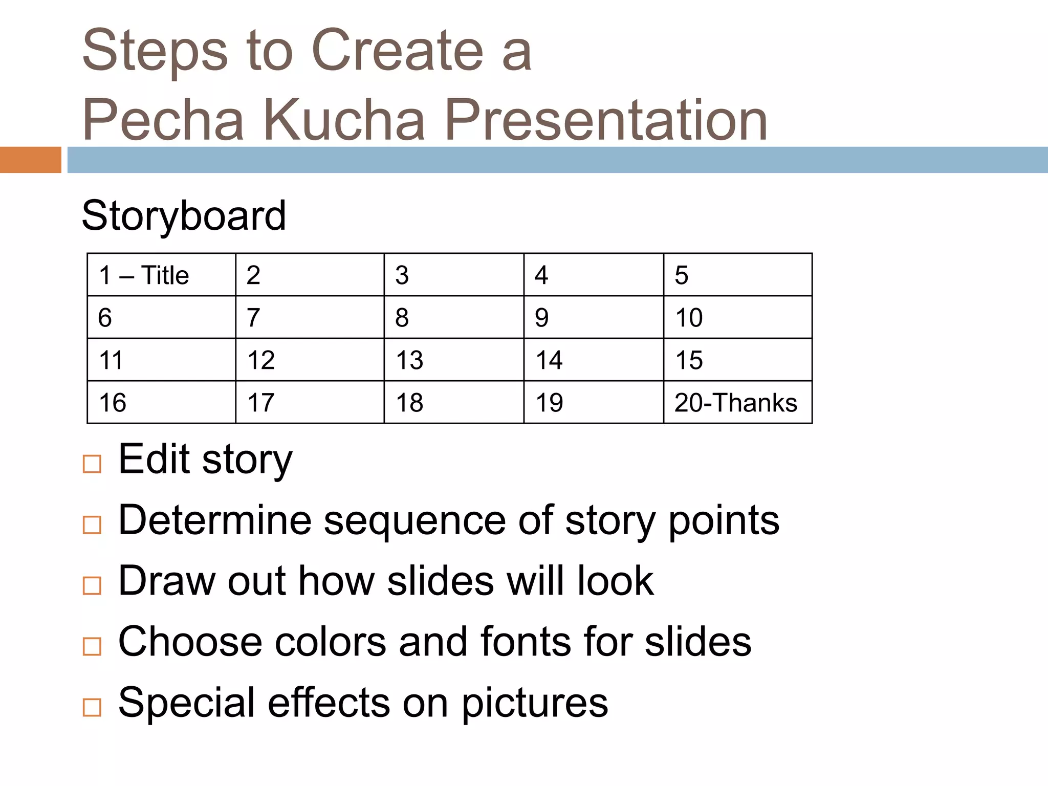
Before You Open PowerPoint
PechaKucha describes the format as 20 images, each auto-advancing after 20 seconds. That wording is important. It is not a 20-page report with a stopwatch attached. The visuals are supposed to carry meaning while your voice supplies the connective tissue.
Before you choose a single image, write one sentence that captures your point. Not your topic, your point. “Design systems” is a topic. “Design systems fail when governance is treated as documentation” is a point. Every slide should establish, complicate, prove, apply or resolve that sentence.
If you cannot explain the point of the talk in one sentence, 20 slides will not rescue it.
Slides 1–3: Earn Attention
Slide 1: Start with tension. Use a contradiction, striking visual, uncomfortable question or moment already in motion. Avoid spending the opening on your name, employer and agenda unless the context genuinely requires it. In a format this short, administrative slides are expensive.
Slide 2: Make the problem visible. Move from the abstract to something concrete: a person, interface, place, artifact or consequence. If slide 1 says “we are overwhelmed by choice,” slide 2 should show what that overload looks like in the real world.
Slide 3: State the promise. Tell the audience what they will understand, notice or be able to do differently by the end. This is orientation, not a corporate learning objective.

Slides 4–7: Establish the World
Slide 4: Give only the context that changes the story. PechaKucha punishes background for background’s sake. Compress dates, definitions and history until only the details that matter remain.
Slide 5: Introduce the first revealing detail. This is where the talk stops sounding generic. Show the specific observation, behavior or artifact that made you care about the subject.
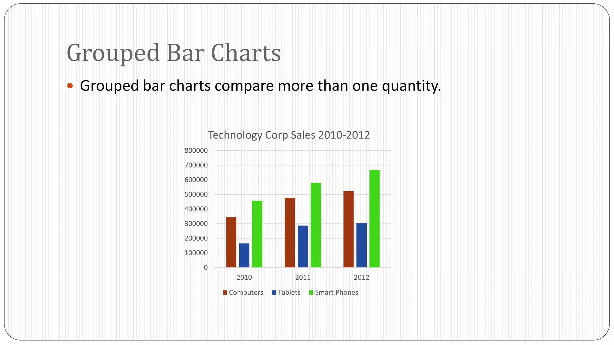
Slide 6: Add evidence. Use one example, one number or one comparison the audience can absorb instantly. A dense chart is technically evidence but functionally dead if it takes 15 seconds just to decode the axes.
Slide 7: Show the consequence. Ask what changes because of what you just showed. A sequence only feels like a story when one beat causes the next.

Slides 8–12: Change the Audience’s Frame
This is the middle of the talk and usually the part that separates a memorable PechaKucha from a sequence of attractive slides. The audience already knows the subject. Now you have to change how they see it.
Slide 8: Introduce friction. Show the failed assumption, exception, trade-off or contradiction that makes the obvious explanation incomplete.
Slide 9: Reframe the problem. This is often the intellectual hinge of the deck. If the talk works, the audience should be looking at the same evidence differently after this slide.
Slide 10: Demonstrate the new frame. Do not explain the reframing twice. Show it working through a case, visual or before-and-after comparison.
Slide 11: Add a second example. One case can be dismissed as an anecdote. A second begins to suggest a pattern.
Slide 12: Name the pattern. Give the audience language for what they have just seen. The label should feel like a conclusion earned by the previous slides, not a slogan dropped from nowhere.
The middle of a PechaKucha should not merely add information. It should change the frame.
Slides 13–16: Make the Argument Useful
Slide 13: Show what to do differently. Convert the idea into a decision, behavior or principle. If the audience agrees with you but cannot tell what changes next, the talk is still incomplete.
Slide 14: Show what not to do. Contrast is efficient. A bad example, anti-pattern or failed version can communicate a rule faster than another paragraph of advice.
Slide 15: Introduce a small practical model. Three parts are easier to grasp than seven. If the framework requires a legend, tiny labels and 20 seconds of setup, it belongs in a report, not here.
Slide 16: Apply the model. Demonstrate the principle in a realistic situation. The audience should not have to imagine how your advice works.
Slides 17–20: Land the Story
Slide 17: Return to the opening tension. Echo an image, phrase or unresolved question from the beginning. This tells the audience that the talk is closing rather than simply running out of slides.
Slide 18: Show what changed. Contrast the audience’s starting assumption with the perspective you have built.
Slide 19: Deliver the takeaway. One sentence is enough. If you need three takeaways, you probably have three talks.
Slide 20: End on an image, not housekeeping. A final visual that carries the idea is usually stronger than “thank you,” a wall of contact details or a last-minute recap.
How Much Can You Say in 20 Seconds?
At a comfortable presentation pace, 20 seconds usually gives you only a handful of sentences. Do not convert that into a word-count target. The real test is whether your spoken beat and the visual beat finish together without sounding hurried.
Rehearse each slide with your hands off the keyboard. If you consistently finish at second 11, the slide may be underwritten or visually weak. If you are still explaining the image when the next slide appears, the slide is overloaded. Both problems are structural, not merely delivery problems.
Design for the First Second
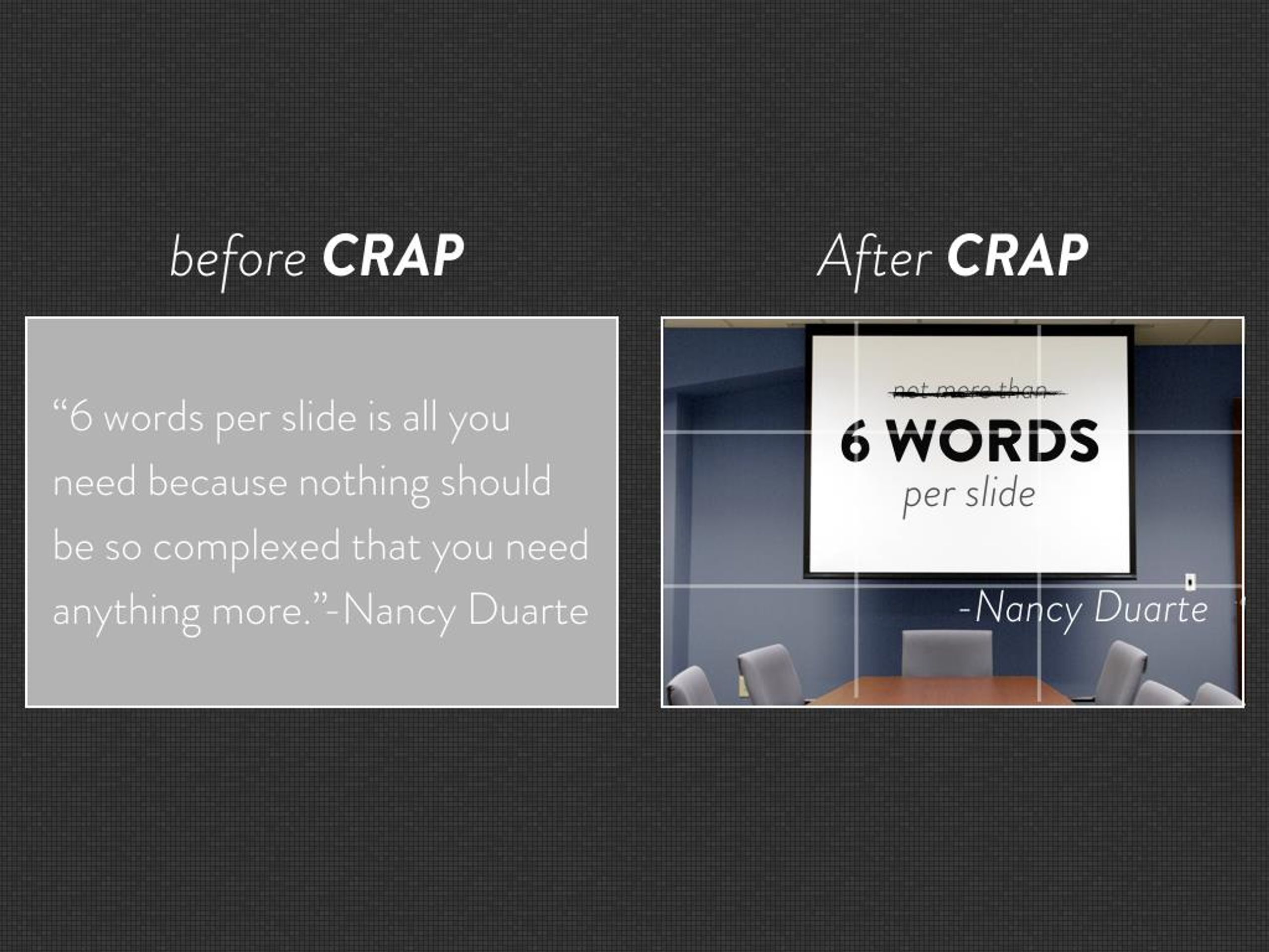
The audience should know where to look almost immediately. Use one dominant visual idea per slide. Keep text short enough to read at a glance. Avoid screenshots with tiny UI, charts that require a legend tour, decorative stock photography and layouts where five elements compete for attention.
Our separate guide to PechaKucha slide design goes deeper into visual hierarchy, image choice and text density. The useful rule here is simpler: if the audience needs most of the 20 seconds to understand the slide, you have left no time for the story.
Set the 20-Second Timing Before You Rehearse
Do not rehearse with manual clicks and promise yourself you will add the timer later. The timer changes the talk. Microsoft PowerPoint lets you set slides to advance automatically after a specified interval from the Transitions timing controls, so configure the real 20-second behavior early and rehearse inside the actual constraint.
Test the entire 6:40 sequence from beginning to end on the machine or export format you actually plan to use. Fonts, transitions, embedded media and aspect ratios can behave differently once the deck leaves the computer where it was designed.
Rehearse the Movement, Not a Script
Do not memorize 20 mini-speeches word for word. Memorize the movement of the story. Know what each slide needs to accomplish, how it hands off to the next one and which phrase or detail you cannot afford to lose.
A useful working document has three columns: slide number, what the audience sees and the one thing you need to say. If the visual shows one idea while the narration explains another, the slide is carrying the wrong image.
Record one rehearsal on your phone. Listen for places where you repeatedly rush during the final five seconds. Those moments often indicate a structural problem. Cut a sentence, move a detail forward or replace the visual with something that needs less explanation.
Research on PechaKucha in education has found benefits in presentation quality and audience understanding in some contexts, but the useful lesson is not that a timer magically improves a talk. The preparation demanded by the constraint is doing much of the work. Studies indexed by ERIC and ERIC are useful starting points.
Use the Template, Then Break It
This 20-slide structure is not an official PechaKucha rule. It is scaffolding. Once the story works, remove anything that feels formulaic. A product case study, travel story, research argument and personal essay should not all sound as though they came from the same worksheet.
If you are still choosing a subject, browse our PechaKucha topic ideas. If you want to see how strong talks handle the constraint, use our guide to PechaKucha presentation examples. And if you are not yet sure this format is the right one, compare PechaKucha vs Ignite vs TED before committing.
The 20×20 rule is not the structure of the talk. It is the pressure that forces you to find one.




Which part of a 20×20 presentation is hardest for you: structure, slide design or timing?