

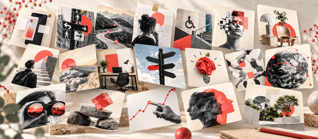
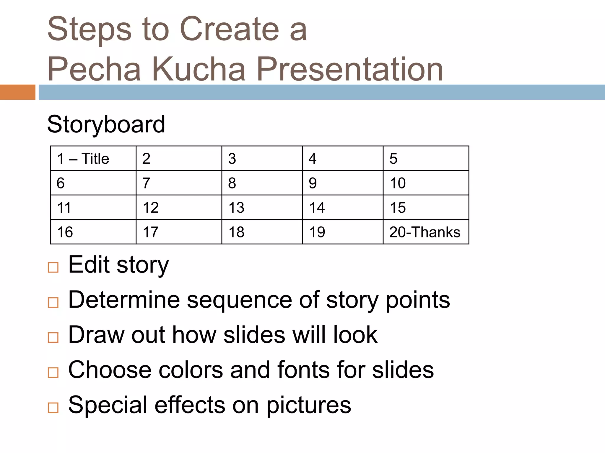
The hardest part of PechaKucha is often not the timer. It is choosing a topic that naturally produces 20 visual moments. A weak topic forces you to pad the deck. A strong one almost writes the sequence for you.
The official PechaKucha format gives you 20 images, 20 seconds each and 400 seconds in total. That makes specific, visual and story-shaped topics much easier to work with than broad explanatory subjects.
If you need the mechanics first, read our complete PechaKucha guide. If you already know the rules, use the ideas below as starting points rather than assignments. The goal is to find a subject where the format makes the idea clearer.
A strong PechaKucha topic almost generates the 20-slide sequence by itself.
1. Twenty Interfaces That Changed How I Think
Choose 20 interfaces from different periods of your life and explain one thing each taught you about behavior, interaction or expectation. The visual anchor is already built in, which lets the narration focus on what changed in your thinking rather than describing the screen.
2. A Product Decision I Would Make Differently Today
Turn one project into a story about judgment instead of a compressed portfolio walkthrough. Spend fewer slides on process and more on the decision, the evidence available at the time, what happened next and why your view changed.
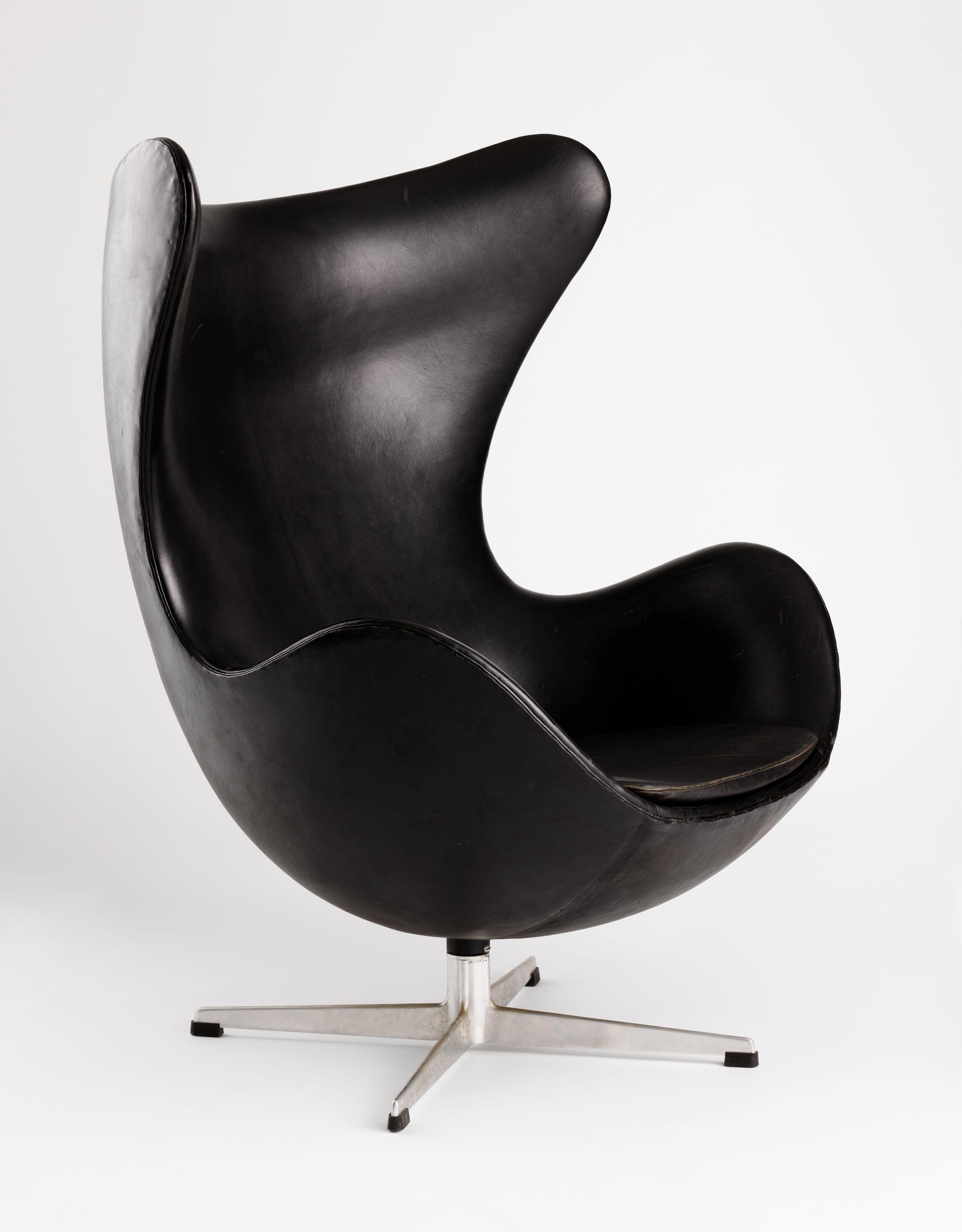
3. Twenty Objects That Explain My Design Taste
Furniture, packaging, tools, album covers, architecture and ordinary objects can reveal taste more vividly than a list of principles. The interesting version explains why apparently unrelated objects belong in the same personal design language.
4. The History of One Feature
Pick a familiar interaction such as search, undo, notifications, tabs, checkout or the shopping cart. Trace its evolution through 20 moments and use each change to show how user expectations, technology or business models shifted.
5. What Our User Research Got Wrong
A good research story is built around surprise. Start with the assumption, show the evidence that challenged it, then follow the decision that changed because of the research. You do not need confidential data if the narrative is about the reasoning rather than the raw findings.
6. One Week Without a Familiar Product
Stop using a product you rely on and document what breaks, what substitutes appear and which habits turn out to be stronger than the product itself. Screenshots, notes, replacement tools and moments of friction give you a natural visual diary.

7. Twenty Screens From One User Journey
Use one screen per slide and narrate what the user is trying to accomplish, where the interface helps and where it creates friction. This works best when the journey has a visible arc rather than 20 screenshots that all communicate the same thing.
8. How One Bad Constraint Made the Work Better
Budget, legacy technology, regulation, time pressure or missing data can become the central tension in a story about creative problem-solving. The key is to show what the constraint removed, what it forced the team to notice and what unexpectedly improved because of it.
9. A Visual Autopsy of a Failed Product
Choose a discontinued or unsuccessful product and reconstruct the experience through screenshots, ads, packaging, reviews and interface decisions. Keep the focus on what users encountered rather than turning the talk into hindsight theatre.
10. Twenty Tiny Details Most People Never Notice
Microcopy, spacing, loading states, sounds, transitions, affordances and defaults can each become a slide. The format rewards close observation because a small detail can comfortably fill 20 seconds when the detail has a consequence.
11. What I Learned From My First Job
Use scenes instead of advice. First desk, first mistake, first difficult meeting, first piece of work you were proud of. Specific moments create a stronger talk than generic “career lessons” because the audience can see the experience rather than being told the moral.
12. A City Explained Through Twenty Design Decisions
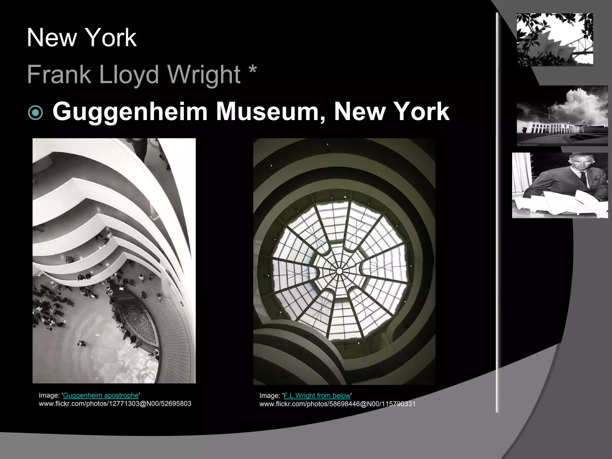
Street signs, transit maps, storefronts, ticket machines, crosswalks, public seating and accessibility decisions can turn a city into a design-system story. The topic works because the city becomes the interface and every slide gives you another piece of evidence.
13. The Evolution of My Workspace
Show how your tools, environment and working habits changed over time. The useful angle is not “look at my desk.” It is what each change says about the work itself: more collaboration, fewer distractions, different tools, changing priorities or a new relationship with technology.
14. Twenty Assumptions New Designers Make
Use each assumption as a visual setup, then complicate it with your narration. Do not make the talk a scolding list. The strongest version shows where you once believed the same thing and what experience forced the belief to change.
15. A Feature From Complaint to Launch
Follow one feature through problem, evidence, alternatives, trade-offs, build and outcome. This is useful for cross-functional product teams because the format strips away project theatre and leaves only the decisions that actually changed the result.

16. Twenty Things AI Still Makes Awkward
Use concrete product experiences rather than broad predictions. Each slide can show a real friction point, failure mode, trust problem or interaction cost. A talk built from specific awkward moments will age better than one built from sweeping forecasts.
Do not choose a topic because you can fill 20 slides. Choose one because the limitation clarifies the subject.
17. What Accessibility Looks Like in Everyday Life
Document ramps, captions, color choices, signage, controls, ticket machines and workarounds. Let the images demonstrate how accessibility is designed into or out of environments instead of turning the talk into a list of principles.
18. Twenty Design Decisions From One Iconic Product
Stay with one product but change the lens every slide: form, interaction, packaging, defaults, pricing, onboarding, accessibility, repairability, sound, typography and so on. The constraint creates depth by forcing you to look repeatedly at the same object from different angles.
19. The Most Expensive UX Mistakes Are Invisible
Build the talk around hidden costs: confusion, training, support tickets, abandonment, workarounds and lost trust. Each slide can make one invisible cost visible without needing to become a dashboard presentation.
20. Twenty Things I Changed My Mind About
This is one of the most flexible PechaKucha premises because change creates built-in tension. Each slide can pair an old belief with the experience, person or piece of evidence that weakened it.
Best PechaKucha Topics for Students
Students usually get better results from topics that combine personal access with a clear research question. A history of one everyday object, a visual comparison of two neighborhoods, the evolution of a familiar technology or a personal experiment all provide material that can be photographed, researched and sequenced without relying on generic stock imagery.
Best PechaKucha Topics for Designers
Designers should resist turning the format into a compressed portfolio. A stronger topic has an argument: interfaces that changed your opinion about onboarding, invisible accessibility, one product decision you now disagree with, or the history of a pattern such as search, save or undo.
Best PechaKucha Topics for Product Teams
For product teams, PechaKucha works best when the goal is shared understanding rather than exhaustive documentation. A research surprise, customer journey, failed experiment, feature evolution or set of recurring friction points can create discussion without consuming an entire meeting.
Turn a Broad Topic Into a 20×20 Topic
If your starting idea is broad, add a lens and a boundary. “Artificial intelligence” becomes “20 moments where AI asks the user to trust something they cannot inspect.” “Architecture” becomes “20 entrances that change how a building feels.” “My career” becomes “20 things I believed about design at 22 that I no longer believe.”
Narrower is usually better because PechaKucha rewards specificity. A broad subject encourages summary. A bounded subject creates scenes, comparisons and evidence.
How to Test a Topic Before Building the Deck
Imagine the slides before writing the talk. Can you picture at least 15 genuinely different visual moments without resorting to decorative stock imagery? If not, the topic may be too abstract.
Then ask whether something changes. Your opinion, the product, the user, the place, the evidence or the audience’s understanding should move. Without movement, 20 slides easily become a catalogue.
Finally, check whether the 20×20 constraint is helping. If the topic needs five minutes on one diagram, it is fighting the format. If the topic becomes clearer when you force it into 20 visual beats, you probably have a PechaKucha.
Use Original Material Whenever You Can
Do not build the deck from search results alone. Collect your own screenshots, photographs, artifacts, observations and examples where possible. Original material gives the presentation a point of view and makes the final deck feel authored rather than assembled.
Once you have a topic, use our slide-by-slide PechaKucha template to shape it and study our PechaKucha presentation examples to see which narrative pattern fits. Research indexed by ERIC also describes PechaKucha as a useful way to teach concision, storytelling and visual communication.



What topic would you add to this list that naturally produces 20 strong visual moments?