


A normal presentation gives you an escape hatch. If a slide is confusing, you can stay on it longer. In PechaKucha, you cannot. Twenty seconds after a slide appears, it is gone whether the audience understood it or not.
That makes PechaKucha slide design a problem of comprehension before aesthetics. The useful question is not “does this look polished?” It is “can the audience understand where to look, what matters and why this image is here before the slide disappears?”
Start With the 20-Second Comprehension Budget
The official PechaKucha format uses 20 images, each auto-advancing after 20 seconds. If you need the format itself explained first, our PechaKucha guide covers the basics and history.
The design implication is simple but brutal: every slide has a fixed lifespan. You are not designing a page for close reading. You are designing a visual moment that appears, supports one thought and leaves.
A PechaKucha slide should be understood before it is admired.
Rule 1: Give Every Slide One Job
A slide can establish place, introduce a person, show evidence, compare two states, reveal a detail or create an emotional pause. Problems begin when one slide tries to do four of those jobs at once.
Before designing, finish this sentence: “When this slide disappears, the audience should understand…” If the answer contains two unrelated ideas, split the slide. PechaKucha gives you sequence. Use it.
Rule 2: Make the Focal Point Obvious
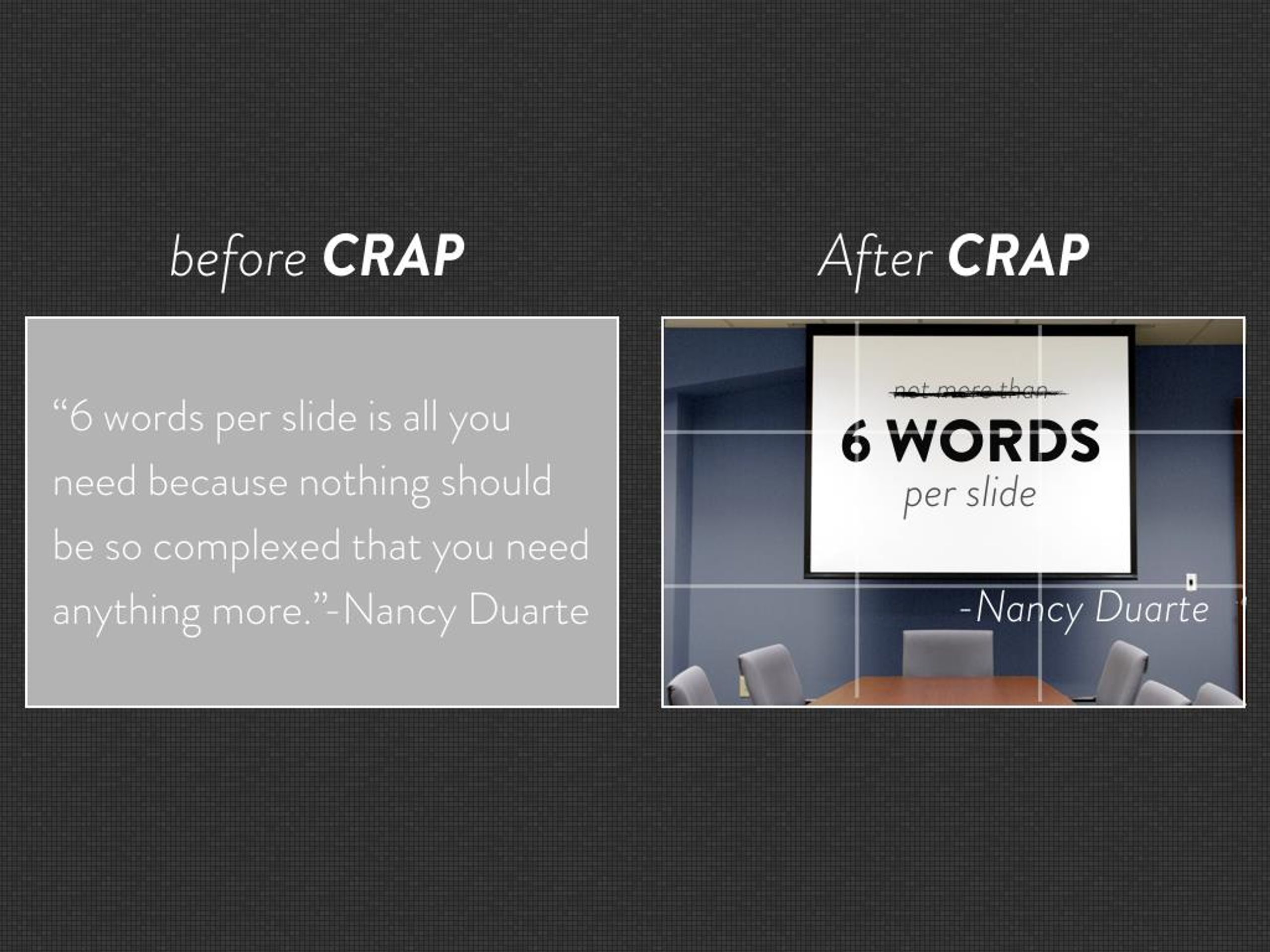
The audience should know where to look almost instantly. That usually means one dominant image, one highlighted detail or one short line of text. Avoid layouts where three screenshots, two captions and a chart all compete for attention.
Hierarchy matters more under time pressure because the audience has no recovery window. A beautifully balanced slide can still fail if nothing clearly leads the eye.


Rule 3: Treat Text as a Visual Element
Text is not forbidden, but it should be readable in a glance. A number, name, contrast, phrase or short statement can work. A paragraph cannot.
Do not write on the slide what you intend to say aloud. The screen and speaker should cooperate. If both deliver the same sentence, the audience has to choose whether to listen or read.
Rule 4: Crop Until Only the Evidence Remains
Full screenshots are one of the most common presentation mistakes. A complete interface may be useful as evidence, but it usually contains far more detail than the audience can process in 20 seconds.
Crop to the part you are actually discussing. If the surrounding context matters, show the whole screen first and the crop on the next slide. That two-step reveal is usually clearer than forcing the audience to search a dense screenshot while you speak.
Rule 5: Use Sequence Instead of Animation
Because the deck already advances automatically, complicated build animations are often unnecessary. If something changes over time, distribute that change across consecutive slides.
Instead of animating five layers into one diagram, use three frames: the starting state, the critical addition and the final relationship. The audience experiences progression without having to decode a busy animation.
Rule 6: Give Every Chart One Message
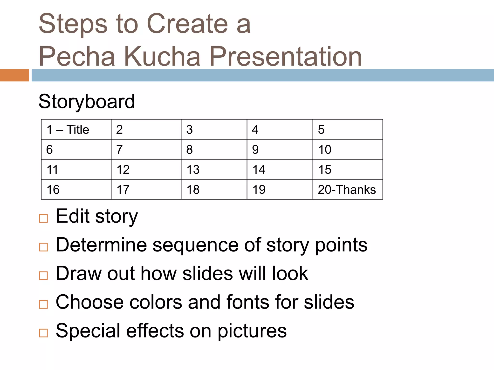
Charts can work in PechaKucha, but they need editing. Remove unnecessary gridlines, labels, legends and secondary series. Highlight the one movement or number the narration is about.
If you need to explain how to read the chart before explaining what it means, the chart is probably too complex for one 20-second beat.
Rule 7: Design the Cut Between Slides
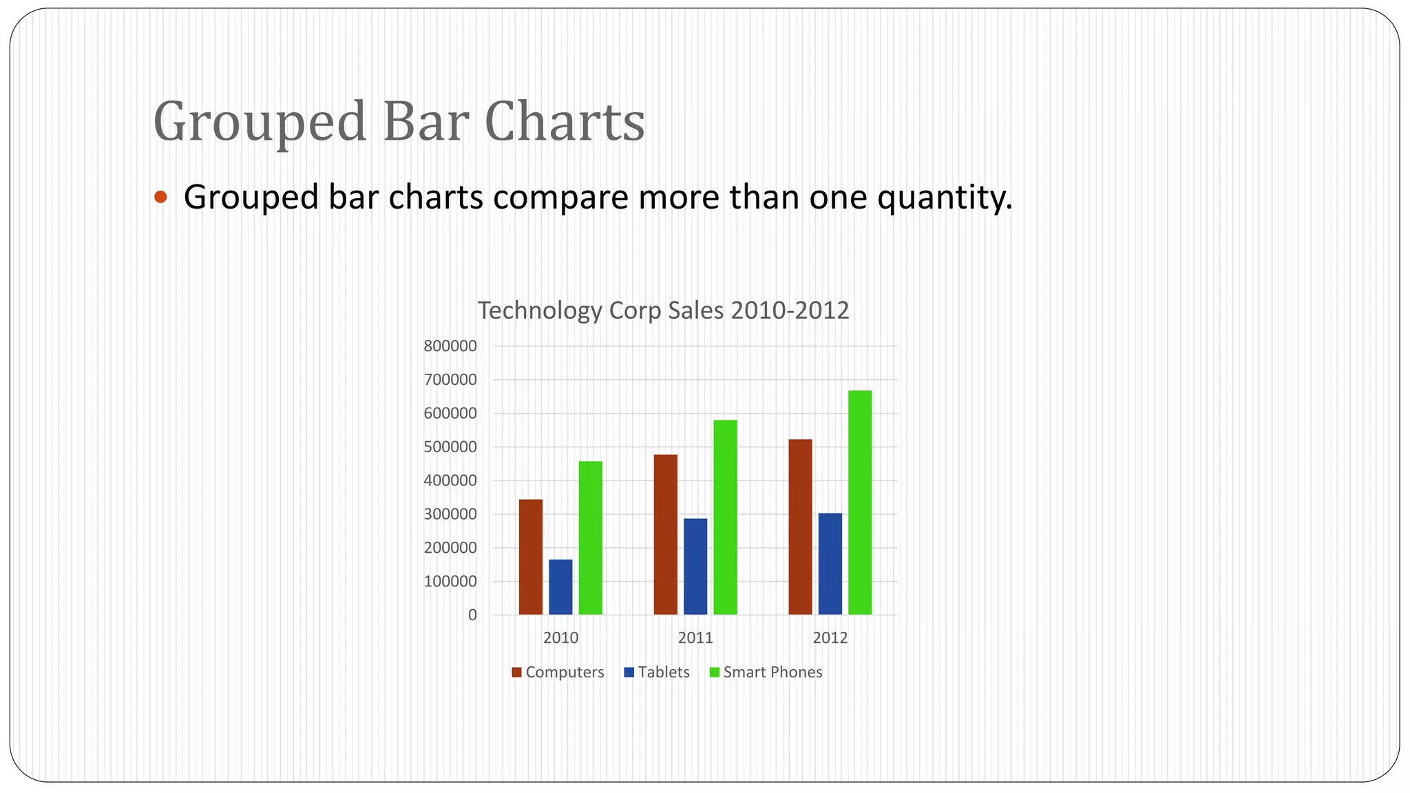
PechaKucha is experienced as motion, not as 20 isolated compositions. The transition between slides is part of the design whether you add a transition effect or not.
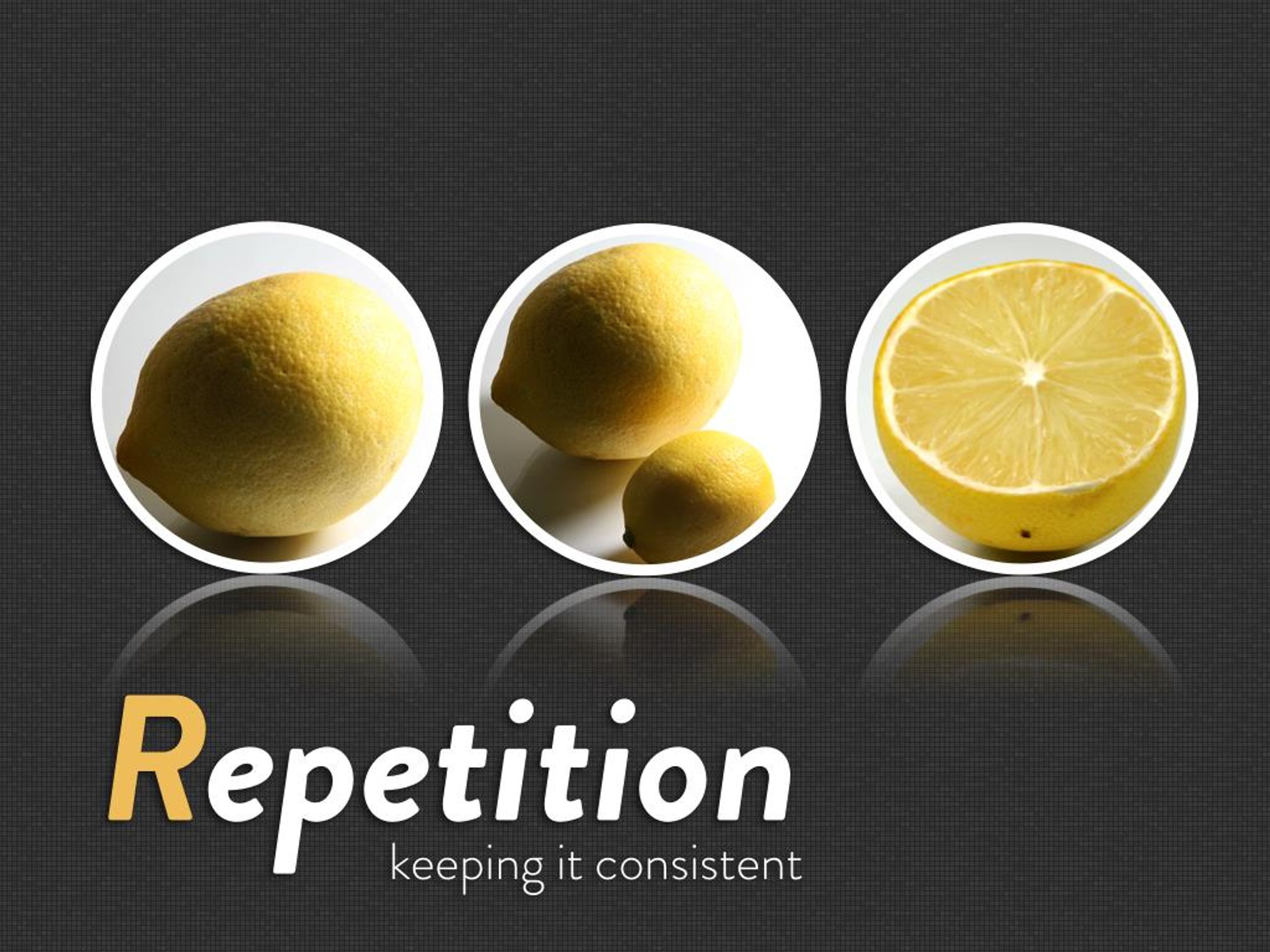
Repetition can create continuity. A similar crop across two slides can reveal change. A sudden shift from dense texture to empty space can signal a turning point. A sequence of progressively closer images can create focus without any animation at all.
A PechaKucha slide is closer to a shot in a film than a page in a report.
Rule 8: Use Empty Space as Timing
Not every frame needs to maximize information. A simple image after several dense slides can create a cognitive pause without changing the timer.
This is one of the most useful tricks in the format. You cannot slow the software, but you can make a slide feel slower by reducing what the audience has to process.

Rule 9: Design for the Back of the Room
A slide that looks excellent on a designer’s laptop can collapse on a projector. View the deck full-screen from several metres away. If small text, faint contrast or tiny UI becomes illegible, simplify it.
This matters especially for designers, who are accustomed to inspecting interfaces at close range. A presentation slide is not an interface mockup. Its viewing conditions are different, and scale exposes weak hierarchy very quickly.
Rule 10: Rehearse the Slide and Sentence Together
The final test is temporal. Let the deck auto-advance while you speak. A slide may be visually excellent and still fail because your narration needs 28 seconds to explain it.
When that happens, do not automatically speak faster. Ask whether the idea needs another slide, whether the image needs a stronger crop or whether a sentence can disappear completely.
Our slide-by-slide PechaKucha template can help if the problem is structural, and our PechaKucha presentation examples show how different story types distribute visual weight across the sequence.
Accessibility Matters More When the Slides Move Fast
Fast slides make accessibility more important, not less. Use strong contrast, type large enough to read at distance and visuals whose meaning does not depend on subtle color differences. If a chart or diagram contains an essential conclusion, say that conclusion aloud instead of assuming everyone can inspect it visually in 20 seconds.
TED’s current slide guidance makes a similar point from a stage-design perspective: use high-resolution visuals, keep graphs clear, use large readable type and avoid asking one slide to support more than one point. Those are sensible presentation rules generally, but PechaKucha raises the stakes because the audience has less time to compensate for weak legibility.
Avoid motion merely to create energy. Rapid transitions, flashing effects and unnecessary animation add cognitive load to a format that is already moving quickly. The automatic slide change provides enough rhythm on its own.
Choose Images for Meaning, Not Decoration
A stock photograph of “teamwork” adds almost nothing to a slide about collaboration because the audience has to invent the connection. A photograph of the actual workshop, whiteboard, prototype or object you are discussing carries evidence.
When original material is unavailable, choose an image that contributes a concrete detail, comparison or metaphor rather than merely filling space. The same rule applies to icons and illustrations. If removing the visual would not change what the audience understands, the image is decorative.
Why the Constraint Can Improve Slide Design
Research on PechaKucha has repeatedly focused on concision, storytelling and visual communication. One teaching paper indexed by ERIC describes the format as a way to develop those skills, while other classroom studies have reported improvements in aspects of presentation quality in specific samples.
The timer does not make a slide clear. It simply removes the presenter’s ability to compensate for a slide that is not clear. That pressure can improve editing because every unnecessary word, label and decorative element has an obvious cost.
Design the Moment, Not the Page
The most useful mental model is to stop thinking in pages. A PechaKucha slide is a timed visual moment with one purpose, a fixed duration and a relationship to what comes before and after.
Design for that and 20 seconds stops feeling like a limitation. It becomes the unit of the story.




What is the most common slide-design mistake you see in fast presentations?