

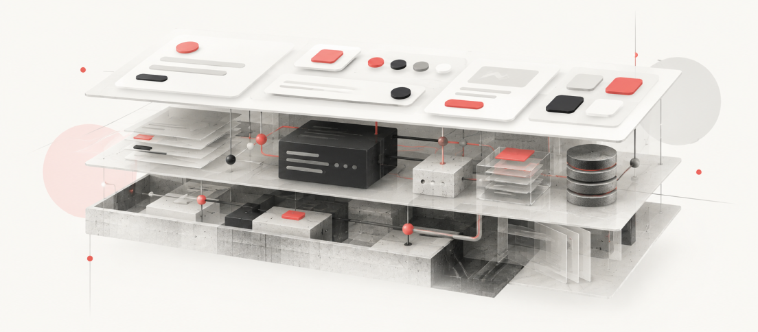
A UI kit can look suspiciously like a design system. It can have immaculate components, carefully named variables, responsive variants, polished documentation pages and enough visual consistency to convince an entire product team that the hard work is done.
Then someone asks a question the file cannot answer.
Which button should engineering actually import? Who owns the component after launch? What happens when one product team needs a variant that another team does not? Which accessibility behaviour is mandatory? How does a breaking change get released? When does an exception become a new pattern? Who is allowed to retire the old one?
A UI kit gives you reusable interface parts. A design system gives an organisation a way to make, ship and change product decisions repeatedly.
That distinction sounds semantic until a company scales. At small size, the same designer may create the component, explain it to engineering and remember why it works the way it does. At larger size, those responsibilities separate. The visual asset survives. The reasoning disappears. The gap between the two is where many supposed design systems reveal that they were UI kits all along.
Our DesignWhine Guide to Design Systems treats a system as product infrastructure rather than a component catalogue. This piece takes the distinction one step further. If you want to know whether you have a system or simply a well-organised kit, look beyond what sits on the canvas.
The Confusion Starts in Figma
The confusion is understandable because modern design tools have made UI kits much more sophisticated.
Figma describes UI kits as curated libraries containing components, styles, variables and example screens that can be pulled directly onto the canvas. Some official kits also support Code Connect. In other words, a UI kit can now contain many of the artefacts people once used to identify a design system. (Source: Figma.)
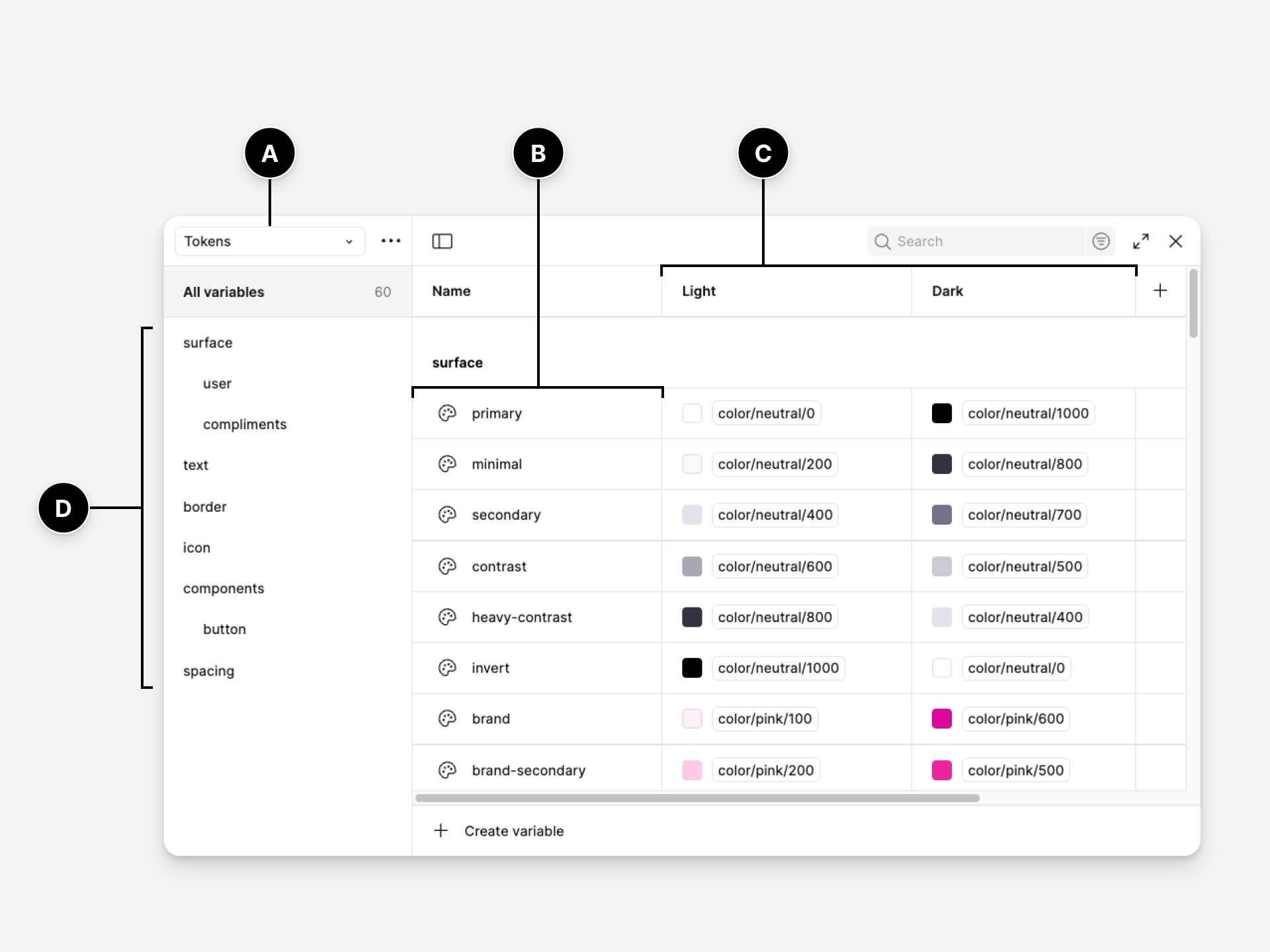
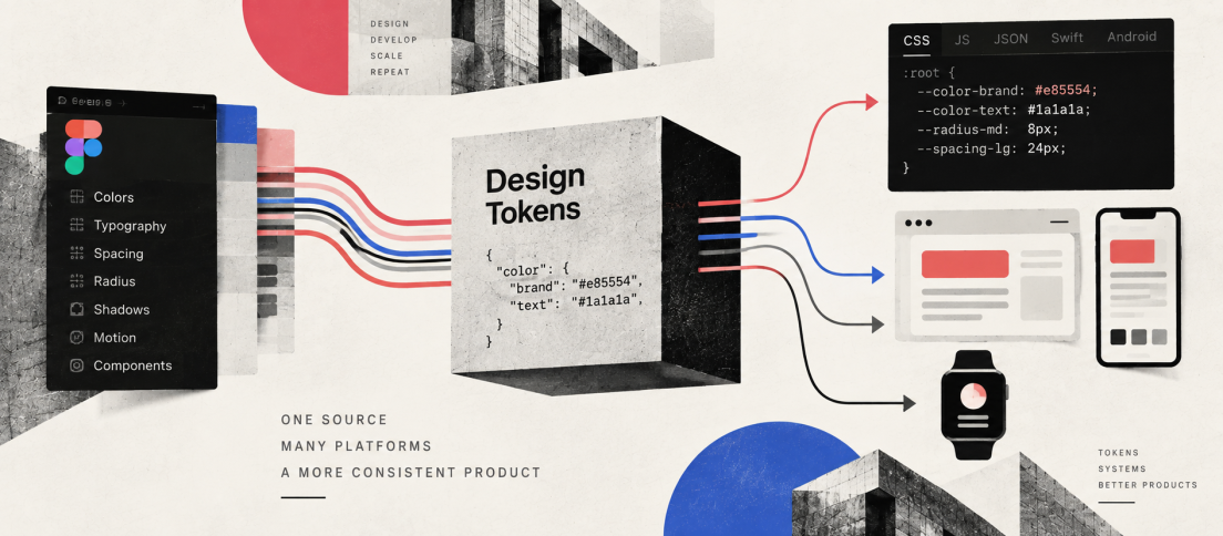
That is useful progress, but it also makes the boundary blurrier. A library with tokens, components and variants can feel complete because the visible design work is complete. The missing parts are mostly invisible. Our deeper guide to design tokens makes the same distinction from the architecture side: variables become truly valuable when their semantic meaning can travel beyond one design file and remain dependable across code, platforms and change.
Figma’s own design-systems course makes the distinction directly. Style guides and component libraries belong inside a design system, but the system operates at the level of the wider product ecosystem. It has to communicate not only what something looks like, but how and why it should be used. (Source: Figma.)
What a UI Kit Actually Solves
A good UI kit solves a real and valuable problem: it reduces the need to redraw known interface elements. It gives designers a shared visual starting point and can dramatically improve consistency inside design files.
That can include colour and typography styles, spacing variables, icons, buttons, inputs, cards, navigation, templates and preassembled screens. In a disciplined team, a UI kit can also encode variants, component properties and responsive behaviour. None of this is trivial.
But a UI kit still primarily answers a design-production question: what should I place on the canvas?
A design system has to answer a much larger set of questions. What is canonical? What is implemented? What is allowed to change? What has been tested? Who owns the decision? How does a team contribute back? What happens when design and code disagree?
| UI Kit | Design System | |
|---|---|---|
| Primary job | Speed up interface design | Standardise repeated product decisions |
| Core artefacts | Components, styles, variables, templates | Foundations, tokens, components, code, patterns, documentation |
| Implementation | May or may not map to code | Production relationship is explicit |
| Usage guidance | Often optional or visual | Explains when, why and when not to use patterns |
| Ownership | Library maintainer | Defined product and engineering ownership |
| Change model | Publish an update | Contribution, review, release, migration and deprecation |
| Success metric | Consistency in design files | Trust, adoption and consistency in the shipped product |
The easiest way to mistake a UI kit for a design system is to judge the system by what designers can see instead of what the organisation can rely on.
But a UI kit still primarily answers a design-production question: what should I place on the canvas?
The System Begins Where the File Ends
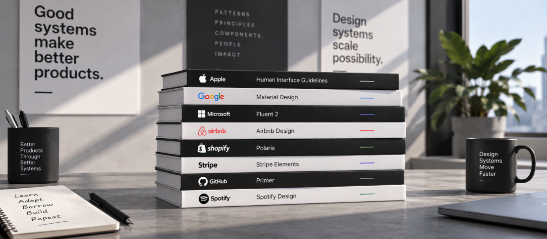
This is why mature public systems look different from a downloadable UI kit. They contain reusable assets, but the assets sit inside a larger operating model. Our analysis of the design systems worth studying in 2026 looks specifically at what Material, Carbon, Polaris, Atlassian, GOV.UK and Primer reveal once you study the machinery behind the component gallery.
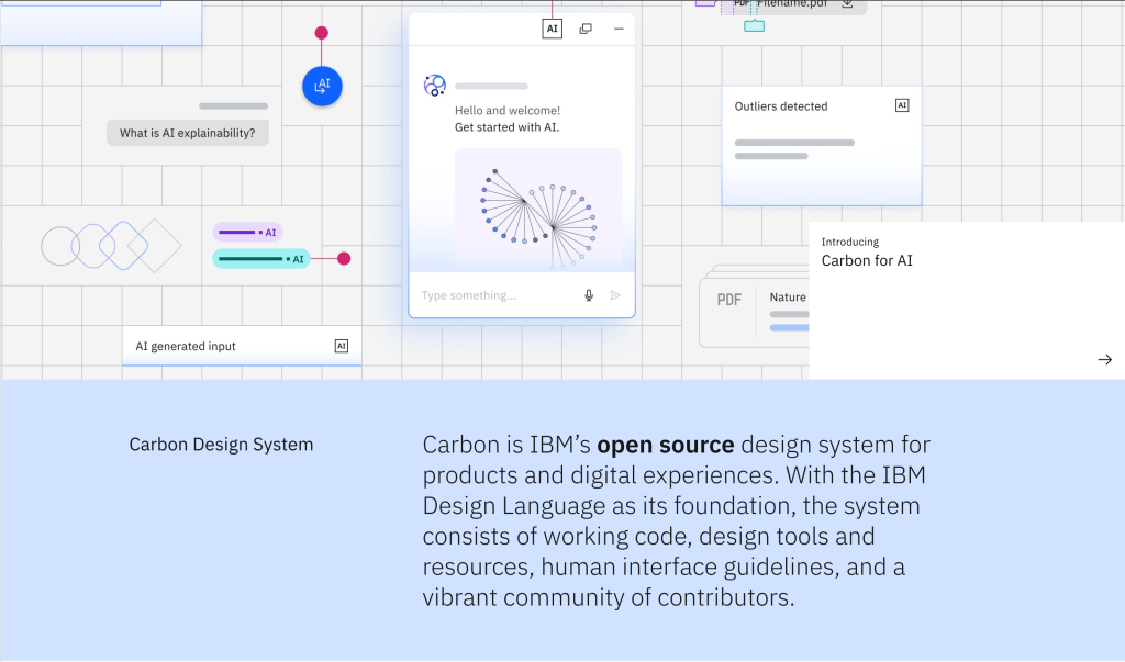
IBM Carbon combines design resources with coded libraries and guidance. GOV.UK publishes styles, components and patterns with production code, user-research context and contribution criteria. A proposed GOV.UK component has to demonstrate that it is useful beyond one service and distinct from what already exists; before publication, it is reviewed for usability, consistency, versatility and accessibility. (Source: GOV.UK Design System.)
That is not simply a better component library. It is a mechanism for deciding what deserves to become shared infrastructure.
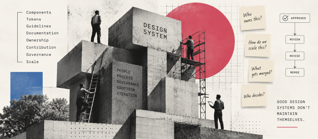
This is the same reason design-system governance matters so much. The moment a shared component becomes important, someone has to decide how it changes without every urgent local request becoming permanent system complexity.
Code Changes the Definition
The most revealing test is to leave Figma entirely.
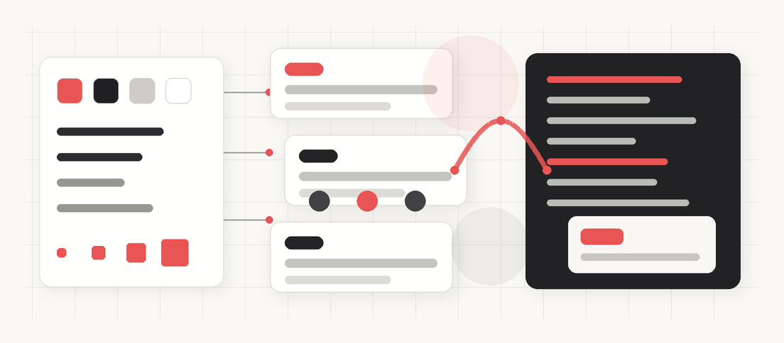
If a designer places a Button from the approved library, does engineering know which production component corresponds to it? Do the same properties exist? Are the same states supported? Are tokens aligned? Does the coded component carry the accessibility behaviour that the visual design implies?
If the answer is no, the kit may be visually consistent while the product remains structurally inconsistent. Designers reuse one thing. Engineers reuse another. Both teams can truthfully say they are following the system while shipping different interpretations of it.
This is why our guide to building a design system teams actually use treats design-code alignment as core work rather than a handoff detail. A component becomes system infrastructure when the organisation can depend on its meaning across design and implementation.
Guidance Is Part of the Product
A UI kit can tell you what a modal looks like. A design system should help you decide whether you need a modal at all.
That is the difference between assets and patterns. Product teams do not only repeat visual elements; they repeat decisions about validation, destructive actions, navigation, disclosure, forms, empty states, errors and recovery. A kit can standardise the surface. A system should preserve the reasoning.
GOV.UK makes this distinction visible by publishing both components and broader patterns, along with evidence about where they have been tested. The point is not simply consistency. It is avoiding the repeated cost of rediscovering the same product solution across teams. (Source: GOV.UK Design System.)
Why Teams Prefer the UI Kit Story
The UI kit version of a design system is attractive because it is finite. You can count the components, polish the file, publish the library and declare version one complete.
The real system is messier. It has users who complain. It has adoption problems. It accumulates technical debt. It needs release notes, migration support, contribution paths and deprecation. It forces organisations to decide who has authority over shared product decisions and how much capacity that work deserves.
That is why many companies fund a library but never truly fund a system. They budget for the visible creation phase and assume maintenance will somehow happen around normal product work. Our design-system estimation model makes those hidden workstreams explicit by separating foundations, tokens, code alignment, documentation, governance and adoption from the component count itself.
If your design system has no owner, no contribution path and no way to retire old decisions, the component count is mostly decoration.
The failure modes are predictable. Our analysis of why design systems fail repeatedly comes back to organisational trust: slow contribution, stale documentation, code drift, invisible ownership and systems that become easier to bypass than to use.
When a UI Kit Is Enough
None of this means every team needs a full design system.
A small product team with one application, a handful of designers and engineers, and tight day-to-day communication may get enormous value from a well-maintained UI kit. Building formal governance, documentation infrastructure and contribution processes can easily cost more than they save.
The problem begins when the organisation calls the kit a system and assumes it will scale like one.
You probably need the next layer when several teams are implementing the same components differently, when new hires cannot understand conventions without asking specific people, when product groups fork components because the central library cannot respond, or when design changes routinely fail to reach production consistently.
Run the Six-Question Test
If you are unsure what your team actually has, ask six questions:
- Can engineering map the important design components to canonical production components?
- Does the system explain when and why to use patterns, not only how they look?
- Is someone explicitly responsible for maintaining the system across design and code?
- Can product teams propose changes through a known contribution path?
- Can the organisation release, migrate and retire shared components deliberately?
- Can a new team member understand important product conventions without relying on tribal knowledge?
If most answers are no, that is not a failure. It simply means the team has a UI kit or component library, and now has a clearer view of the work required to turn it into infrastructure.
AI Makes the Difference Harder to Ignore
AI is making this distinction more visible because machines are less forgiving of implied knowledge.
An agent can see a component and reproduce its appearance. It cannot reliably infer why that component is canonical, which token is semantic, which state is prohibited, when a new pattern requires review or which implementation engineers are expected to reuse.
That is why our AI-ready design-system guide focuses on semantics, code mappings, governance and machine-readable rules. A UI kit gives AI assets. A mature design system gives AI context.
The DesignWhine View
The industry has spent years making component libraries look more sophisticated. That has been useful, but it has also made it easier to confuse visual organisation with organisational maturity.
A UI kit can be excellent. A component library can be excellent. Neither needs to pretend to be something larger.
The design system begins when the organisation makes the assets dependable beyond the file: in code, in guidance, in ownership, in contribution, in migration and in the decisions that survive after the people who created the original library have moved on.
That is a less glamorous definition than “one source of truth”. It is also much closer to the truth.



What was the moment your team realised its component library needed to become something bigger: code drift, governance, documentation, contribution friction or simple scale?