
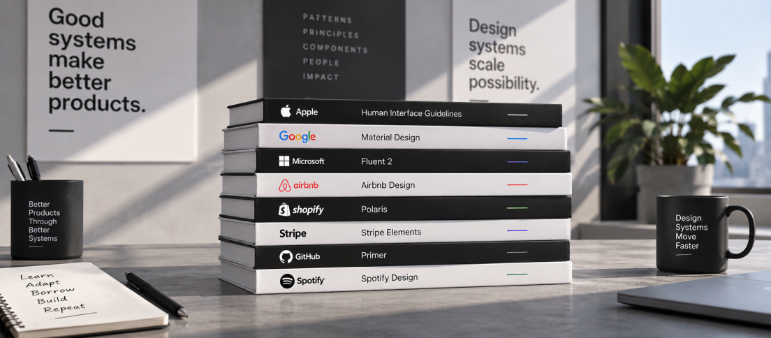
Design-system inspiration has a bad habit of turning into visual tourism. Teams browse Material, Carbon or Polaris, admire the typography, inspect a component page, borrow a naming convention and come away believing they have studied the system.
They have usually studied the surface.
The systems worth learning from in 2026 are interesting for a different reason. They show what happens after the component library becomes important enough to carry organisational weight. They have to evolve without breaking thousands of product decisions, absorb new technologies, support accessibility across huge audiences, create contribution rules, map design to production and increasingly expose enough structure for AI agents to use them correctly.
A design system worth studying teaches you how it changes, not merely how it looks.
This is not a ranking of the “best” design systems. It is a reading list. Each of the six systems below is useful because it exposes a different part of the operating model that our DesignWhine Guide to Design Systems argues matters more than the library itself. If you are building that operating model from scratch, our guide to building a design system teams actually use turns those principles into a practical sequence.
| Design System | Study It For | The 2026 Lesson |
|---|---|---|
| Material 3 | System evolution at massive scale | A mature system can become more expressive without abandoning structure |
| Carbon | AI transparency and machine-readable infrastructure | AI can become a governed product state, not a decorative layer |
| Shopify Polaris | Design system as platform runtime | Components, releases and product surfaces can become one distribution model |
| Atlassian Design System | Token-driven migration | Semantic foundations make large visual change survivable |
| GOV.UK Design System | Evidence-based governance | Shared components should earn their place through user need and reuse |
| GitHub Primer | Accessibility, contribution and AI tooling | Consistency should support product work rather than suffocate it |
Material 3: Evolve Without Freezing
Material Design is easy to dismiss precisely because it is so familiar. Its components have influenced a generation of Android products and design kits. That ubiquity can make it feel less like a living system and more like design-system wallpaper.
Material 3 Expressive makes it interesting again.

At Google I/O 2026, Material positioned its latest work around expressive, adaptive products: more vibrant colour, motion physics powered by tokens, flexible typography, contrasting shapes and a Compose-first Android direction. The important part is not the aesthetics. It is that Google is showing how a system with enormous installed weight can deliberately become more emotional without discarding the primitives that make it scalable. (Source: Material Design.)
That is a useful correction to a common design-system instinct. Mature systems often become visually conservative because every expressive decision is seen as a threat to consistency. Material 3 Expressive argues that consistency does not require personality to be frozen. A system can establish stronger motion, shape and type while still expressing those choices through reusable rules and tokens.
Study Material for: how to evolve the visual language of an established system without turning the redesign into a local rebrand exercise.
Carbon: Make AI a System State
IBM Carbon has long been worth studying for breadth: working code, design resources, human-interface guidance, open-source contribution and support across multiple frameworks. In 2026, however, its most interesting work sits around AI.
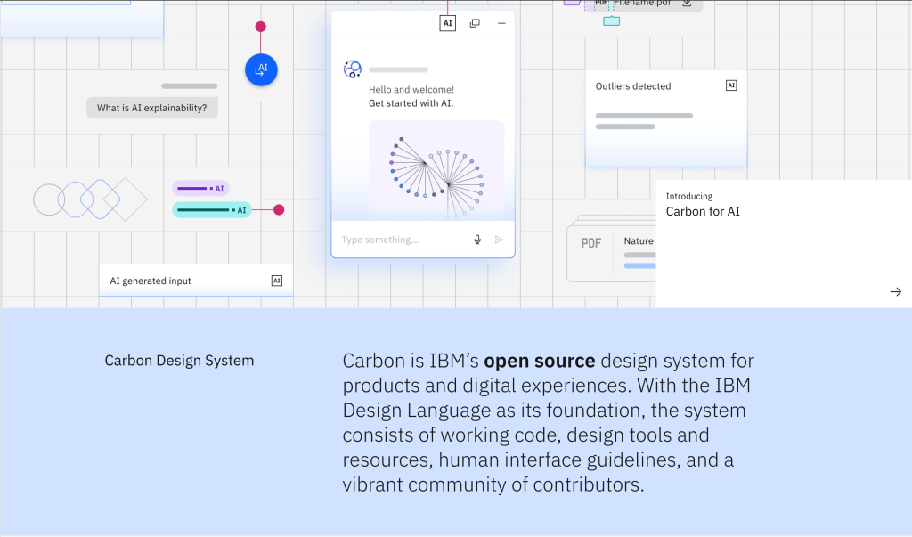
Carbon for AI does something more disciplined than adding a sparkle icon to generated features. It defines a distinct visual and behavioural identity for AI, requires explicit labelling, builds explainability into components and gives AI states their own tokens while preserving the core Carbon language. Its roadmap goes further: Carbon Next describes v12 as being prepared for generated interfaces, AI agents, reusable instructions and guardrails, while Carbon now also exposes system knowledge through MCP. (Sources: Carbon Next; Carbon MCP.)
The lesson is not “add AI components”. It is to treat AI as a new product condition that needs system-level rules for presence, trust, explainability and reversal. That is much closer to what our AI-ready design-system guide argues: machines need structured context, but humans also need visible signals about what the machine did.
Carbon for AI does something more disciplined than adding a sparkle icon to generated features.
The strongest AI design-system work is not about making AI look futuristic. It is about making AI behaviour legible.
Study Carbon for: how a system incorporates an entirely new interaction paradigm without creating a parallel design language.
Polaris: Turn the System Into Runtime
Shopify Polaris is one of the clearest examples of a design system becoming more than documentation and downloadable components. The current Polaris architecture is built around unified web components that render across Shopify surfaces and inherit the platform’s design language by default.
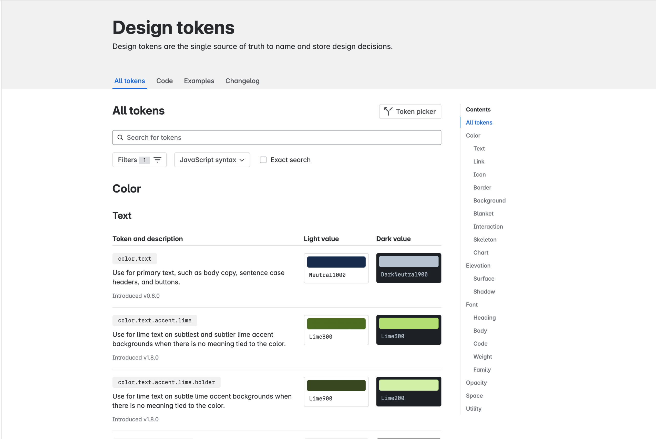
For app developers, Polaris is automatically available through Shopify’s tooling, and the same web-component model now spans multiple product surfaces. In August 2026 Shopify also moved the Polaris CDN to semantic versioning, separating major breaking releases from compatible minor improvements and allowing teams to choose between automatically tracking a stable major or pinning an exact release. (Source: Shopify; Shopify developer changelog.)
This matters because a design system begins to behave like platform infrastructure once its release model affects every extension, app surface and consumer. The system is no longer simply advice about what a button should look like. It controls how that button is delivered, updated and constrained.
Study Polaris for: what happens when a design system becomes part of the runtime contract between a platform and the people building on top of it.
Atlassian: Migrate Through Meaning
Large design-system changes are often less about creating the new thing than surviving the migration from the old one. Atlassian is especially useful to study here.
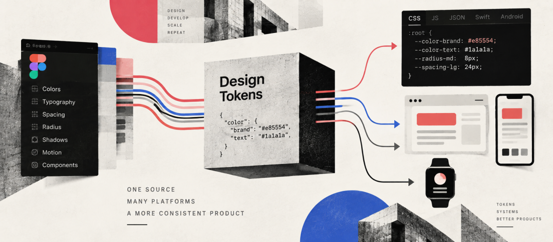
Its design tokens are explicitly described as the single source of truth for repeated visual decisions. Rather than asking teams to choose a particular blue or shadow, token names encode intent such as success, emphasis or surface roles, allowing themes and visual foundations to change underneath them. Atlassian’s token model supports light, dark and high-contrast themes and is backed by migration tooling in Figma and product code. (Source: Atlassian Design System.)
This is the practical version of the argument we made in Design Tokens Are Becoming the API of Design. A semantic token is valuable because a consuming product depends on meaning rather than a literal visual value. That gives the system room to evolve.
Atlassian is also notable for beginning to package design-system context for AI-assisted development. Its internal agent skills cover components, tokens, accessibility, migrations, styling and even a design-md layer for visual direction. The exact tooling is internal, but the model is revealing: system knowledge is being turned into reusable machine context rather than left as documentation that an agent may or may not discover. (Source: Atlassian.)
Study Atlassian for: how semantic foundations make large-scale visual migration and agent-assisted implementation less fragile.
GOV.UK: Make Components Earn Their Place
GOV.UK may be the least glamorous system on this list, which is exactly why product teams should study it.
Its contribution criteria make system governance unusually explicit. A proposed component or pattern has to be useful beyond one service and unique enough not to duplicate what already exists. Before publication, it must be shown to be usable, consistent and versatile, including evidence from user research, people with disabilities, different browsers, assistive technologies and devices. (Source: GOV.UK Design System.)
That is a very different standard from “three teams asked for it”. It makes contribution an evidence problem rather than an influence problem.
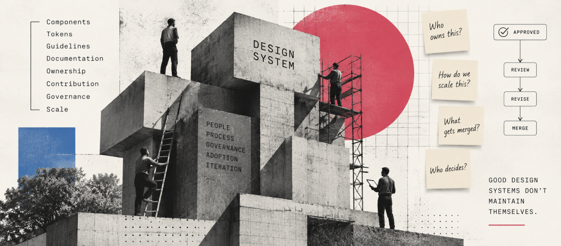
It also exposes why design-system governance is more than review meetings. Good governance decides what deserves to become shared infrastructure, what should remain local and what evidence is required before the organisation commits to maintaining something indefinitely.
The best contribution model is not the one that accepts the most ideas. It is the one that makes shared decisions expensive enough to deserve permanence.
Study GOV.UK for: contribution criteria, accessibility evidence and the discipline to keep local product needs from automatically becoming global system debt.
Primer: Standardise Without Suffocating
GitHub’s Primer is useful because it combines unusually strong accessibility infrastructure with a pragmatic attitude toward product experimentation.
Primer defines a common language for cohesive, accessible and responsive GitHub experiences, but its guidance for new patterns explicitly leaves room for local ideas that are not yet ready for the shared system. The goal is not to force every interface to be assembled only from existing components. Teams can ship a new pattern if it is accessible, visually consistent and high quality, while the system separately decides whether the pattern deserves to be upstreamed. (Source: Primer.)
That is a healthy answer to one of the tensions in Your UI Kit Is Not a Design System: a system should standardise what deserves to be shared without becoming a veto on product design.
Primer is also moving system knowledge directly into AI workflows. Its MCP server exposes components, patterns, accessibility guidance, token specifications and even CSS linting to agents. It can review alt text, retrieve component examples and give coding guidance from the system itself. (Source: Primer.)
Study Primer for: the balance between accessibility, contribution, product autonomy and machine-readable system guidance.
What These Systems Have in Common
The visual languages are very different. The operating patterns are not.
- They have a boundary. Not every local need becomes a shared component.
- They connect design to implementation. The system is not allowed to end inside Figma.
- They encode intent. Tokens, patterns and naming preserve meaning rather than only values.
- They invest in accessibility before the final screen. Accessibility lives in foundations, components, contribution rules and testing.
- They have a model for change. Releases, migration and deprecation are system concerns.
- They are making system knowledge more machine-readable. MCP, agent skills and structured guidance are becoming part of design-system infrastructure.
That last point may be the most important change in 2026. A few years ago, design-system maturity meant making the library easier for designers and developers to use. The frontier now includes making the same decisions legible to software without reducing the system to a pile of machine-friendly tokens.
Do Not Copy the Components
The least useful thing you can do with this list is copy the components.
Your product probably does not need Material’s visual expression, Carbon’s AI glow, Shopify’s extension model, Atlassian’s exact token grammar, GOV.UK’s contribution process or GitHub’s density. Those choices emerged from different products, users, organisations and technical constraints.
Study the decisions underneath them instead. How does the system decide what becomes shared? How does it preserve accessibility? How does it migrate? How does code stay connected? How does local innovation get absorbed without creating chaos? How is knowledge exposed to agents without surrendering governance?
Those questions are also useful diagnostics. Our analysis of why design systems fail shows what happens when the same operating mechanisms break down: contribution becomes too slow, code drifts, ownership disappears, documentation loses trust and local workarounds become easier than the shared path.
That is what makes a design system worth studying. Not the number of components in the sidebar, but the quality of the machinery behind them.



Which design system has taught your team the most, not visually, but in how it handles governance, migration, accessibility, contribution or design-to-code?