


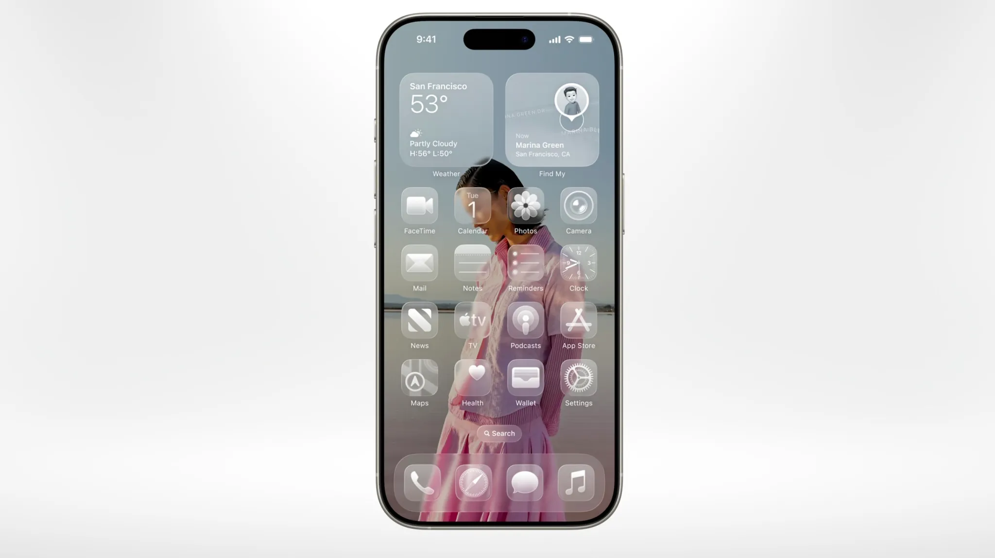
Liquid Design is back in the news, although Apple still calls the system Liquid Glass. As iOS 27 arrives on September 14, Apple is revisiting the visual language it introduced with such confidence at WWDC 2025. The company now says the latest version improves readability through more uniform refraction and better contrast, sharpens icons, and adds a slider that lets users move Liquid Glass from ultra-clear to fully tinted.
That is an unusually revealing update. Last year, Apple presented Liquid Glass as the new visual foundation for its platforms. This year, it is giving users a control to decide how much of that foundation they actually want. Apple’s own iOS 27 page frames the changes as refinements for readability. Its Human Interface Guidelines now tell developers to use Liquid Glass sparingly, avoid it in the content layer, and reserve the clearest version for visually rich backgrounds.
In other words, the design is being constrained by the usability problems it created. That makes this a good moment to return to a question DesignWhine raised during our WWDC 2025 coverage of Liquid Glass: what happens when Apple’s taste for visual drama starts competing with the basic obligations of an interface?
The Apple Design Halo
Apple deserves much of its design reputation. The original iPhone simplified mobile computing. Multi-touch became intuitive enough to disappear into habit. The MacBook’s hardware-software integration remains difficult to match. Apple is unusually good at making complex systems feel coherent.
The problem is what happens after a reputation becomes a presumption. Apple no longer has to prove every design decision from zero. A new interaction arrives already surrounded by decades of institutional credibility, immaculate launch films, disciplined industrial design and a global fan culture ready to interpret friction as intention. When another company creates an awkward interaction, we call it awkward. When Apple does it, we often search for the hidden genius.
Apple’s greatest UX advantage may also be its most dangerous one: users and designers are unusually willing to assume the friction is intentional.
That is the myth worth challenging. Great industrial design does not automatically produce great user experience. Visual coherence is not the same as discoverability. Premium materials are not the same as ergonomics. Fewer controls are not automatically simpler. And forcing users to learn around a constraint does not transform that constraint into good UX.
Liquid Glass Repeats an Old Mistake
The core problem with Liquid Glass is not transparency itself. Transparency can communicate depth and hierarchy. The problem is that a visual effect becomes an interaction problem when it weakens the boundary between control and content.
Nielsen Norman Group’s usability analysis of iOS 26 identified precisely that tension. Floating controls could fade into their backgrounds, search bars could interfere with content, and navigation lost contextual cues such as labelled back buttons. The interface looked lighter while asking users to do more interpretive work.
This is not new territory for Apple. In 2013, Nielsen Norman Group’s assessment of iOS 7 warned that Apple’s shift toward flat design weakened affordances, made actionable elements harder to distinguish from content and increased gesture ambiguity. More than a decade later, the aesthetic vocabulary has changed from flatness to glass, but the underlying temptation is familiar: remove visible structure because visible structure looks inelegant.
UX does not care whether a control is beautiful in a keynote. It cares whether people can recognise it, understand its state, predict its behaviour and recover when they make a mistake. Those are less glamorous standards, but they are the ones interfaces live or die by.
The Magic Mouse Problem
The cleanest physical example is still the Magic Mouse charging port. Apple moved the mouse to USB-C but kept the charging port on its underside. Apple’s own support documentation confirms the consequence: unlike the Magic Keyboard and Magic Trackpad, the Magic Mouse cannot be used while charging.
Defenders will point out that it charges quickly and needs charging infrequently. Both things can be true. Neither changes the interaction principle. The product imposes complete task interruption because the charging solution preserves the uninterrupted visual surface of the object.
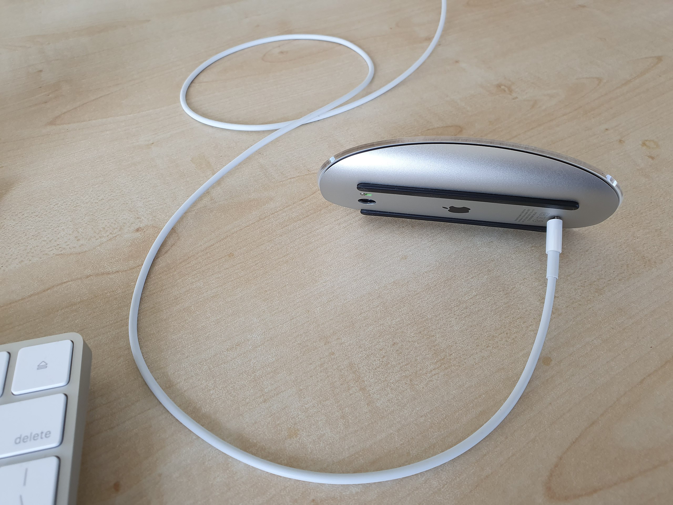
This is where Apple’s design halo becomes visible. Instead of asking why a desktop input device should become unusable during a routine maintenance state, the discussion often shifts to why the user should have remembered to charge it earlier. The burden of a product decision is quietly transferred to user behaviour.
Thinness Was Not Usability
The butterfly keyboard was the same instinct at a much larger scale. Apple introduced the mechanism to enable thinner laptops. The resulting keyboards became notorious for stuck, repeating and unresponsive keys, eventually producing a repair programme, multiple redesign attempts and a settlement before Apple returned to a scissor-switch mechanism.
That episode matters because it exposes a recurring design hierarchy. Thinness is measurable on a specification sheet and beautiful in a side-profile photograph. Reliability is experienced slowly, privately and repeatedly by the person trying to type. When those values conflict, a genuinely user-centred product should make the boring thing win.
Apple eventually corrected the keyboard, just as it is now correcting Liquid Glass. Iteration is healthy. The criticism is not that Apple makes mistakes. Every product organisation does. The criticism is that Apple’s mistakes are often granted a period of aesthetic deference in which users are asked to reinterpret obvious friction as courageous design.
Discoverability Keeps Losing
Apple has repeatedly pursued interaction models that reduce visible interface at the cost of discoverability. 3D Touch was technically impressive but depended on users knowing that pressing harder on an apparently ordinary element might reveal another layer of interaction. Nielsen Norman Group found the gesture physically demanding in some contexts and vulnerable to accidental dismissal. Apple eventually removed the pressure-sensitive hardware and replaced much of the interaction with long-press context menus.
Stage Manager on iPadOS offered another version of the same problem. MacStories’ detailed review described window controls that were inconsistent, difficult to discover and sometimes hidden behind unexpected flows. Apple later rebuilt iPad multitasking around a more conventional windowing model. Again, novelty was eventually pulled back toward established interaction grammar.
Then came the iOS 18 Photos redesign. Apple replaced familiar tabs with a unified scrolling surface filled with collections and automatically generated groupings. Users complained about clutter, lost navigation landmarks and difficulty finding familiar destinations. During beta and point releases, Apple removed the carousel and restored behaviours such as familiar zoom navigation.
There is a useful lesson here for designers. Familiarity is not laziness. Stable navigation is not visual baggage. Recognition is often better than recall because people should not have to continually reconstruct the information architecture of software they use every day.
Vision Pro Made Beauty Heavy
Apple’s spatial-computing work shows the same tension at the level of the body. Our Vision Pro versus Meta Quest 3 comparison praised Apple’s visual fidelity, hand tracking and interface polish, but the industrial-design trade-off was difficult to ignore. The glass and aluminium that made Vision Pro feel expensive also contributed to the weight sitting on a user’s face.
WIRED documented complaints around weight and comfort, while our later analysis of the first-generation Vision Pro’s market struggles argued that technical sophistication could not overcome ergonomics, price and weak everyday use cases. This is a fundamental UX point: the body is part of the interface. A headset can have extraordinary pixels and still fail an experience if people do not want to keep wearing it.
Liquid Glass itself emerged from Apple’s spatial-computing visual language. That lineage is revealing. Translucency, layered surfaces and environmental context make intuitive sense when digital objects literally occupy space around you. Moving that language across phones, tablets and desktops may create ecosystem consistency, but consistency is not automatically appropriateness. Different devices have different input methods, distances, lighting conditions and cognitive demands.
A design system becomes dogma when consistency across products matters more than appropriateness to the product in front of the user.
Good Engineering Cannot Solve Social UX
The problem is not always visual. Our recent piece on Apple Watch Series 12 and ambient listening found Apple doing many technical things correctly. Audio Intelligence uses unusually strong privacy architecture, including hardware-isolated processing and tightly controlled handling of raw audio.
Yet the UX question extends beyond the owner. If a wearable can interpret conversations happening around it, bystanders become participants in the interaction. Cryptography can protect data, but it cannot tell the person across the table what the watch is doing in a socially legible way. Apple’s engineering strength does not exempt it from the harder human problem.
This matters to the broader myth because Apple products are frequently evaluated from the perspective of what the device can accomplish rather than what the surrounding humans must understand, tolerate or adapt to. Good UX is not simply the elimination of technical friction for the purchaser. It includes context, consent and the people the interface indirectly affects.
Apple Can Still Do Great UX
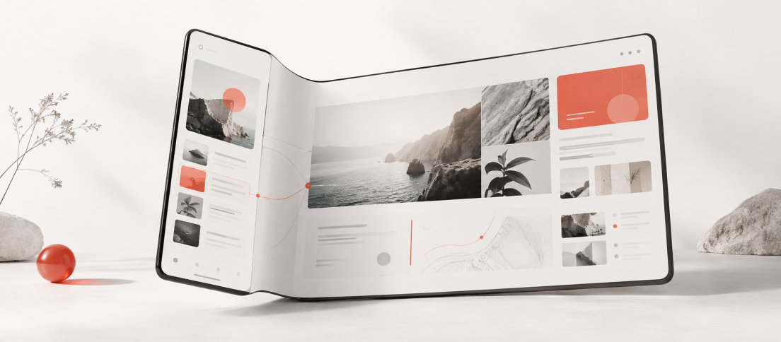
None of this requires pretending Apple is bad at design. In fact, our analysis of the iPhone Duo shows why that would be lazy. Apple’s first foldable treats the fold as an interaction state rather than merely a hardware spectacle. Controls reposition around posture, layouts adapt between screens, multitasking responds to the larger canvas and the device tries to preserve continuity between closed and open states.
That is precisely the distinction this argument needs. Apple is capable of excellent UX when the design begins with continuity, context and user behaviour. The problem comes when the company’s enormous confidence in its aesthetic language encourages everyone else to suspend the same criticism they would apply to another product.
The fan culture around Apple is understandable because the company has earned real loyalty. But loyalty becomes analytically useless when every inconvenience can be rationalised after the fact. If a less glamorous company shipped a mouse that had to be turned upside down to charge, a keyboard made unreliable in pursuit of thinness, a photo app that removed familiar navigation, or an interface whose transparency needed an accessibility setting to tame it, designers would not spend quite so much time explaining why users simply needed to adjust.
Liquid Glass Is the Test
iOS 27 does not prove Liquid Glass was a failure. The better interpretation is that Apple has spent a year discovering the boundaries of its own idea. Contrast has been strengthened. Refraction has been made more uniform. Users can tint the glass. Developers are explicitly told to use the material sparingly. These are sensible corrections.
But they also make the original criticism harder to dismiss. If readability has to be restored, hierarchy has to be restrained and transparency has to become adjustable, then the early objections were not merely resistance to change. They were UX concerns doing exactly what UX criticism is supposed to do.
The useful question is therefore not whether Apple still makes beautiful products. It plainly does. The question is whether beauty has become too persuasive a proxy for usability, especially inside the design community. Apple should be held to a higher standard precisely because its choices become defaults copied by thousands of teams.
Great UX is not what Apple ships. Great UX is what survives the same scrutiny we would apply if the logo were missing.



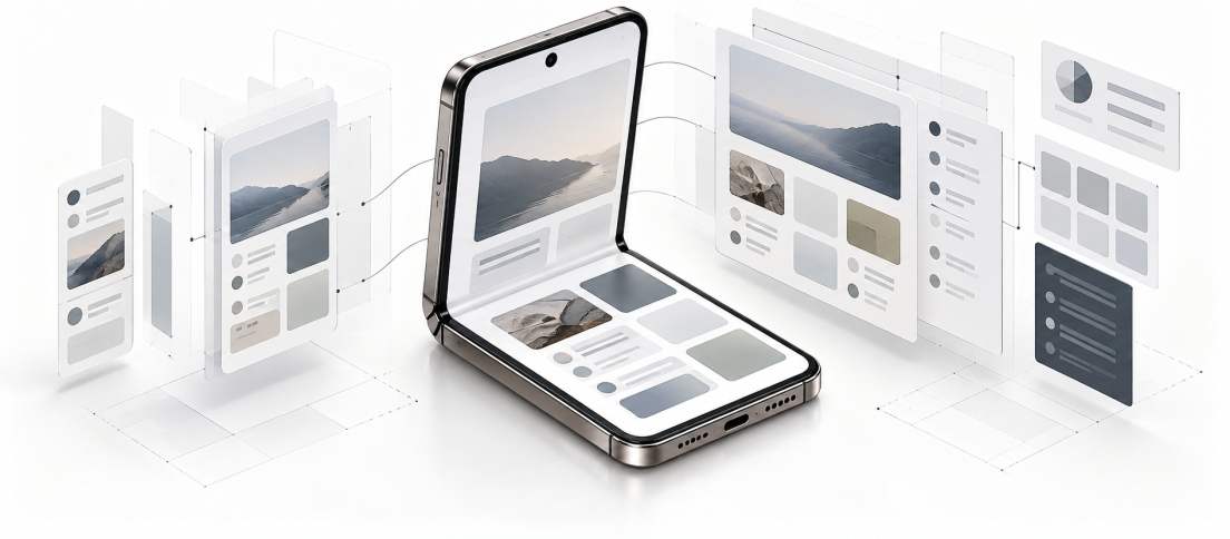


Apple has earned its design reputation. But does that reputation sometimes stop us applying the same UX standards we would use on everyone else? Liquid Glass, Magic Mouse, Vision Pro, Photos and the butterfly keyboard make an interesting pattern.