

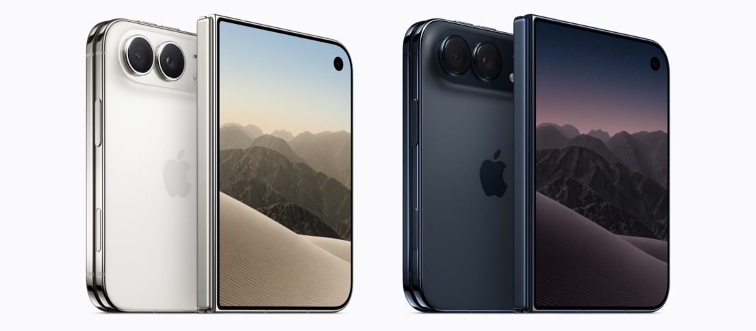
Apple has finally made a foldable iPhone. The iPhone Duo, announced on September 9, opens from a compact 5.4-inch outer display into a 7.6-inch inner screen and starts at $1,999. Pre-orders begin October 16, with availability from October 23.
That makes it easy to treat the Duo as a hardware story: Apple is late, Samsung has been folding phones for years, and the hinge wars have already moved through several generations. For the longer arc, our complete history of foldable phones traces how those hardware and interaction ideas evolved before Apple arrived. But for DesignWhine, the more interesting question is whether Apple has solved the problem we raised in our 2025 look at foldable smartphones. We argued then that the category had become a triumph of engineering without a convincing everyday reason to exist.
We are not reversing that argument simply because Apple has arrived. We have not used the iPhone Duo yet, so this is not a review. It is an analysis of Apple’s design choices, developer guidance and the first hands-on reports. The question is narrower and more useful: has Apple finally turned the fold from a mechanical trick into an interaction model?

The Smartest Choice Is Boring
One of Apple’s most consequential decisions is also one of the least spectacular: the outer and inner displays use the same aspect ratio. Apple says content therefore scales proportionally as the phone opens and closes. That sounds like a specification until you remember how much friction early foldables created when interfaces jumped between radically different shapes.
The value is continuity. A user should not have to mentally re-map an app because the hardware changed state. Early hands-on coverage from The Verge highlights the seamless transition between screens and a crease that is far less intrusive than the category’s early devices. Tom’s Guide similarly described the software response to changing angles as unusually polished, while noting that the crease is still visible.
Apple’s most important foldable innovation may be making the fold feel less like an event.
That matters because the best interaction transitions often disappear into muscle memory. The fold should not demand attention every time. It should simply reveal more space when the user wants it.
Early hands-on coverage from The Verge highlights the seamless transition between screens and a crease that is far less intrusive than the category’s early devices.
The Interface Is the Real Fold
This is where the Duo begins to separate itself from the old foldable pitch. Apple has redesigned parts of iOS 27 around the device rather than stretching a normal phone interface across a bigger rectangle. Lock Screen controls, app navigation, toolbars, the Dynamic Island and the status area can move to the side, preserving vertical space and keeping frequent actions closer to the thumb.
Apple’s new Human Interface Guidelines for iPhone Duo are revealing. Developers are told to design for resizing, use size classes rather than fixed screen assumptions, preserve functionality across poses and maintain information hierarchy between the outer and inner displays. Mail, for example, can show a single message when closed and a list-plus-detail view when open.
This is much closer to responsive product design than to the old “phone becomes mini tablet” story. It also fits a broader shift we have been watching across interfaces, including our recent look at Android experiences that adapt to bodies and surroundings. The interface is increasingly expected to respond to context rather than force the user into one fixed posture.

Multitasking Finally Has a Chance
Last year, we were skeptical of foldable multitasking because putting two cramped apps beside each other often felt like a demo designed to justify the hinge. Apple’s implementation is more credible. iPhone Duo can run two apps side by side, open two windows of the same app, save app pairs and keep Siri AI visible alongside the content being discussed.
None of this is revolutionary on larger devices. iPad users have lived with multi-window ideas for years. The difference is that the Duo makes the transition between quick phone use and a denser workspace part of one continuous object. That may prove more useful than the raw screen size itself.
The developer ecosystem is also arriving earlier than it did for many Android foldables. Apple says Netflix, Zoom and Slack already have Duo-specific experiences. Whether the long tail of apps follows is still an open question, but Apple is at least giving developers a clear layout model instead of asking them to invent one for every posture.
The Hinge Becomes an Input
The more persuasive Duo ideas are the ones that use the hardware state itself. Partially fold the device and it can sit on a table for FaceTime, video, workouts or StandBy. The outer screen can become a live camera preview for the person being photographed. Duo FaceTime can place people on opposite displays. These are small interactions, but they finally make the second screen and hinge do something other than create more pixels.
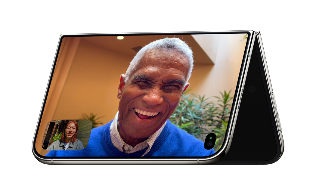
The question is no longer whether Apple can make a good foldable. It is whether folding can become a habit rather than a novelty.
The Old Problems Have Not Vanished
A $1,999 starting price still makes the Duo a luxury experiment for most people. Touch ID replaces Face ID, a compromise that looks suspiciously like the hardware dictating the authentication experience. Durability claims are strong, including IP68 protection and a reinforced inner display, but long-term foldable reliability is something launch-day demonstrations cannot prove.
And the biggest uncertainty is still behavioural. A device can offer beautifully adaptive layouts without creating a new reason to unfold it. Apple has a history of making hardware and software feel inseparable, something we have also examined through the influence of Jony Ive’s product philosophy in the age of AI hardware. But polish is not the same as necessity.
Apple Has Changed the Test
Our 2025 verdict on foldables was deliberately harsh: impressive technology, uneven design execution and a product category still searching for a genuine user need. The iPhone Duo does not invalidate that verdict. It makes the test more demanding.
It also matters to our broader critique in Liquid Design and the Myth of Apple’s Great UX. Apple should not receive automatic credit simply because a design decision looks polished. The Duo is useful precisely because it shows the other side of that argument: when Apple earns the praise through continuity, context and interaction design, the difference is visible.
For the first time, a major foldable launch is less interesting for its hinge than for its state transitions, adaptive controls, posture-aware software and the ways two screens can cooperate. Apple has not proved that everyone needs a folding phone. It may, however, have produced the first foldable that understands the UX problem well enough to ask the right question.






Last year, we argued that foldables were engineering triumphs still searching for a user problem. iPhone Duo is the first device that makes us reconsider that, not because the hinge is better, but because iOS treats the fold as part of the interaction model. Would you actually use it differently from a normal iPhone?