
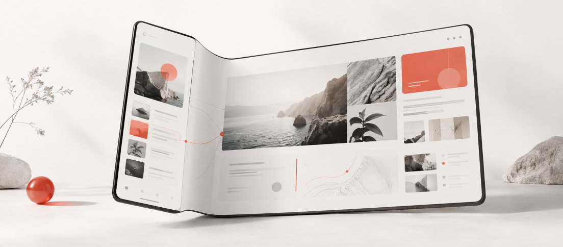
Most foldable UX advice starts too late. It tells teams how to adapt a screen after they have already decided the product deserves a foldable treatment. The harder and more useful question comes first: when does a foldable actually make the product better?
That is the question most foldable articles glide past. They move quickly to hinges, breakpoints, Flex Mode and resizable layouts, as if every product naturally benefits from a screen that can open like a book. In reality, many do not.
A foldable phone is not just a small tablet hidden inside a phone. It is a device that changes the cost of switching context in the middle of a task. On a conventional mobile screen, product teams constantly make one compromise: if two things cannot coexist, the user must move between them. On a foldable, that compromise becomes negotiable.
That is why the real foldable design problem is not “how should this screen respond when opened?” It is whether the product has any task that becomes meaningfully better when more context can stay visible at the same time.
We recently argued that the iPhone Duo could break conventional responsive design systems because the old phone-tablet-desktop ladder assumes a stable canvas that no longer exists. This guide takes that argument further. It is not just about how to adapt layouts. It is about how to decide whether the adaptation is worth building at all.
Foldables are valuable when they reduce the navigation, hiding and remembering that small screens force on users.
Why Most Foldable UX Advice Feels Thin
Much of it describes interface behavior without offering a product thesis. Yes, a list can become a two-pane layout. Yes, a half-open phone can separate content from controls. Yes, Android apps should respond to current window size rather than fixed device assumptions. All of that is true. It is also not enough.
Designers do not need another article telling them to be responsive. They need help deciding where a foldable creates actual value. Otherwise the result is predictable: a product opens into a larger screen, the cards stretch, the margins widen, a few controls remain visible, and everybody politely calls it optimized.
Google’s current adaptive app guidance is right to focus on window size, resizability and large-screen continuity. Samsung’s foldable design guidance is also useful on posture and continuity. But teams still need an editorial layer on top of the platform layer: what kinds of products deserve a serious foldable strategy and what kinds merely need competent adaptation?

The Foldable Value Test
A product is a strong foldable candidate when unfolding improves at least one of these four things:
- Simultaneous context: the user benefits from seeing two related things at once instead of moving between them.
- Reduced navigation cost: the product becomes meaningfully faster when one or two transitions disappear.
- Creation with reference: the user needs to make something while seeing source material, tools or supporting context beside it.
- Hands-free or posture advantage: the physical posture of a partially folded device changes ergonomics in a useful way.
If a task satisfies none of those conditions, it probably does not need a foldable-specific concept. It still needs to behave well when the window changes size, but the product value lies in adaptation, not reinvention.
The goal is not to prove that the product works on a foldable. The goal is to prove that unfolding was worth doing.
Where Foldables Actually Earn Their Keep
Some categories repeatedly benefit from the extra context a foldable can preserve. Not because the screen is larger, but because the task itself is split across related information.
| Product Category | Why Foldables Help | Useful Unfolded Pattern |
|---|---|---|
| Inbox, CRM, messaging and support tools | Users need to move quickly between a collection and the selected item | List plus detail, or thread plus supporting context |
| Maps, travel and place discovery | The user benefits from keeping geographic context visible while exploring details | Map plus details, filters or itinerary context |
| Document, research and knowledge tools | Creation often depends on source material, comments or references staying nearby | Primary content plus comments, notes or source pane |
| Admin, analytics and operational dashboards | Users need metrics, filters and drill-down context without repeated menu hops | Main dashboard plus persistent filters or side analysis |
| Camera, video and calls | Half-open posture can improve ergonomics and separate content from controls | Content above, controls below |
Notice what these categories share. They all contain a relationship that mobile usually serializes. The user wants both pieces of the relationship at once, but a narrow phone has to hide one of them. A foldable changes that equation.
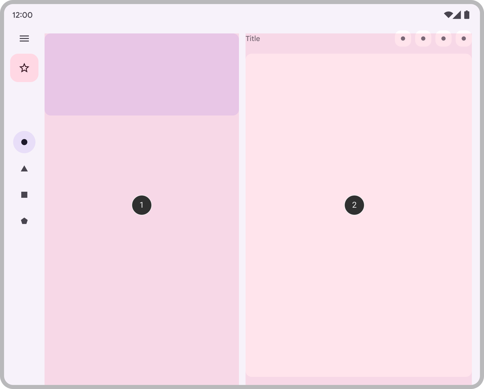
Take a project-management product. On a normal phone, a user sees a task list, opens a task, then opens comments or attachments, then returns to the task list. The sequence is survivable, but it is also noisy. On a foldable, the list can remain visible, the selected task can become the main pane, and attachments or comments can appear as a supporting region when enough width exists. The unfolded state is better not because it shows more pixels, but because it removes several small acts of context reconstruction.
Where Foldables Still Do Not Matter Much
Some products are still primarily narrow-flow experiences. A basic onboarding journey, a simple payments flow, a lightweight utility app, a routine settings section or a linear media feed may gain a nicer layout when expanded, but not a deeper product advantage.
That does not mean these products should ignore foldables. It means they should not overinvest in foldable theatre. If the task remains fundamentally sequential, the job is to preserve continuity, readability and sensible density, not to invent an elaborate two-pane concept for its own sake.
This is where many foldable demos become unconvincing. They show more columns, more card width or a rearranged toolbar, but no reduction in effort. Designers should be skeptical of unfolded layouts that feel visually busier without changing the underlying task.
The Three Decisions That Matter Most
Once a team knows the product has genuine foldable potential, three design decisions do most of the work.
Continuity
Folding and unfolding should feel like a workspace changing shape, not like the user being teleported between product versions. Scroll position, selected item, entered text, playback position, open draft state, filters and validation state should survive. Samsung is explicit about this in its foldable guidance, and Android’s adaptive quality expectations make the same point from a platform perspective.
A good design review question is brutally simple: if the user unfolds the device at this exact moment, what is the one thing the interface must not make them find again?
Simultaneous Relationship
When more width appears, what relationship becomes worth keeping visible? List and detail? Content and controls? Document and comments? Map and place details? Video and chat? That answer determines whether the product should become a multi-pane experience or simply remain a better spaced single-pane one.
This is the most strategic foldable decision. If the relationship is weak, the expanded layout will feel decorative. If the relationship is strong, the product suddenly feels more intentional.
Posture
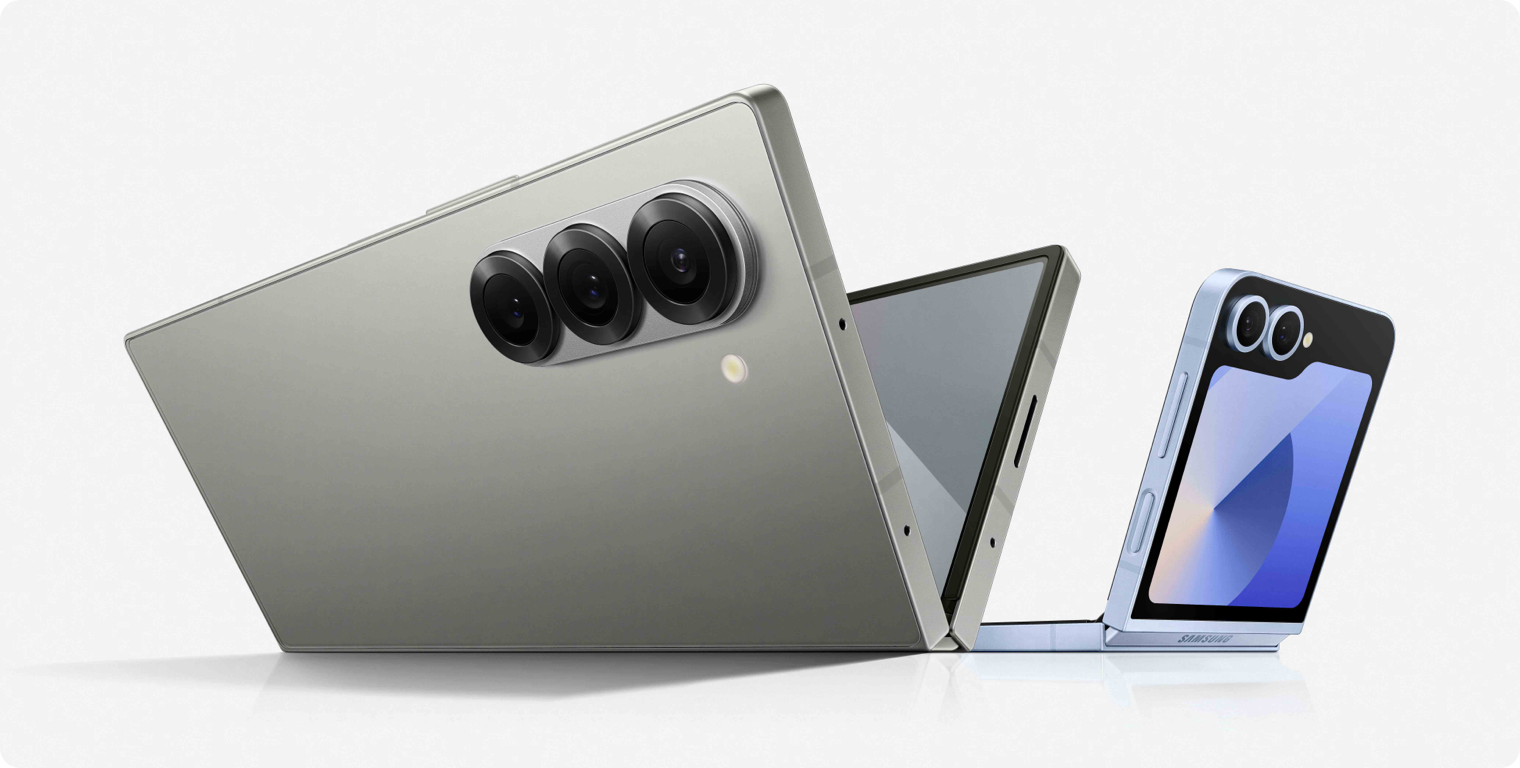
Half-open and tabletop states are where foldables become physically different devices, not just larger canvases. But posture-specific layouts should only exist when posture changes ergonomics or attention flow in a useful way. Camera, video, calling, certain reading experiences and some gaming or creation flows can benefit. Many settings screens and forms cannot.
Design The Hinge Like A Constraint, Not A Feature
The hinge is often over-romanticized. In most serious products it is not a source of delight so much as a region of risk. Text can become awkward across it. Controls can land in an uncomfortable zone. Dialogs can open badly. Small actions can feel fragile if placed too close to a separating fold.
The better mental model is to treat the fold as a dynamic gutter. Sometimes it is merely something to avoid. Sometimes it becomes the perfect boundary between two panes. But it should rarely dictate the whole design concept. The product task should do that.
A Better Figma Approach
Most foldable design systems fail when they start with device artboards. They end up producing “Fold closed,” “Fold open,” “Split screen,” “Landscape fold” and a long tail of variants that describe hardware more than behavior.
A better approach is to model semantic layout states. Use Auto Layout, Fill Container, min and max dimensions, nested containers and variables to define Compact, Medium and Expanded behavior. The question is not “what does the Fold frame look like?” It is “when does this component stop stretching, when does the supporting pane appear, when does navigation become a rail, and which pane disappears first when space shrinks again?”
This is exactly the kind of systems thinking we highlighted in The Design Systems Worth Studying in 2026. Good systems describe how interfaces behave when context changes. Foldables simply make weak behavior visible faster.
A Monday-Morning Audit For Product Teams
If a product team wants to know whether foldable optimization deserves serious attention, this is the fastest useful audit:
- Pick one critical journey. Do not audit the whole product. Choose a single high-frequency task.
- Map every time the user navigates away, opens a drawer or hides context. That is the current tax imposed by limited space.
- Ask what two things would be most valuable to keep visible together. If the answer is weak, the product may only need adaptive resizing.
- Test whether the unfolded state removes effort or merely rearranges UI. Fewer taps, less memory load and faster completion are the real signals.
- Shrink the app again into split-screen. If the whole concept breaks once width becomes scarce, it was never truly adaptive.
- Only then explore posture-specific behavior. Tabletop modes should solve a real ergonomic problem.
This is also where teams should borrow from our earlier Apple foldable UX analysis and our history of foldable phones. The big industry mistake has never been a lack of hardware ambition. It has been a lack of software experiences that explain why the shape matters.
The best foldable products do not celebrate the fold. They quietly remove friction that ordinary mobile layouts trained us to accept.
How To Measure Whether It Worked
A foldable-ready product should come with a product hypothesis. If a second pane is meant to reduce navigation, measure navigation reduction. If a wider workspace is meant to speed up review or creation, compare task completion time. If posture is meant to improve hands-free use, measure session quality or control interaction. Expanded layouts that cannot be tied to a better outcome are usually just more expensive layouts.
The fold itself is not a metric. Better task performance, lower context loss and reduced interaction cost are.
What Foldables Are Really Teaching Designers
The larger lesson of foldables is not about foldables alone. It is that our old idea of responsiveness was often too visual and not behavioral enough. We became good at resizing components. We were less rigorous about asking what extra space should actually do for the user.
That is why this topic matters even for teams whose foldable audience is still tiny. The same design decisions improve tablets, desktop Android, split-screen use and other hybrid contexts. Foldables simply force those questions into the foreground because they make the changing workspace impossible to ignore.
In that sense, foldables are not a hardware niche. They are a design stress test. They reveal whether a product knows how to preserve continuity, expose useful relationships and adapt without losing its mental model. When those things are true, the unfolded state can feel quietly inevitable. When they are not, a foldable app is just a stretched phone trying to look modern.
Foldable UX: Common Questions
Short answers to the questions product teams usually run into first.
What is foldable UX design?
Foldable UX design is the practice of designing products that remain coherent across folded, unfolded, partially folded and multi-window states. The goal is not just visual responsiveness but continuity, context preservation and better task performance when more space becomes available.
Do all apps need a special foldable strategy?
No. Every app should adapt well to changing window sizes, but only some products gain meaningful value from an unfolded workspace. The strongest candidates are products where two related contexts become more useful when they remain visible together.
What is the biggest mistake teams make with foldables?
Treating the unfolded state like a stretched phone. If extra space does not reduce navigation, preserve more context or improve ergonomics, the design may be adaptive in appearance but not valuable in practice.
How should designers prototype foldables in Figma?
Model semantic states such as Compact, Medium and Expanded rather than device-specific artboards. Use Auto Layout, min and max dimensions, reusable components and variables to describe when panes appear, when navigation changes and which content collapses first as width shrinks.
Is Flex Mode useful for every product?
No. Posture-specific layouts are most useful when posture changes ergonomics, such as in video, calls, camera use or some forms of hands-free interaction. For many tasks, a well-behaved adaptive layout is enough.






What is the strongest foldable opportunity in your product right now: less navigation, more visible context, better creation-with-reference, or a posture-specific use case?
The point about foldables changing the cost of switching context is especially useful—designing for the hinge or Flex Mode alone misses the real UX question of when the expanded state meaningfully helps. Treating the open screen as a deliberate workflow transition, rather than a larger canvas, makes the responsive patterns much more convincing.
Agreed. The unfolded state becomes much more useful when it represents a meaningful change in workflow rather than simply “more screen.” That’s probably the design principle worth carrying beyond foldables too.
The focus on whether a product genuinely benefits from reduced context-switching is more valuable than treating foldable support as a checklist of hinges, breakpoints, and Flex Mode. Designing around posture changes and user intent first seems like the right way to avoid forcing tablet-like layouts onto experiences that do not need them.
Exactly. The hinge and breakpoints are implementation details; the more interesting question is whether changing posture actually improves the user’s workflow. That distinction is what we wanted to push with this piece.