


Foldable phones are old enough now to have a history, which is strange because the category still feels unfinished. The first commercially available flexible-screen phone appeared in 2018. Samsung followed with the Galaxy Fold in 2019. Motorola revived the Razr. Microsoft tried two separate screens. Google, Oppo, Honor, OnePlus and Huawei refined different versions of the idea. Huawei added a second hinge. Samsung kept iterating. And now, in 2026, Apple has entered with the iPhone Duo.
For most of those eight years, foldables were discussed as an engineering story. Could the screen bend without breaking? Could the crease disappear? Could the hinge survive dust? Could two halves close without a gap? Those questions mattered, but they were never the whole problem.
The harder problem was always product design. A phone that changes shape also changes screen size, aspect ratio, posture, reachability, input, app layout and the amount of attention it asks from the user. Every fold creates a state transition. Every state transition creates design work.
The history of foldable phones is really the history of designers trying to make a strange piece of hardware feel inevitable.
Before Screens Could Fold
The urge to create more mobile screen space predates flexible OLED. Devices such as the Kyocera Echo in 2011, NEC Medias W in 2013 and ZTE Axon M in 2017 tried to solve the problem with two conventional screens joined by a hinge. In hindsight, they are more important than their sales suggest because they exposed the central UX question early: what is the second screen actually for?
The Axon M could mirror one screen, run separate apps on each display or stretch a single app across both. Engadget’s 2017 review found genuine utility in using YouTube on one side while writing email on the other, but it also found the larger proposition weak. The hinge sat directly through extended content. Both displays faced outward when closed. The phone was awkwardly thick, its buttons were displaced and one panel could lag behind the other while scrolling.
That is a recurring pattern throughout foldable history. A device solves the abstract problem of “more screen” and immediately creates five smaller problems around ergonomics, continuity and attention. The physical transformation may be novel, but the user still has to decide whether invoking it is worth the effort.

FlexPai Proved the Screen Could Bend
Royole’s FlexPai arrived in late 2018 and is generally credited as the first commercially available smartphone with a truly flexible display. Unfolded, it offered a 7.8-inch AMOLED canvas. Folded, the display wrapped around the outside of the device.
As an engineering demonstration, it was extraordinary. As a product, it was a preview of nearly every difficulty the industry would spend the next several years solving. The folded device was thick. Its outward screen left the expensive flexible panel exposed. The software had to decide which bent surface was active. The transition from tablet-like object to phone-like object was visually dramatic but behaviorally uncertain.
This is where the history of foldables really begins: not when a screen first bent, but when bending became a responsibility for the interface. The FlexPai made the technology visible. Good product design would eventually have to make the technology disappear.

FlexPai solved the question “can a phone bend?” before the industry had solved “why should a phone bend?”
Galaxy Fold Invented the Grammar
Samsung’s original Galaxy Fold in 2019 is the device that established the modern book-style foldable. The company paired a 4.6-inch cover screen with a 7.3-inch inner display and introduced two ideas that still define the category: App Continuity and Multi-Active Window.
App Continuity was the more important invention from a UX perspective. Start something on the outside, open the phone and the same app should expand rather than restart. That sounds obvious now. In 2019 it was a new interaction grammar. The hinge was no longer only a mechanical component. It became an input that told software the user wanted a different spatial mode.
But first-generation reality was brutal. Early review units suffered screen failures, forcing Samsung to postpone the April launch and reinforce the display before releasing the phone later that year. Even once the hardware survived, reviewers found the daily ergonomics difficult. The cover display was narrow and surrounded by thick bezels. The device was heavy and thick. Some apps did not adapt correctly. Instagram Stories could crop content. Closing an app from the large screen did not always continue the task outside.
WIRED’s review captured an issue that specifications could not: owners constantly had to decide whether a task was worth unfolding for. That tiny calculation matters. On a slab phone there is almost no transition cost between intent and action. On an early Fold, checking something quickly could require choosing a screen first.

Flip Phones Found Another Job
The Galaxy Fold tried to put a tablet in your pocket. The Motorola Razr revival and Samsung Galaxy Z Flip asked a different question: what if the reward for folding was simply a smaller phone?
That sounds less ambitious, but product-wise it may have been clearer. A clamshell does not need to persuade someone that mobile multitasking should become their new habit. Its basic proposition is understandable before the screen turns on: a normal-size phone that becomes more compact when carried.
Samsung then added Flex Mode. When the Z Flip was partially folded and standing by itself, the interface could split, placing content on the upper half and controls below. The camera could become its own tripod. A video call could stand on a table. The hinge finally produced a use case that could not be reproduced simply by buying a bigger screen.

Yet flip phones developed their own contradiction. As cover displays became larger and more capable, users could reply to messages, take selfies, run widgets and eventually launch full apps without opening the device. Samsung’s Z Flip5 made the outer display a meaningful interface rather than a notification strip. Oppo went further by supporting dozens of apps on the Find N3 Flip cover screen.
The better the cover screen becomes, the less often the product needs its signature interaction: opening.
Surface Duo Exposed the Software Problem
Microsoft’s Surface Duo in 2020 deliberately avoided flexible-display fragility. It used two conventional 5.6-inch screens joined by a 360-degree hinge, creating either two separate workspaces or one larger 8.1-inch composition. Microsoft framed the product around focus and productivity, arguing that two persistent screens could reduce the constant app switching of ordinary smartphones.
Conceptually, the Duo was fascinating. Outlook could put the inbox on one side and the message on the other. Kindle could resemble an actual book. Maps could show context on one display and directions on the other. Two apps could launch together as a pair. Microsoft had a real product thesis, not just flexible hardware.
The execution showed why foldable UX cannot be solved by industrial design alone. WIRED rated the original Surface Duo 4/10, citing bugs, unresponsive gestures, difficult typing, camera awkwardness and a lack of optimized third-party apps. Spanning ordinary Android interfaces across two panels could put important content behind the physical gap. The device made multitasking visible but made basic phone behavior less reliable.

The lesson was important: a novel form factor creates an ecosystem problem. The first-party experience can be brilliant, but a phone is mostly other people’s software. If thousands of developers do not understand the new screen states, the hardware remains an expensive exception.
Foldables Slowly Learned to Behave
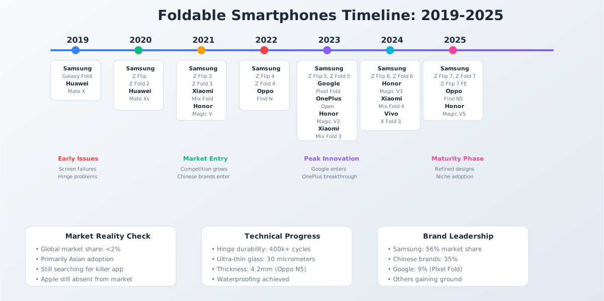
From 2021 onward, the category became less theatrical and more usable. Samsung’s Fold3 added water resistance, S Pen support, a Taskbar, App Pairs and more mature multi-window controls. Its Flip3 expanded the usefulness of the cover display. Oppo’s Find N shortened and widened the book-style shape, making the outer screen feel more like a normal phone. Honor and Huawei pushed thickness and weight downward. Google’s Pixel Fold used Android’s growing large-screen support to make split-screen, drag-and-drop and tabletop mode feel less like vendor hacks.
The OnePlus Open in 2023 was emblematic of the shift. OnePlus marketed it as a replacement for a conventional flagship rather than an engineering experiment. The product battle had moved from “look, it folds” toward “look how few compromises remain.”

This is a subtle but critical phase in product maturity. New categories often become viable not when they gain one killer feature, but when they stop demanding constant forgiveness. A foldable that is thin enough, durable enough, fast enough, camera-capable enough and familiar enough can finally be judged on usefulness rather than tolerated as an experiment.
Hardware Problems Became UX Problems
The crease is the obvious example. It is a physical indentation, but its consequences are experiential. A visible line cuts across photography, reading and video. A tactile dip matters when drawing with a stylus. Reflections make the center of the screen more noticeable. Potential buyers interpret the crease as evidence of fragility even when the display is technically durable.
Weight behaves the same way. A heavy foldable is not simply a heavier specification. It changes how long someone will read one-handed, whether they use the device standing on a train, whether it feels natural for photography and how willing they are to unfold it casually. Samsung executives recently told WIRED that reducing weight has been central to making the category easier to recommend.
Aspect ratio may be even more consequential. Early book foldables often paired a very narrow outside display with an almost square inner one. That meant two awkward canvases instead of one familiar phone plus one useful large display. Typing, video, web layouts and social formats all inherited the mismatch. The industry gradually widened cover screens because the outside of a foldable cannot merely be a waiting room for the inside.
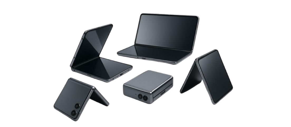
That was the core argument in our earlier analysis of foldable smartphones in 2025. We described the category as expensive answers to questions most people were not asking. Apple’s arrival does not make that argument wrong. It gives the industry another chance to answer it.
Hardware is part of UX. A crease changes reading. Weight changes posture. Thickness changes pocketability. Battery anxiety changes whether the large screen gets used at all.
Apps Were the Problem Hardware Couldn’t Fix
Foldables forced mobile interfaces to stop pretending that screen size was stable. Samsung’s developer guidance says an app should preserve state when a device folds or unfolds and resize gracefully across changing density, aspect ratio and window dimensions. Google expanded Android’s large-screen APIs. Vendors built compatibility layers for apps that did not understand Flex Mode or multi-window behavior.
Those behaviors have become important enough to spill beyond product design into patent law. In our analysis of Samsung’s foldable phone patent lawsuit, we examine claims that reach into app continuity, display-state transitions and the software behavior that makes a changing form factor usable.
These requirements sound like responsive web design translated into hardware, but the interaction stakes are higher. On the web, resizing a browser window is deliberate and visible. On a foldable, the user can trigger a radical layout change through a physical gesture while expecting the task to remain continuous. The system has to preserve scroll position, selection, media state, keyboard context, navigation hierarchy and sometimes the relationship between two apps.
That is why app continuity became so central to Samsung’s foldable story, and why the company’s current developer documentation still treats seamless restoration of state as essential. It also explains why foldables improved as Android itself improved. The ecosystem gradually stopped treating these devices as exotic exceptions and started treating adaptive layout as normal platform behavior.
This broader move toward context-responsive interfaces is not limited to foldables. We recently examined how Android is making interfaces respond to bodies, motion and surroundings. Foldables add physical geometry to that list. The screen is no longer just a place where the interface appears. Its shape becomes part of the interface state.
Then the Phone Grew Another Hinge
Huawei’s Mate XT pushed the category into tri-fold territory, launching globally in 2025 after its China debut. A second hinge allows the device to move through phone, intermediate and roughly tablet-sized states. Samsung followed the tri-fold branch as manufacturers searched for ways to make the larger canvas more dramatic.
Tri-folds reveal the category’s central temptation: if one fold creates useful optional space, perhaps two folds create even more value. They also multiply the design problem. A product team now has to account for more widths, more postures, more hinge positions, more weight distribution and more ambiguity about which canvas the user actually wants.
At some point, adaptability can become interface tax. Every additional state must earn its existence by enabling a behavior that feels better than simply carrying a small tablet. The history of foldables repeatedly shows that screen area is easy to measure and much harder to convert into purpose.
Every additional fold creates more screen. It also creates another decision the interface has to make correctly.
Why Foldables Stayed Niche
By 2025, the engineering had improved enormously, but the category was still only 1.6 percent of global smartphone shipments, according to Counterpoint Research. Shipments reached 19.6 million units, up 18 percent year over year, yet foldables remained a small corner of a market measured in well over a billion phones.
Price explains part of that. Book-style foldables often lived far above mainstream flagship pricing. Durability concerns persisted. Cameras and batteries sometimes lagged conventional premium phones because folding hardware consumed internal volume. Repair anxiety remained higher. Dust resistance proved stubborn.
But there is another explanation that is harder to put on a spec sheet: most users had already become exceptionally good at using a slab phone. App switching is fast. Large phones are already large. Tablets exist when people need a tablet. A foldable has to outperform habits that took more than a decade to form.
This is the category’s real adoption barrier. Novelty can justify an early purchase. Habit has to justify the second one.
Apple Arrives After Everyone Paid Tuition
Apple entered in September 2026 with the iPhone Duo, almost eight years after FlexPai and seven years after the original Galaxy Fold. That lateness is not a footnote. It is the product strategy.
Apple inherited a category whose failure modes had already been documented in public. Samsung learned how narrow a cover screen could become before it felt hostile. Microsoft demonstrated how much an ecosystem matters. Flip phones taught the industry that posture itself could be useful. Oppo, Honor and OnePlus pushed book foldables toward more natural proportions and lighter bodies. Huawei demonstrated how far flexible display engineering could stretch. Google helped normalize responsive large-screen Android.

Apple’s most interesting choices are therefore not that the Duo folds, but which old foldable problems it tries to make boring. The outer 5.4-inch and inner 7.6-inch displays share the same aspect ratio, allowing content to scale proportionally. iOS 27 is designed around changing poses and orientations. Navigation and controls can shift to preserve usable space. Apps are expected to resize instead of behaving like fixed phone screens pasted onto a larger rectangle.
Apple’s own Human Interface Guidelines for iPhone Duo emphasize continuity, adaptive layouts and preserving information hierarchy across states. That is the right problem to focus on. The fold should change capability without making the user feel as though they entered another operating mode.

Apple did not arrive first. It arrived after the rest of the industry spent years discovering which foldable problems users refuse to forgive.
Apple Still Has to Prove the Habit
This is where we would resist the easiest conclusion. Apple entering the category does not mean foldables have finally “won.” The iPhone Duo starts at $1,999. It remains thicker and heavier than a conventional iPhone. Its camera system makes compromises. Long-term durability has not been proven by launch-day demos. And a beautifully continuous interface still cannot manufacture a need for the larger screen.
The final UX question is behavioral: what recurring task becomes meaningfully better because the device folds? Reading? Two-app work? Gaming? Video? AI-assisted workflows? Photography? The answer does not have to be one universal killer app. But the opening gesture has to become habitual enough that users stop thinking about whether they should do it.
That is the standard we set in our 2025 critique, and it still holds. The best thing Apple can do for foldables is not make the hinge invisible. It is make the decision to unfold feel obvious.
The Future Is More Than Bigger Screens
Market forecasts now assume Apple will materially expand the category. Counterpoint expects global foldable shipments to rise from 19.6 million in 2025 to about 38.6 million by 2029. IDC’s August 2026 forecast calls foldables one of the only growing parts of a shrinking smartphone market, projecting 22.9 million units this year and roughly 27 million in 2027.
That growth will make the design problem more interesting, not less. As foldables become normal, users will tolerate fewer special-case interfaces. Developers will expect platform primitives instead of vendor workarounds. Cover screens will need clearer roles. Tri-folds will need to justify their extra states. Weight, durability and battery life will increasingly be judged as interaction qualities rather than engineering achievements.
AI may also change the value of the larger mobile canvas. Modern assistants increasingly work across apps, summarize documents, compare information and ask users to supervise multi-step actions. A phone-sized rectangle was built around one app at a time. A foldable canvas may become more useful when the job of the interface shifts from executing one task to monitoring several.
That is still a hypothesis, not a solved use case. But it is more compelling than the original pitch of simply carrying a smaller tablet in your pocket.
The Fold Finally Becomes Ordinary
The most important achievement of foldable phones may eventually be that nobody talks about folding. The first eight years were dominated by the mechanism because the mechanism kept demanding attention: fragile displays, thick bodies, visible creases, strange ratios, broken layouts and apps that did not know where they were.
The category is now entering a different phase. Samsung has eight generations of experience. Android has adapted. Competitors have diversified the shape. Tri-folds have stretched the idea. Apple has finally decided the technology is mature enough to become an iPhone.
That does not prove everyone needs a foldable phone. It proves the industry has finally reached the point where the hinge itself is no longer the most interesting part.
The foldable phone becomes successful when folding stops being the feature and starts being the invisible reason the product can do something better.


The most interesting part of foldable history is how often the hardware got ahead of the interface. Which generation do you think first made the fold feel genuinely useful rather than merely impressive?