

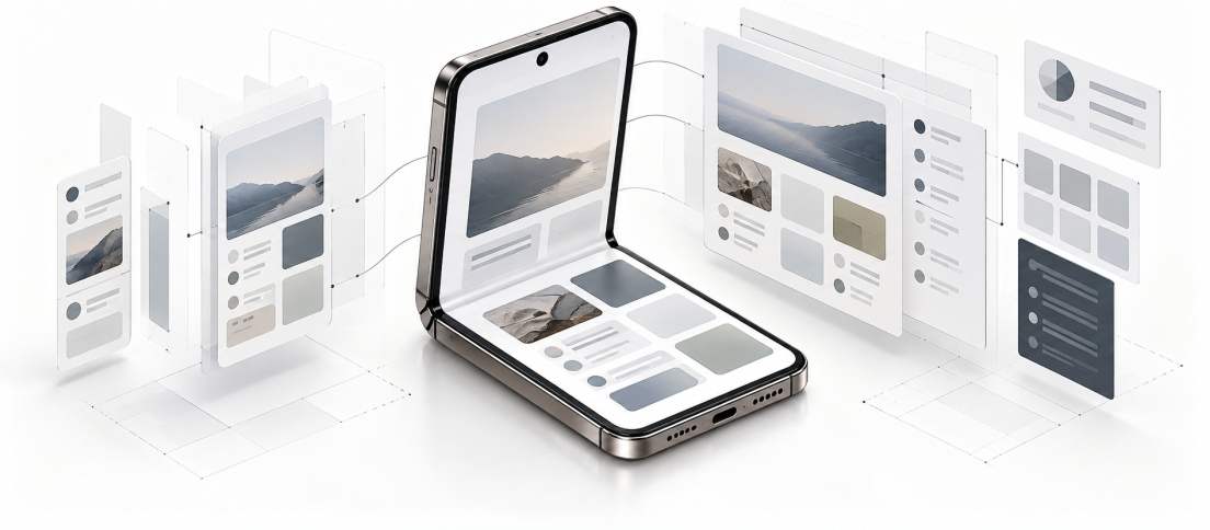
For years, responsive design has trained product teams to think in rectangles.
A phone is narrow. A tablet is wider. A desktop is wider still. Components rearrange, columns collapse, navigation changes and the design system tells everyone what should happen at each breakpoint.
The iPhone Duo complicates that model because the screen no longer changes only when a user switches devices or rotates one. The hardware itself can change shape while the task is still happening. Apple’s first foldable moves between a compact outer display and a much larger inner canvas, with iOS 27 designed around those changing states.

That sounds like another responsive-layout problem. It is not. It is a design-system problem involving state, continuity, hierarchy, navigation, reachability and the assumptions buried inside components that were created for a world of mostly static screens.
We have already looked at whether Apple has finally made foldable UX coherent, and our history of foldable phones traces how the category spent years learning to make changing hardware states usable. This is the practical follow-up. If you design or build digital products, what actually changes in your system now?
A foldable does not just add another breakpoint. It adds another moment in which your product has to decide what should stay, what should move and what should transform.
Responsive Design Was Built for Static Screens
Most responsive systems are still organized around width. A component behaves one way below a threshold and another way above it. The model is familiar because it works. It gives designers a manageable set of frames and engineers a manageable set of rules.
But width is only a proxy for context.
Apple’s own developer guidance for iPhone Duo makes that distinction unusually explicit. In its Prepare your app for iPhone Duo session, Apple tells developers to avoid assumptions about device type, screen references and orientation when making layout decisions. Instead, apps should respond to the space and traits available to the interface at that moment.
That is a subtle but important shift. Your design system should not be asking, “Is this an iPhone?” It should be asking, “What can this interface meaningfully do with the space and posture available right now?”
The web moved toward this philosophy years ago with fluid layouts, intrinsic sizing and container queries. Mobile product design has often remained more device-minded because the number of states was constrained. Foldables weaken that assumption.
The Fold Adds Behavioral State
Imagine a user reading a long message in your app on the outer display. They unfold the device.
A weak responsive implementation simply makes everything bigger. A slightly better one changes the layout. A genuinely adaptive product understands what the user was doing and uses the new space without making them reconstruct the task.
The message might remain selected while a conversation list appears beside it. The scroll position should survive. A composer should not disappear. Draft text should remain intact. A temporary panel should not unexpectedly become a permanent column simply because more width appeared.
This is why the design problem is larger than breakpoints. The product is moving between states while preserving intent.

Android has been confronting this for years. Google’s foldable guidance treats folded, open-flat, book and tabletop postures as different interaction contexts. Apple is now bringing the same problem directly into iPhone product teams.
Your Components Need Behaviors, Not Versions
This is where many design systems will expose their weakness.
A mature component library may have compact, medium and large variants for a card. It may have mobile and desktop navigation. It may define spacing tokens and typography scales beautifully. None of that necessarily tells a team what happens when the user changes the available canvas halfway through a task.
Google’s foldable guidance treats folded, open-flat, book and tabletop postures as different interaction contexts.
Design teams need to document transformation rules, not simply variants.
- Navigation: When does a bottom tab bar become a sidebar? Does the selected destination stay identical during the transition?
- Master-detail: When does a list reveal a persistent detail pane, and what occupies that pane before something is selected?
- Overlays: Does a bottom sheet remain a sheet on a larger canvas, become a side panel or close entirely?
- Forms: Does a single-column form become two columns, or would that change the reading and completion order?
- Media: Does video expand, anchor to one region or remain fixed while contextual controls use the extra space?
- Toolbars: Which actions move, which remain stable and which become visible only when additional space exists?
This is closely related to the distinction we made in Your UI Kit Is Not a Design System. Components are the visible layer. The real system is the decision-making infrastructure beneath them. Foldables simply make that difference harder to ignore.
If your design system documents what a component looks like at three widths but not how it transforms while a task is in progress, it is only partially responsive.
Create a Foldable Readiness Matrix
You do not need to redesign your entire product for one new iPhone. You do need a way to expose where your current system depends on assumptions that are about to become less reliable.
A simple readiness matrix is a good place to start. Take the highest-value flows in your product and document how each should behave across compact, expanded and posture-specific states.
| System Decision | Compact State | Expanded State | Partial / Posture State |
|---|---|---|---|
| Primary navigation | Bottom tabs or compact hierarchy | Sidebar or persistent navigation where useful | Keep core destinations reachable without crossing awkward regions |
| Content hierarchy | One primary task | Master-detail or contextual secondary content | Prioritize one region for primary content |
| Overlays | Sheet or full-screen takeover | Sheet, popover or side panel based on task | Avoid placing critical content across the fold |
| Task state | Current selection, scroll, draft and media state | Preserve all task state through expansion | Preserve state through posture changes |
| Primary actions | Thumb-reachable controls | Reposition without changing meaning | Keep actions in an accessible active region |
| Testing | Portrait and landscape | Expanded portrait and landscape | Book, tabletop, tent and multitasking where relevant |
The point of this exercise is not to create a giant matrix that designers resent maintaining. It is to force explicit decisions where teams currently rely on intuition.
Start with your five most important flows. Login. Search. Checkout. Messaging. Content creation. Whatever makes your product valuable. If those experiences cannot survive a change in available space without losing state or hierarchy, you have found a real system gap.
Foldable Readiness Checklist
If your team wants a fast internal audit, start here.
- Does task state survive expansion and collapse?
- Does navigation transform without making users re-orient themselves?
- Do overlays, sheets and panels adapt logically to the larger canvas?
- Are critical controls clear of reserved regions and awkward postures?
- Does the information hierarchy improve rather than simply spread out?
- Have you tested the transition itself, not only the start and end states?
The Hinge Is a Reserved Region
Foldables also introduce physical geometry into interface governance.
Apple’s adaptive-layout guidance for iPhone Duo introduces reserved regions around hardware such as the hinge and cameras. Apple recommends displacement patterns that move content away from these regions instead of allowing essential controls or information to sit awkwardly across them.
For designers, the practical lesson is larger than “do not put a button on the hinge.” Safe areas can no longer be treated as static redlines supplied at handoff. The usable region itself may change with posture.

That means system documentation should distinguish between decorative overflow and task-critical content. A background image can tolerate interruption. A scrubber, text field, slider or primary CTA cannot. A design token can define spacing, but it cannot decide which element deserves displacement. That remains a product decision.
Design Tokens Will Survive This
The good news is that foldables do not invalidate the foundations of modern design systems.
Color, typography, spacing, radius, elevation and semantic tokens remain useful precisely because they separate design decisions from one specific screen. As we argued in Design Tokens Are Becoming the API of Design, tokens are strongest when they carry intent across platforms rather than hard-code one implementation.
What needs to evolve is the behavioral layer above them.
A sidebar is not merely a wider version of bottom navigation. A detail pane is not just extra content that appears above 768 pixels. A component system should increasingly be able to say: when available space supports persistent context, reveal it; when it does not, preserve the same task through navigation.
In other words, teams should encode intent before device.
Designers Need to Prototype the Transition
Static frames will be especially misleading here.
A designer can create a beautiful outer-screen frame and a beautiful inner-screen frame while completely missing the most important interaction: what happens between them.
For key workflows, prototype the transformation itself. Start a task in the compact state. Change the available space. Confirm what remains selected. Confirm where navigation moves. Confirm whether focus survives. Confirm whether an open keyboard, modal, player or draft behaves predictably.
This is one of those cases where motion is not decorative. The transition explains continuity. If a list-detail view simply flashes into existence after unfolding, users may understand it eventually. If the selected item visibly retains its relationship to the newly revealed pane, the system explains itself.
Engineering Needs Rules, Not More Figma Frames
Product designers should resist solving this by producing twenty more artboards for every feature. That simply transfers ambiguity downstream.
Engineers need a small number of explicit rules: what is fluid, what is conditional, what is persistent, what can relocate and which states must survive layout change. Apple is pushing developers toward size classes and local environment information rather than fixed screen assumptions for exactly this reason.
A good handoff might therefore describe a behavior like this:
- Below the regular-width threshold, show one pane.
- When regular width becomes available, preserve the current selection and reveal contextual navigation beside it.
- Do not reset scroll, input or media state during the transition.
- If a reserved region intersects the control area, displace the controls rather than resizing the task content.
- When space collapses again, return the user to the same selected object.
That is far more useful than “here is the foldable screen.”
Your QA Matrix Just Got Worse
There is an unglamorous consequence to all of this: testing gets more expensive.
Teams already test device sizes, orientation, Dynamic Type, localization and accessibility settings. Foldables add transitions and posture. The failure modes are also more subtle than simple clipping. A screen can look correct after unfolding while losing the user’s place, duplicating navigation, moving focus unpredictably or putting a control into an unreachable region.
For each critical journey, add four questions to QA:
- Does the layout remain usable before and after the state change?
- Does the user’s task state survive the transition?
- Does the information hierarchy remain understandable?
- Do controls remain reachable and unobstructed in every supported posture?
This is not an argument for exhaustive testing of every theoretical fold angle. It is an argument for recognizing continuity as a quality criterion rather than assuming layout correctness is enough.
Do Not Build a Foldable Design System
The worst response to the iPhone Duo would be a new folder called “Foldable Components.”
That repeats the device-specific thinking Apple is explicitly telling developers to avoid. The better response is to make the existing system more adaptive.
Audit where your product assumes one fixed canvas. Document how key components transform. Define continuity rules for important tasks. Prototype transitions instead of only endpoints. Treat safe areas as dynamic. Give engineers behavioral rules. Expand QA from screen correctness to state correctness.
Our 2025 critique of foldables argued that the category had become an extraordinary feat of engineering without an equally convincing software purpose. The iPhone Duo does not magically solve that. What it does is make the adaptive-interface problem impossible for mainstream iOS teams to dismiss as someone else’s edge case.
The useful lesson is not that every product now needs a special foldable experience. It is that a design system built around static device categories was already becoming obsolete. Foldables simply make the weakness visible.
The future-proof design system is not the one with the most breakpoints. It is the one that can preserve user intent while the interface changes around it.







Most design systems document what components look like at different widths. Far fewer document what should happen when the interface changes size while a task is already in progress. Which part of your current system would break first: navigation, overlays, state continuity or QA?